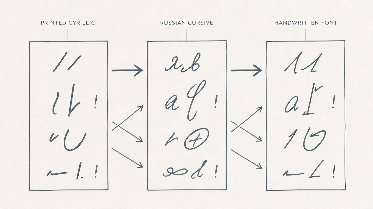
The “Cyrillic handwritten” font family is usually Russian cursive. But it’s worth noting that not all Cyrillic languages use the Russian handwriting system, so if you’re going to write in Serbian, for example, you need a different script style.
Cyrillic is typically printed with straight lines, but handwritten (i.e., cursive) letters can be quite different from print. In this guide I explain how to choose or create your own Cyrillic cursive fonts and understand why they work—or don’t.
Making a Cyrillic handwriting font
If you want to know how to make your own Cyrillic handwriting fonts, here’s how to start.
There are two distinct approaches to writing, which are reflected in the shapes of the letters themselves:
Lowercase italic forms resemble their Latin counterparts, yet often appear more cursive due to variations in stroke structure. Lowercase Russian italics are often based on Russian cursive, including lowercase т resembling Latin m. This visual similarity, however, doesn’t always align with phonetic sound values within each language.
This is known as the Latin-cursive trap. Modern Russian cursive п can resemble Latin cursive n, for example, despite having a different sound value. The logic of overall writing may seem straightforward, but decoding keys based solely on the visual similarity of characters will almost certainly mislead you.
I’ve already written about this problem, but now I’m expanding the discussion. Below are the main clusters where ambiguity occurs among lowercase Russian cursive.
The cursive letters и, л, м, ш, щ, and ы contain similar elements and can create ambiguity. Cursive т and ш can also become difficult to distinguish, so writers may add a bar or use a printed T-shaped т; д may resemble ꝺ or ∂. Contrast these letters that collapse into similar strokes with practical context cues and common disambiguations that writers employ.
Here’s what to expect in the next section when looking at Russian cursive.
Serbian and Macedonian cursive
In my last piece about making Cyrillic fonts, I explained that some languages—such as English and Chinese—have multiple handwriting systems that aren’t mutually interchangeable. For example, we have calligraphy and cursive; Chinese has regular, cursive, and running scripts, etc.
However, in the realm of Cyrillic languages, many of them share similar writing systems. So, does that mean a Russian-only font can serve as an appropriate basis for creating a penmanship model across all Cyrillic languages?
It depends on what you mean by “Cyrillic.” Some of the languages that use the Cyrillic alphabet differ significantly from the Russian cursive writing style, and you should avoid trying to treat any one font or handwriting model as pan-Cyrillic.
Let’s look at two such cases: Serbian and Macedonian.
What makes a handwriting-style Cyrillic font feel designed as one family?
A handwriting-style Cyrillic font is generally a family of 50+ letters, though it’s actually over ten thousand individual letters that are needed for real coverage. The key is to create a family of handwritings that feels like one family of handwriting, not a random collection of glyphs.
So, what makes a family of handwriting feel like it was designed as one?
-
Natural Cyrillic shapes.
-
Harmony with Latin, if appropriate.
-
Spacing rhythm, i.e., the flow between characters.
-
Weight or color, depending on the design.
-
Knowledgeable review rather than mechanically translating the Latin parts. (Some people just take Latin typefaces and translate them letter by letter, but this can produce odd results.)
Joining vs. not joining
Most people who use joined handwriting rely on continuous connection as the main stylistic feature. However, it’s optional when you can achieve style, rhythm, variation, and legibility with deliberate execution. The caveat is that you can’t necessarily force continuous connections, so you’ll still need to consider whether or not to join characters.
Unconnected characters.
You can vary the amount of connection, using three variations as examples.
Connected to each other, but not forming loops.
Connected to each other, forming loops.
Connected to each other, and even connected to other letters (e.g., the tail of an “s”).
Pacifico and its unconnected counterpart.
Caveat’s characters are not connected, while three variations help create a natural handwriting appearance. Pacifico is a joined script font with standard and exit forms designed to make connections look natural.
How do I verify real language support?
When you buy a font, it’s easy to trust that it covers the entire Cyrillic range unless told otherwise. That’s not necessarily the case, however, especially with fonts that label themselves as simply covering Cyrillic.
To verify that the font supports a given language, test words in that language.
Marck Script shows a small selection of the scarce Cyrillic character set available in the font. Its Latin set supports English, and the Cyrillic set can be used for Ukrainian, Belarusian, and Serbian.
Ukrainian and Belarusian, for example, have additional diacritical marks.
Serbian uses the same Cyrillic alphabet, but includes extra characters, including ŋ and ć.
Caveat: Just because a font supports Cyrillic doesn’t mean it’s appropriate for every Cyrillic language.
For example, the following font contains both extended Latin and Cyrillic alphabets, plus the Ukrainian accent marks shown above. However, it also contains т, Н, and Т, which may not be acceptable for other Cyrillic languages. Marck Script supports Latin and Cyrillic, but its Cyrillic character set is scarce even though it can set some languages. Caveat supports extended Latin and Cyrillic and can set most Cyrillic-based languages, but some support remains imperfect. The type.today review notes problems with Ukrainian accent marks and incorrect Serbian support in some fonts.
An original-font workflow
Below is an overview of my workflow when making a handwriting font. The process involves capturing a sample of handwriting, testing that handwriting against the target languages, editing, then converting the file into downloadable formats.
Handwriting capture
On-screen alphabet
Printable template
Test fonts and the languages they cover
Edit
Download
Convert to TTF or OTF (the standard formats)
FontGenerator
FontGenerator offers a guided approach to building a new font based on a handwriting sample. It offers a free starting plan, with paid plans for larger or private projects. You can write the alphabet on screen, upload a photo of paper, or use the printable template.
Note that while FontGenerator helps automate much of the creation of Cyrillic handwriting fonts, there’s no guarantee that it will produce universal Cyrillic automation. The tool-assisted process is still being tested, so please try it out and report any bugs you find.
Choosing the right font format
Finally, here’s what I recommend in terms of selecting the right format for installing a font locally for printing or desktop use versus delivering it to the web. As a rule, you won’t need to convert between formats manually.
TTF (TrueType): If you want to install the font and print it.
OTF (OpenType): Same as TTF.
WOFF: Older browsers require WOFF. We recommend WOFF for compatibility reasons.
WOFF2: The preferred format for sending fonts to the web.
Browser converter
Because you can download the WOFF and WOFF2 files directly, you don’t really need to convert anything unless you’d like to provide your customers with a downloadable font for installation. You’ll need to convert the WOFF and WOFF2 files to TTF or OTF instead.
But since most people prefer downloading the WOFF2 version of a font, it’s likely unnecessary to convert those files. Instead, you can use a browser-based font converter, which can convert a downloaded WOFF2 file into a downloadable font that’s ready for delivery.
Where to go from here
Ultimately, the only way to be sure that you can make or choose a handwriting-style Cyrillic font is to begin with an original sample and test it against all the languages that you intend to cover. Otherwise, you risk ending up with a font that looks beautiful but lacks coherence and fidelity.
Once you’ve built a few versions of the font, you can test each word in the intended language before shipping them off for production.
You must also ensure that you haven’t copied another’s protected material. Don’t clone someone else’s commercial typeface without permission. Don’t copy pirated font files. Don’t reproduce someone else’s handwriting. Don’t steal a celebrity’s signature.
Above all, remember that Russian-only coverage is not universal! If you’re writing in another Cyrillic language, you need to account for those differences.
Target-language word testing
One of the easiest ways to identify problems in a handwriting font is to simply type a word in the target language and see if it’s readable.
Remember: You can’t just assume that the font works just because it covers the correct Cyrillic range. You must also test the words that users will actually type.