In the vast realm of typography, there exists a peculiar phenomenon known as “freaky fonts.” These fonts, often seen in online memes and social media posts, take on an unusual appearance. The term refers to a style of text known as Unicode Mathematical Bold Script, or simply styled text using Unicode math characters rather than a downloadable typeface.
The most familiar freaky font meme appears as symbols such as 𝓯𝓻𝓮𝓪𝓴𝔂, where each letter is displayed in a bold script style. While it’s tempting to refer to these characters as a “freaky font,” they’re not: they’re just styled text. A font file (such as those provided by Microsoft’s Arial Unicode MS) contains the actual glyphs that render these letters, which are also available in Unicode itself. So long as your device supports the required font, you can paste them into any field that accepts Unicode text.
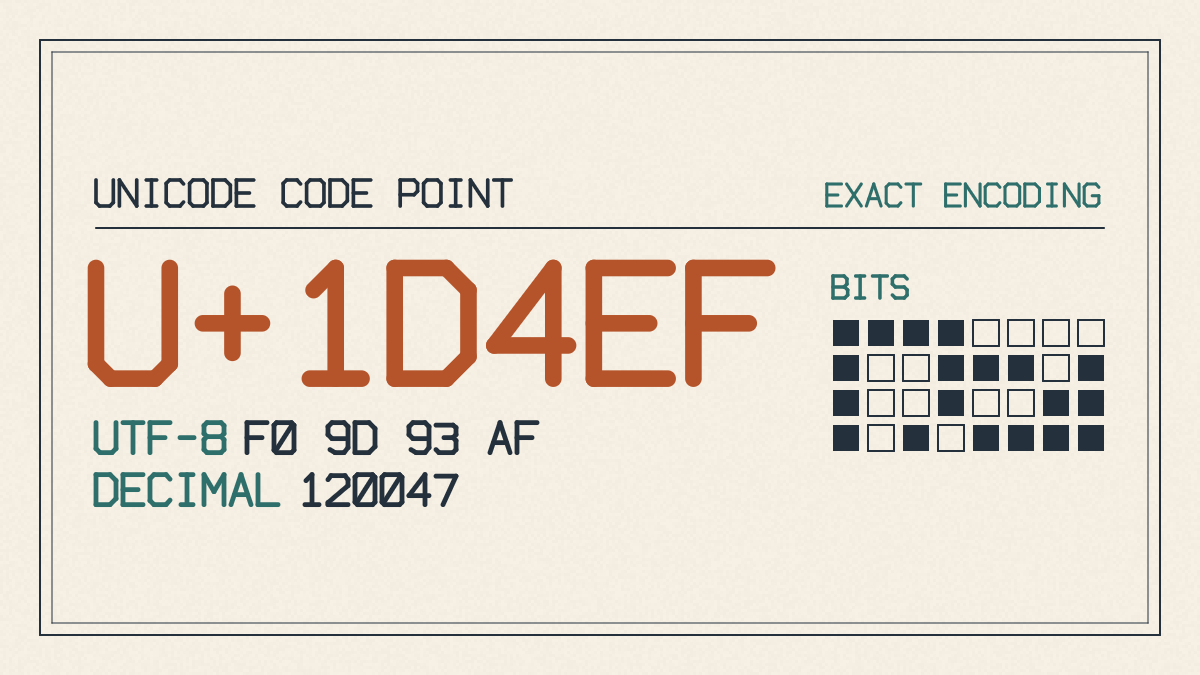
For the casual user, this means you simply choose a Bold Script style, copy the text from somewhere (like my website), and then paste it into a short bio, username, caption, or message.
Rendering and Compatibility Risks
Unfortunately, because you’re simply pasting Unicode symbols, you can’t be sure how they’ll look on the receiving app or platform. Some will support Unicode rendering perfectly; others may not. As a result, boxes, question marks, plain fallback letters, or even altered shapes could appear depending on what font they choose for normal A–Z and digits, or accented letters. In all likelihood, though, you’ll see some sort of symbol.
If you want to use Unicode accents sparingly, that’s fine. But if you’d like to make a point or provide information to others, you need to think about whether you should instead choose a decorative font that provides more readable accents and a consistent rendering of your words. There’s another reason, too: accessibility.
Real editable text — meaning the characters used to compose the words — is far more usable and accessible than just a collection of separate Unicode symbols. For instance, screen readers will read your word correctly. Search engines and spell-checkers will recognize it as well. If I wanted to write something longer, like an article, the Unicode symbols would require me to search for them, one at a time, to find their names, which can be confusing. (It’s actually quite easy to find Unicode symbols with the right tools, but the process isn’t nearly as straightforward.)
Symbols vs Installable Glyphs
Design programs treat each character as its own symbol. In contrast, installable fonts treat each letter or punctuation mark as a glyph drawn from a single source. If we’re creating a real display font ourselves, we can control everything about the way it looks and how it renders. And we don’t have to rely upon Unicode to provide the symbols themselves.
What Are Real Installable Fonts?
A real installable font file changes the way a font looks. It’s possible to have different weights of the same font installed on a device, as well as different styles. When you apply an installable font to text, however, you’re still using the characters themselves. You’re changing the spacing, the language data, etc., but ordinary text remains text.
TTF, OTF, WOFF, and WOFF2 files represent various ways in which font technology has evolved over the years. They allow us to change the way that text looks while preserving normal text, spacing, and language data. An installable font allows for broader character coverage than Unicode alone, allowing us to define our own fonts in addition to the many thousands available through Unicode.
You can decide to use a Unicode symbol rather than installing a font only when no font can be selected. Otherwise, choosing a real installable font can improve accessibility, search results, readability, and ensure consistent rendering.
Banshee Slab: An Original Decorative Horror Direction
There are many decorative fonts out there, and a few designed specifically toward horror or spookiness. One, Banshee Slab, attempts to provide original direction for a new visual genre. It’s an AI-generated typewriter slab with drips, made for Horror & Spooky designs, and it comes in one style with 148 glyphs: 105 Latin letters, plus accented and special forms with verified coverage for the listed languages. You can test it with your own text before licensing or downloading.
Banshee Slab was created by AI-generated artwork, which can sometimes feel strange. But it also offers a good opportunity to test the exact phrase before committing to it. How do the letters render? What about the spacing between letters? Do they have a unique feel that separates them from other typewriter slab drips? How does the spacing affect the readability of the phrase? Does it add or detract from the horror?
We’ve provided several options for viewing Banshee Slab. You can inspect its glyphs individually, along with variations in size, line height, letter spacing, and previewed style. You can also choose a personal license, which requires a fee, or commercial license for businesses.
Creating Your Own Freaky Display Font
When designing your own font, you can describe broad visual traits without worrying about copying a known commercial look. Describe a decorative style that might incorporate dripping slab, quirky display, gothic, or glitchy lettering. Upload the lettering artwork so that the AI can draw an installable font. Later, you can edit letters, spacing, weights, and language coverage to ensure that the finished product is exactly as you want it.
Mathematical Bold Script: Short Social Decoration
I suggest using Mathematical Bold Script very sparingly, if at all. This is mostly for the purposes of social media decoration. If, however, you want to make a statement, you’ll need to choose a font that gives you a certain level of consistency and the ability to create your own accents, both decorative and functional. Use Unicode if you don’t mind how the symbols render on your devices, but choose a licensed font otherwise.