Serif1 style17 languages
Catenary Stem Sans Barred I Geometric Font
H S $ I B P
AI-generated
Sans serif · 1 style · 316 characters · Version 0.1.1 · Published October 7, 2026
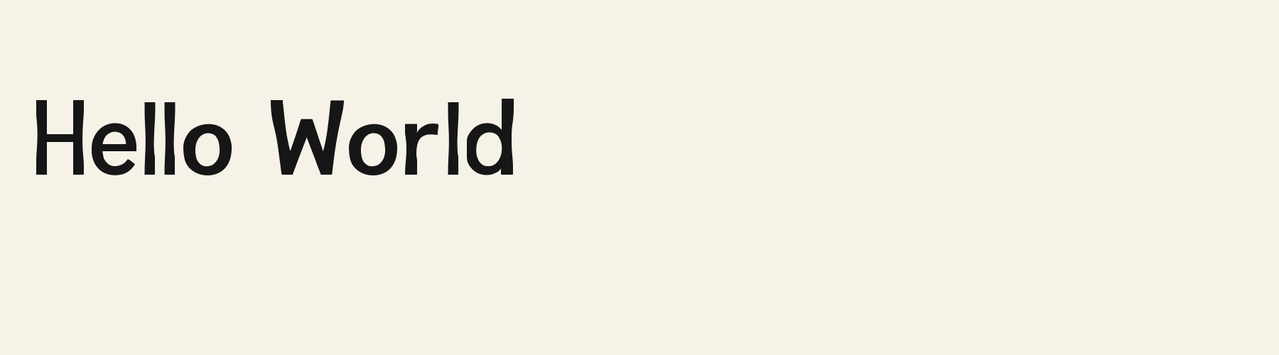
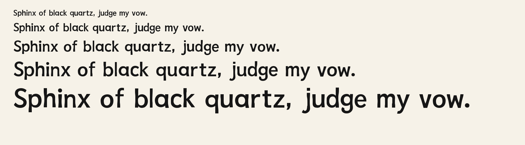
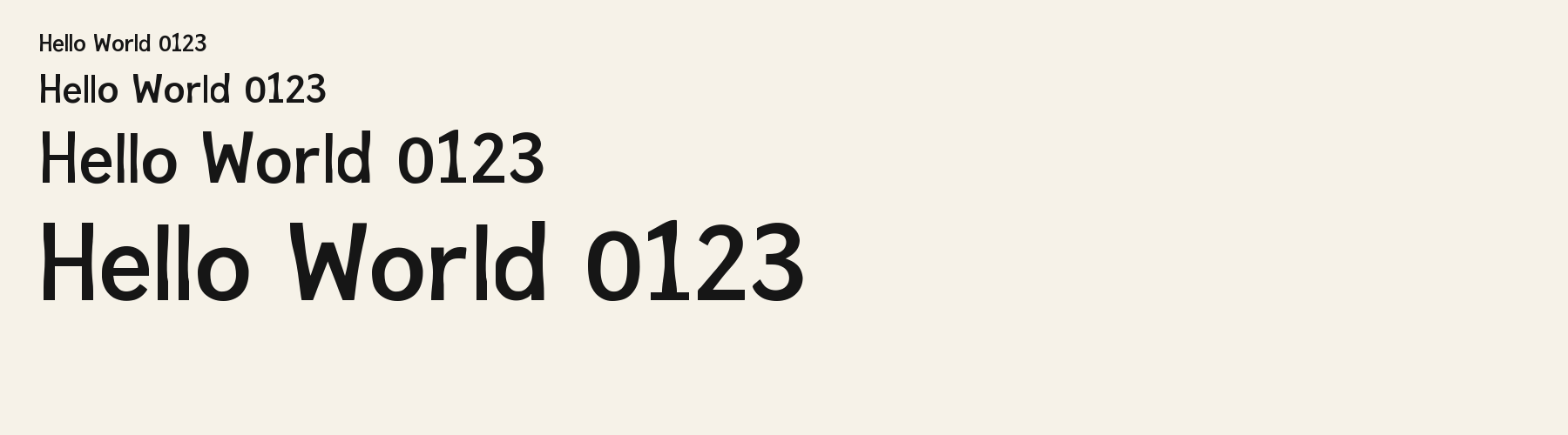
Catenary Stem Sans combines rounded bowls with upright strokes whose edges gently draw inward, most visibly in the enlarged Hello World specimen.
Also available as: Catenary Stem Sans Outline
Personal use: with Pro, Studio, or as one of 5 Font Pass picks ($4.99 once)Commercial license from $15/mo, yours to keep after your plan endsSee plans
Aa
HS$IBP
Test
Test Catenary Stem Sans
Type the words you plan to use and adjust size, line height, and letter spacing. The preview uses the final font file.
The quick brown fox jumps over the lazy dog
Design
Barred I Geometric Letterforms
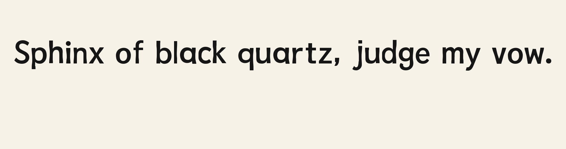
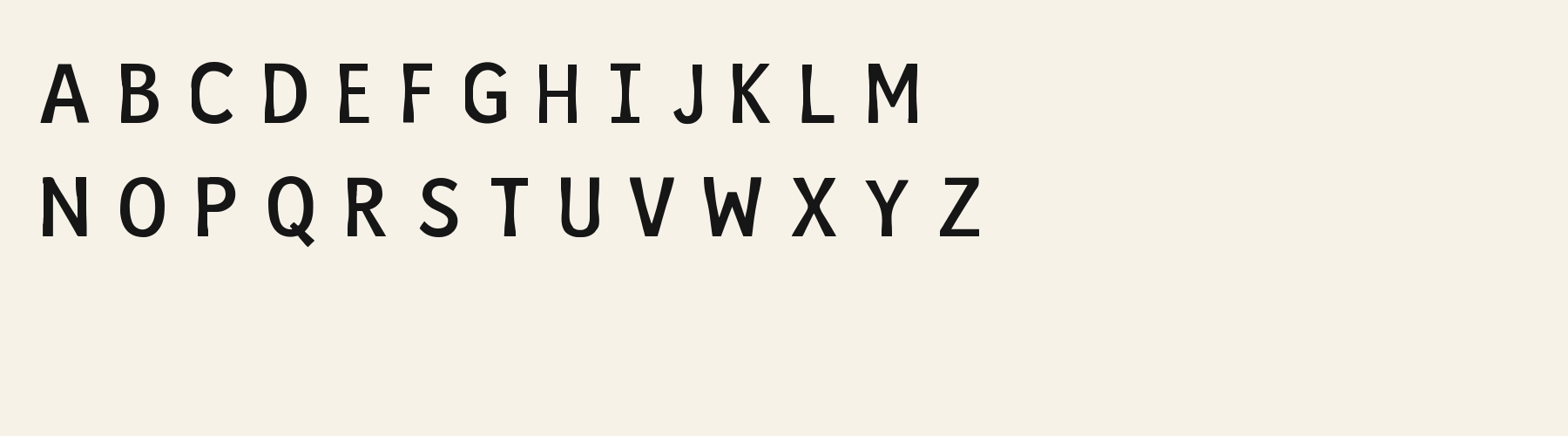
Catenary Stem Sans combines rounded bowls with upright strokes whose edges gently draw inward, most visibly in the enlarged Hello World specimen. The capital I has horizontal bars at both ends, while the Q sends a short diagonal tail through its lower right curve. The lowercase a uses a single rounded bowl with a right stroke ending close to its top. Solid, medium-weight strokes give the letters a firm presence, with slightly lighter curves across the tops and bottoms of round forms. The result feels restrained and contemporary, with enough shaping to soften its geometric structure.
Test the font in your wording
Inspect the barred I, lowercase l and dotted i in your actual Latin wording, along with the space around rounded bowls. Check descender clearance and individual letter pairs as spacing changes. For other scripts, verify available glyphs and their appearance separately.
Font pairing roles
Try this face for headings and short labels, supported by a text serif with a larger lowercase body for longer passages. Its compact lowercase and solid strokes suggest a useful contrast with more open text spacing and finer details.
Catenary Stem Sans: letterforms and layout
Distinctive letterforms
I
a
Q
Compare the layout
Same font, different settingsDigital tools
DIGITAL TOOLS
Compare the wording as written with an uppercase preview. The lowercase version shows rounded bowls and ascenders above the smaller letter bodies; uppercase turns the dotted i into the barred I and gives the line a more uniform height.
Preview settings, not minimum size recommendations. Wide samples scroll sideways.
Choose your letterforms
Same wording · 40pxHELLO WORLD
Catenary Stem Sans has solid strokes, gently curved upright edges and unbroken bowls. Choose it when the heading needs a compact silhouette with subtle shaping visible inside otherwise simple letters.
HELLO WORLD
Zigzag Spine Sans Extrude 3D combines angular bends along the uprights with thin offset contours beside the heavy letter faces. Choose it when those repeated zigzags and dimensional edges should become a prominent part of the heading.
Catenary Stem Sans font in use
Signal Input
Product label. Rounded lowercase bowls and the barred capital I give this short equipment label a mix of curved and squared details. Quiet Forms
Book or album cover. The Q’s projecting tail and rounded lowercase forms give a spare cover title distinctive details without additional lettering effects. Hello Tomorrow
Website headline. Tall ascenders and gently drawn-in uprights give a mixed-case website heading a clear rhythm of vertical strokes and rounded bowls.
The scenes are illustrations drawn on this page with Catenary Stem Sans itself, not client work.
How this page was made. Catenary Stem Sans is a FontGenerator library font made with AI; before release its letters were read back one by one by independent automated checks. The design notes were written by AI from the specimen images and checked against them by a second, independent pass; font measurements come from the font file. Preview sizes and spacing are comparison settings.
Specimens
Specimens
Rendered from the font files, without retouching.
About
About Catenary Stem Sans
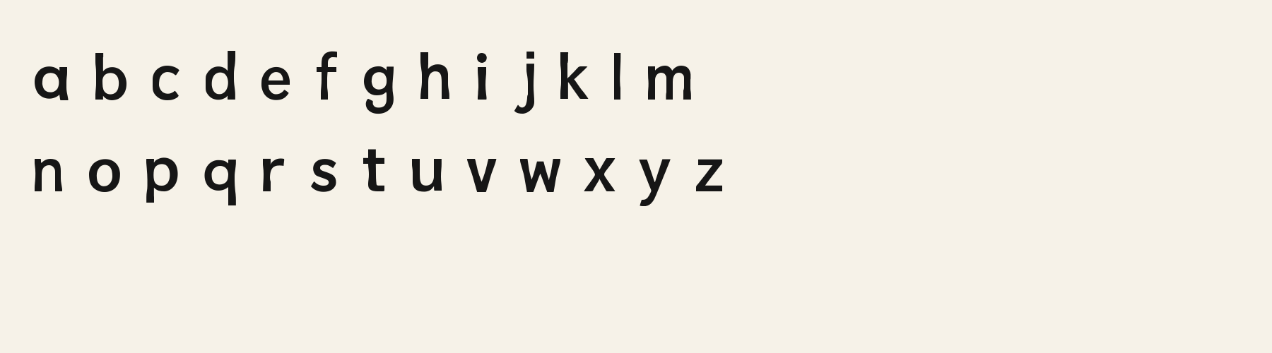
Its lowercase sits low: the x-height is 68.3% of the cap height, where the median for sans serif fonts is 71.4%, lower than 31 of the 34 other sans serif fonts. Ascenders on b, d, h, k and l line up with the capitals (98% of their height), and descenders on g, j, p, q and y drop 29.6% of the cap height below the baseline, deeper than 22 of the 34 other sans serif fonts. Catenary Stem Sans runs 14% narrower than the median for sans serif fonts: an average lowercase letter, spacing included, is 67.3% as wide as the capitals are tall (an average capital, 77.4%). The o is close to a circle, 0.95 times as wide as it is tall, and W is the widest capital, at 1.34 times the width of H. Round letters overshoot: O rises 1.3% of the cap height above H and dips 1.2% below the baseline.
The letters stand upright, leaning less than 2.5° either way. Vertical stems measure 12.6% of the cap height, heavier than 16 of the 28 other sans serif fonts. Ink covers 36% of each lowercase letter's box (its advance width by the cap height), darker than 22 of the 34 other sans serif fonts. The contrast is mild: the sides of o and O are 1.32 times as thick as their tops and bottoms.
Its 316 characters include 273 Latin letters, plus 43 figures, punctuation marks and symbols; 221 of the Latin letters are accented or special forms beyond A to Z. The word space measures 46% of the cap height, and the blank space either side of a lowercase letter takes up 15.7% of its width. The font carries no kerning, so spacing comes from each letter’s own side bearings. The figures have different widths, so columns of numbers set in Catenary Stem Sans will not line up exactly.
One other library font shares Catenary Stem Sans's underlying letter structure. Compared with Catenary Stem Sans, Catenary Stem Sans Outline puts down 58% less ink.
Measured from the version 0.1.1 font file. Comparisons are with the 376 published library fonts measured on November 21, 2026, 35 of them sans serif fonts.
Catenary Stem Sans in one language
- Swedish
Flygande bäckasiner söka hwila på mjuka tuvor.
Characters
Characters
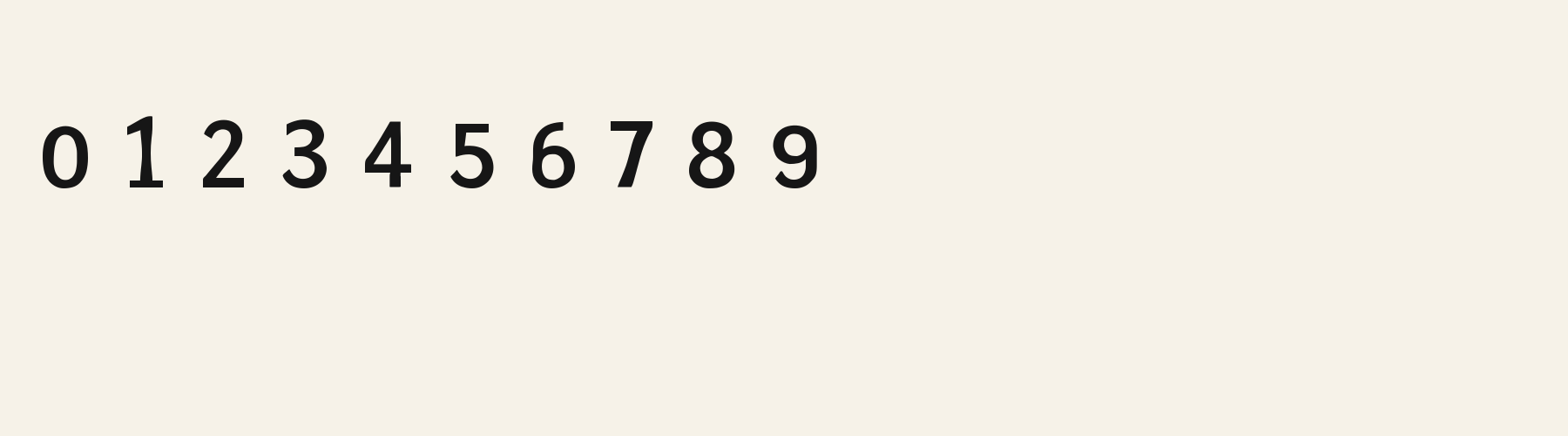
Includes all 95 printable Basic Latin characters, 316 characters in total.
Verified language coverage: Afrikaans, Albanian, Basque, Catalan, Czech, Danish, Dutch, English, Estonian, Filipino, Finnish, French, Galician, Hungarian, Indonesian, Irish, Italian, Malay, Norwegian, Portuguese, Romanian, Slovak, Slovenian, Spanish, Swahili, Swedish, Zulu
- Stroke
- Solid black even medium mono-strokes with normal cap height, x-height, baseline, ascenders and descenders
- Best for
- Contemporary technology headings, UI labels, packaging, and readable geometric display work
Basic Latin · 95
- !
- "
- #
- $
- %
- &
- '
- (
- )
- *
- +
- ,
- -
- .
- /
- 0
- 1
- 2
- 3
- 4
- 5
- 6
- 7
- 8
- 9
- :
- ;
- <
- =
- >
- ?
- @
- A
- B
- C
- D
- E
- F
- G
- H
- I
- J
- K
- L
- M
- N
- O
- P
- Q
- R
- S
- T
- U
- V
- W
- X
- Y
- Z
- [
- \
- ]
- ^
- _
- `
- a
- b
- c
- d
- e
- f
- g
- h
- i
- j
- k
- l
- m
- n
- o
- p
- q
- r
- s
- t
- u
- v
- w
- x
- y
- z
- {
- |
- }
- ~
Latin letters with accents · 210
- ª
- º
- À
- Á
- Â
- Ã
- Ä
- Å
- Æ
- Ç
- È
- É
- Ê
- Ë
- Ì
- Í
- Î
- Ï
- Ð
- Ñ
- Ò
- Ó
- Ô
- Õ
- Ö
- Ø
- Ù
- Ú
- Û
- Ü
- Ý
- Þ
- ß
- à
- á
- â
- ã
- ä
- å
- æ
- ç
- è
- é
- ê
- ë
- ì
- í
- î
- ï
- ð
- ñ
- ò
- ó
- ô
- õ
- ö
- ø
- ù
- ú
- û
- ü
- ý
- þ
- ÿ
- Ā
- ā
- Ă
- ă
- Ą
- ą
- Ć
- ć
- Ċ
- ċ
- Č
- č
- Ď
- ď
- Đ
- đ
- Ē
- ē
- Ĕ
- ĕ
- Ė
- ė
- Ę
- ę
- Ě
- ě
- Ğ
- ğ
- Ġ
- ġ
- Ģ
- ģ
- Ħ
- ħ
- Ī
- ī
- Ĭ
- ĭ
- Į
- į
- İ
- ı
- IJ
- ij
- Ķ
- ķ
- Ĺ
- ĺ
- Ļ
- ļ
- Ľ
- ľ
- Ŀ
- ŀ
- Ł
- ł
- Ń
- ń
- Ņ
- ņ
- Ň
- ň
- Ŋ
- ŋ
- Ō
- ō
- Ŏ
- ŏ
- Ő
- ő
- Œ
- œ
- Ŕ
- ŕ
- Ř
- ř
- Ś
- ś
- Ŝ
- ŝ
- Ş
- ş
- Š
- š
- Ţ
- ţ
- Ť
- ť
- Ŧ
- ŧ
- Ū
- ū
- Ŭ
- ŭ
- Ů
- ů
- Ű
- ű
- Ų
- ų
- Ÿ
- Ź
- ź
- Ż
- ż
- Ž
- ž
- ſ
- Ʒ
- Ǎ
- ǎ
- Ǔ
- ǔ
- Ǥ
- ǥ
- Ǧ
- ǧ
- Ǩ
- ǩ
- Ǯ
- ǯ
- Ǿ
- ǿ
- Ș
- ș
- Ț
- ț
- Ȟ
- ȟ
- ɑ
- ʒ
- Ḃ
- ḃ
- Ḋ
- ḋ
- Ḟ
- ḟ
- Ṁ
- ṁ
- Ṗ
- ṗ
- Ṡ
- ṡ
- Ṫ
- ṫ
- Ɑ
Download
Download
Choose the license that matches your project before downloading.
Download
This font is part of the Pro library: it downloads with Pro or Studio, or as one of the five picks of a Font Pass.
Commercial use
Client work, products and redistribution need a commercial license. Library fonts include it with Pro or Studio; fonts you make include it when you make them on Pro or Studio. A Font Pass is for personal projects.
TTF · OTF · WOFF · WOFF2
Read the full font licenseTools
Do more with Catenary Stem Sans
Free tools that run in your browser. Images you make with them, such as a signature PNG, can be used for any purpose.
- Make a font like thisDescribe the style and get your own font in the direction of Catenary Stem Sans, private on paid plans.
- Check languagesSee which of 54 languages a font can write and exactly which letters are missing.
- Convert font filesTurn TTF or OTF into WOFF2 for the web, or back again. Files never leave your device.
- Compare with your fontsDrop in your own font files and set them next to library fonts.
Pairings
Fonts to pair with Catenary Stem Sans
A different structure keeps a pairing readable: set one font for headings and the other for text. Test both with your own words.
Serif1 style38 languages
Script1 style17 languages
Similar
More sans serif fonts
See all sans serif fontsSans serif1 style17 languages
Compared with Catenary Stem Sans: Lighter strokes
Rounded Humanist Terminal
Free downloadSans serif2 styles21 languages
Compared with Catenary Stem Sans: 55% wider · lighter strokes
Sans serif1 style31 languages
Compared with Catenary Stem Sans: 15% wider · heavier strokes
Sans serif1 style18 languages
More
You may also like
Fonts from other styles, first those that suit the same kinds of work as Catenary Stem Sans.
Serif1 style17 languages
Also suits: book or album cover
Monospace1 style22 languages
Also suits: product label
Decorative1 style17 languages
Also suits: product label
Stencil1 style38 languages
Also suits: product label
FAQ
Catenary Stem Sans questions
- Can I use Catenary Stem Sans commercially?
- Catenary Stem Sans is part of the Pro library. Pro and Studio include it with a commercial license that continues after the plan ends; a Font Pass can pick it as one of 5 fonts for personal use.
- Which languages does Catenary Stem Sans support?
- Catenary Stem Sans's 316 characters include 273 Latin letters, plus 43 figures, punctuation marks and symbols; 221 of the Latin letters are accented or special forms beyond A to Z. It has all 95 printable Basic Latin characters. Verified language coverage: Afrikaans, Albanian, Basque, Catalan, Czech, Danish, Dutch, English, Estonian, Filipino, Finnish, French, Galician, Hungarian, Indonesian, Irish, Italian, Malay, Norwegian, Portuguese, Romanian, Slovak, Slovenian, Spanish, Swahili, Swedish, Zulu. Missing a language? Customize the font and add it in Studio.
- What is Catenary Stem Sans good for?
- Product label: Rounded lowercase bowls and the barred capital I give this short equipment label a mix of curved and squared details. Book or album cover: The Q’s projecting tail and rounded lowercase forms give a spare cover title distinctive details without additional lettering effects. Website headline: Tall ascenders and gently drawn-in uprights give a mixed-case website heading a clear rhythm of vertical strokes and rounded bowls. Less suited: For dense numerical tables, compare a companion with tabular figures and check column alignment in the actual layout before choosing either face.
- What fonts pair well with Catenary Stem Sans?
- Newsreel Serif (serif), Quest Italic (serif) and Scribe Broadpen (script) are drawn on a different letter structure, so Catenary Stem Sans can carry the headings while one of them sets the text. Each has its own page with a type tester for trying the pair.
- Which fonts are similar to Catenary Stem Sans?
- In the same sans serif style: Catenary Stem Sans Outline (lighter strokes); Rounded Humanist Terminal (55% wider, lighter strokes); Terrace Join Sans (15% wider, heavier strokes).