Serif1 style17 languages
Pinched Counter Grotesk
AI-generated
Sans serif · 1 style · 148 glyphs · Version 0.1.0
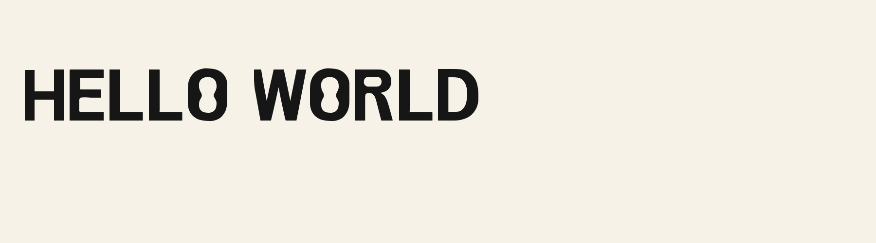
Pinched Counter Grotesk is an original contemporary grotesk for clean tech headings, interface labels, and readable display text. Solid black, even-width strokes with conventional baseline, cap height, x-height, ascenders, and descenders. The counter waist is an internal negative-space system only: it never closes an aperture, creates an added stroke, or turns a normal letter into a symbol. Keep counters and openings readable at small sizes. Best for clean technology titles, contemporary editorial labels, interface headings, and packaging.
Personal use: with Pro, Studio, or as one of 5 Font Pass picks ($4.99 once)Commercial license from $15/mo, yours to keep after your plan endsSee plans
Aa
HS$Ins
Test
Test Pinched Counter Grotesk
Type the words you plan to use and adjust size, line height, and letter spacing. The preview uses the final font file.
The quick brown fox jumps over the lazy dog
Specimens
Specimens
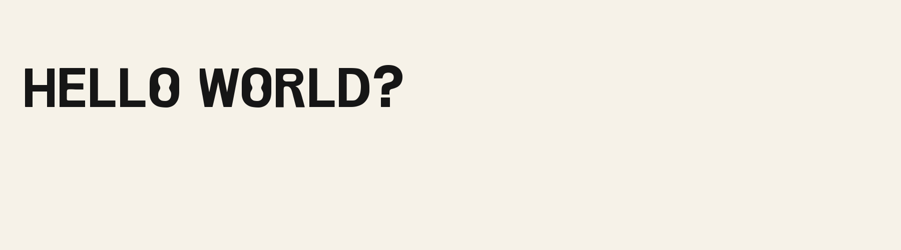
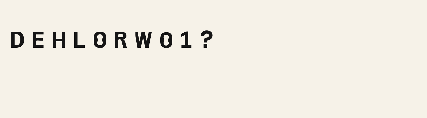
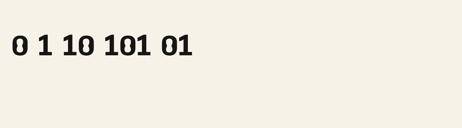
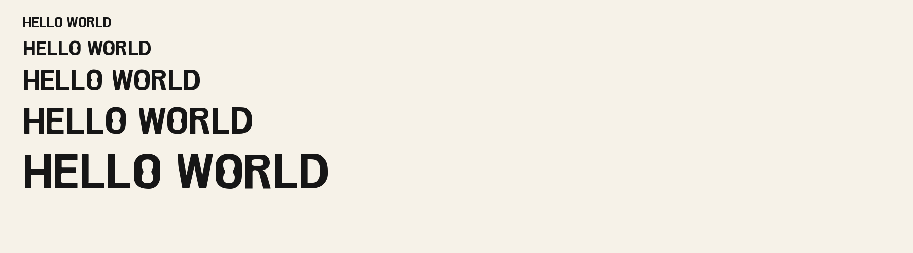
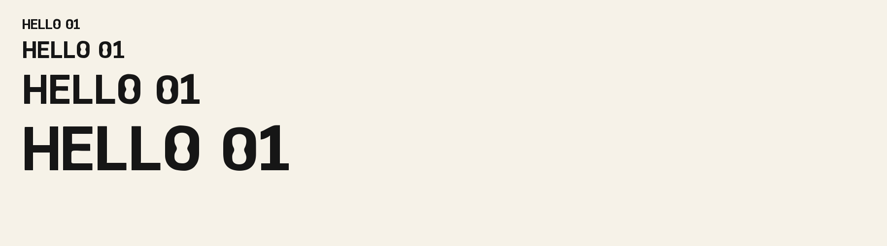
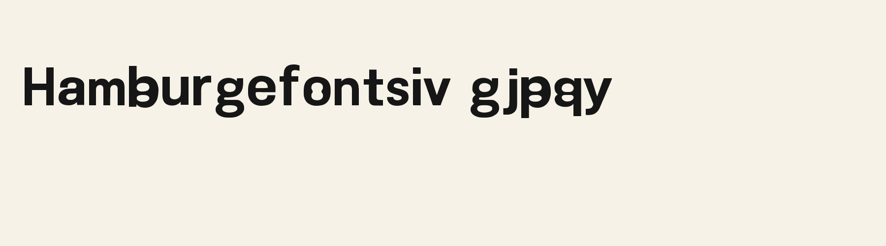
Rendered from the font files, without retouching.
About
About Pinched Counter Grotesk
Its x-height is 71.8% of the cap height, near the 72.9% typical of sans serif fonts in the library, lower than 62 of the 105 other sans serif fonts. Ascenders on b, d, h, k and l rise 3.9% above the capitals, and descenders on g, j, p, q and y drop 28.9% of the cap height below the baseline, deeper than 68 of the 105 other sans serif fonts. Its letters are of average width for sans serif fonts: an average lowercase letter, spacing included, is 74.8% as wide as the capitals are tall (an average capital, 87.2%), within 3.3% of the median. The o is close to a circle, 0.93 times as wide as it is tall, and W is the widest capital, at 1.21 times the width of H. Round letters overshoot: O rises 2% of the cap height above H and dips 1.1% below the baseline.
The letters stand upright, with no measurable slant. Vertical stems measure 19.6% of the cap height, heavier than 69 of the 74 other sans serif fonts. Ink covers 45.9% of each lowercase letter's box (its advance width by the cap height), darker than 90 of the 105 other sans serif fonts. Strokes change thickness with direction: the sides of o and O are 1.6 times as thick as their tops and bottoms.
Its 148 characters include 105 Latin letters, plus 43 figures, punctuation marks and symbols; 53 of the Latin letters are accented or special forms beyond A to Z. The word space measures 46% of the cap height, and the blank space either side of a lowercase letter takes up 14.4% of its width. The font carries no kerning, so spacing comes from each letter’s own side bearings. The figures have different widths, so columns of numbers set in Pinched Counter Grotesk will not line up exactly.
Measured from the version 0.1.0 font file. Comparisons are with the 603 library fonts measured on October 13, 2026, 106 of them sans serif fonts.
Characters
Characters
Includes all 95 printable Basic Latin characters and 148 glyphs in total.
Verified language coverage: Afrikaans, Albanian, Basque, Catalan, Dutch, English, Filipino, Galician, Indonesian, Irish, Italian, Malay, Portuguese, Spanish, Swahili, Swedish, Zulu
- Structure
- Upright medium-width mono-stroke grotesk. Enclosed counters in O/0, B, P, R, b, d, p, q, and g share one restrained internal waist: two shallow opposing counter lobes meet at a narrow horizontal middle, while their outer bowls remain clean and conventional. Stems are straight; terminals are plain. Use a double-storey a, open e, conventional k fork, N diagonal, ordinary 1 flag, and a real descender on g. No outline, shadow, stripe, notch, bridge, scallop, detached mark, or decorative terminal
- Stroke
- Solid black, even-width strokes with conventional baseline, cap height, x-height, ascenders, and descenders. The counter waist is an internal negative-space system only: it never closes an aperture, creates an added stroke, or turns a normal letter into a symbol. Keep counters and openings readable at small sizes
- Best for
- Clean technology titles, contemporary editorial labels, interface headings, and packaging
Basic Latin · 94
- !
- "
- #
- $
- %
- &
- '
- (
- )
- *
- +
- ,
- -
- .
- /
- 0
- 1
- 2
- 3
- 4
- 5
- 6
- 7
- 8
- 9
- :
- ;
- <
- =
- >
- ?
- @
- A
- B
- C
- D
- E
- F
- G
- H
- I
- J
- K
- L
- M
- N
- O
- P
- Q
- R
- S
- T
- U
- V
- W
- X
- Y
- Z
- [
- \
- ]
- ^
- _
- `
- a
- b
- c
- d
- e
- f
- g
- h
- i
- j
- k
- l
- m
- n
- o
- p
- q
- r
- s
- t
- u
- v
- w
- x
- y
- z
- {
- |
- }
- ~
Latin letters with accents · 105
- ª
- º
- À
- Á
- Â
- Ã
- Ä
- Å
- Æ
- Ç
- È
- É
- Ê
- Ë
- Ì
- Í
- Î
- Ï
- Ñ
- Ò
- Ó
- Ô
- Õ
- Ö
- Ø
- Ù
- Ú
- Û
- Ü
- Ý
- ß
- à
- á
- â
- ã
- ä
- å
- æ
- ç
- è
- é
- ê
- ë
- ì
- í
- î
- ï
- ñ
- ò
- ó
- ô
- õ
- ö
- ø
- ù
- ú
- û
- ü
- ý
- ÿ
- Ā
- ā
- Ă
- ă
- Ċ
- ċ
- Ē
- ē
- Ĕ
- ĕ
- Ġ
- ġ
- Ī
- ī
- Ĭ
- ĭ
- Ŀ
- ŀ
- Ō
- ō
- Ŏ
- ŏ
- Œ
- œ
- Ū
- ū
- Ŭ
- ŭ
- Ÿ
- ɑ
- Ḃ
- ḃ
- Ḋ
- ḋ
- Ḟ
- ḟ
- Ṁ
- ṁ
- Ṗ
- ṗ
- Ṡ
- ṡ
- Ṫ
- ṫ
- Ɑ
Download
Download
Choose the license that matches your project before downloading.
Download
This font is part of the Pro library: it downloads with Pro or Studio, or as one of the five picks of a Font Pass.
Commercial use
Client work, products and redistribution need a commercial license. Library fonts include it with Pro or Studio; fonts you make include it when you make them on Pro or Studio. A Font Pass is for personal projects.
TTF · OTF · WOFF · WOFF2
Read the full font licenseTools
Do more with Pinched Counter Grotesk
Free tools that run in your browser. Images you make with them, such as a signature PNG, can be used for any purpose.
- Make a font like thisDescribe the style and get your own font in the direction of Pinched Counter Grotesk, private on paid plans.
- Check languagesSee which of 54 languages a font can write and exactly which letters are missing.
- Convert font filesTurn TTF or OTF into WOFF2 for the web, or back again. Files never leave your device.
- Compare with your fontsDrop in your own font files and set them next to library fonts.
Pairings
Fonts to pair with Pinched Counter Grotesk
A different structure keeps a pairing readable: set one font for headings and the other for text. Test both with your own words.
Script1 style17 languages
Serif1 style17 languages
Similar
More sans serif fonts
See all sans serif fontsSans serif1 style32 languages
Sans serif1 style17 languages
Sans serif1 style32 languages
Sans serif1 style17 languages
FAQ
Pinched Counter Grotesk questions
- Can I use Pinched Counter Grotesk commercially?
- Pinched Counter Grotesk is part of the Pro library. Pro and Studio include it with a commercial license that continues after the plan ends; a Font Pass can pick it as one of 5 fonts for personal use.
- Which languages does Pinched Counter Grotesk support?
- Pinched Counter Grotesk has 148 glyphs, including all 95 printable Basic Latin characters. Its 148 characters include 105 Latin letters, plus 43 figures, punctuation marks and symbols; 53 of the Latin letters are accented or special forms beyond A to Z. Verified language coverage: Afrikaans, Albanian, Basque, Catalan, Dutch, English, Filipino, Galician, Indonesian, Irish, Italian, Malay, Portuguese, Spanish, Swahili, Swedish, Zulu. Missing a language? Customize the font and add it in Studio.
- How do I install Pinched Counter Grotesk?
- On Windows, right-click the TTF or OTF file and choose Install. On a Mac, double-click it and click Install Font. For a website, upload the WOFF2 file and load it with @font-face. Restart open apps so they see the new font.
- Can I change letters in Pinched Counter Grotesk?
- Yes. Customize makes a copy in your account and opens it in Studio, where you can redraw letters, adjust spacing, add Bold or Thin and add languages. The library version of Pinched Counter Grotesk stays unchanged.
- Can I make my own font like Pinched Counter Grotesk?
- Yes. Describe the sans serif style you want in the generator, or upload a picture of lettering you like, and AI draws a complete installable font. Fonts made on a paid plan stay private.