
By the Numbers
If you have a specific font or typeface in mind, it’s easy to get bogged down by the details. There are fonts for everything — from headlines to body copy to logos, from print to digital publishing and social media to websites.
But what about the numbers? The digits that form the core of any layout can be an afterthought when choosing fonts, but they’re actually a deliberate part of the design process.
For example, consider the number system we use today. Our numerals aren’t designed to convey meaning like letters, nor do they need to express ideas or evoke feelings. They’re used to perform a very practical job: helping to make information more readable. But how exactly do they work?
The answer is two-fold. In this article, I’ll explain why you might want to choose one style of numerals over another, then describe how you can test these styles on screen to ensure that your designs render as intended across platforms.
When Should You Use Different Numeral Styles?
You’ll need to pick the right kind of figures to match your content. The four main combinations of figure styles — lining/old-style and tabular/proportional — all have their place.
Prices should be displayed vertically with old-style numerals because they’re usually displayed next to other text, like a heading, so the vertical alignment works better than text rhythm does.
Similarly, dates in a list work well with tabular old-style figures when they need to harmonize with surrounding names or text, but if you’re displaying phone numbers, financial data, statistics, or anything where the digits line up in columns, tabular figures will help align them properly.
On the other hand, running text should always display proportional figures, which are the same width as surrounding text (like “a” or “o”), making them easier to read.
All-caps headings don’t require proportionality since the characters are uniform in height; however, mixed-case body text needs proportional figures to maintain the natural flow between the different letter heights.
In general, you’ll need both the figure style and the form (height) to decide which set of numerals to use. Tabular figures are usually proportional to the text around them. OpenType controls can expose figures only when both the font and application support them.
Figure Styles
You’ve probably seen them already: lining figures and old-style figures. When you’re trying to figure out what difference they make, just try reading a couple sentences side by side, one using one style and the other using the other. If they don’t look similar, the contrast is clear.
Lining numerals sit at the same level as the rest of the text, so they’re easy to read. Old-style numerals, though, appear lower, sometimes even resembling cursive script. This gives a more decorative feel to a document.
Old-style numerals, also known as lowercase numerals, tend to be more decorative, especially if paired with something like a script font, while lining numerals lend themselves well to sans-serif designs. That said, there’s not much of a reason to use old-style numerals except to create contrast between the lines of a paragraph.
Both styles of numerals come in tabular and proportional variations. Tabular figures, also called fixed-width figures, all take up the same width, so they’re ideal for things like price lists or phone numbers. Proportional figures vary in width based on the numeral, making them ideal for body text.
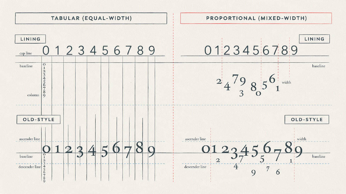
The most important distinction between these variations is how tall they appear. Lining figures reach the top of the capital letter, while old-style figures are shorter than the tallest capital letters.
Some fonts offer a mix of both styles of figures. However, in order to preview your design accurately, you’ll need to ensure that both the font and the application supporting the figures are available on your machine.
A quick way to distinguish between tabular and proportional figures is the zeroes-over-ones test. If you type 0000000000 and then 1111111111, the length of both should be the same.
Font Categories
Monospace and pixel-style fonts are great choices for screens, either as a standalone font or to simulate a typewriter. These can serve a useful purpose as numeric labels, especially when working on arcade games, console gaming, or retro graphics. A pixel-based font could work well in applications like a game menu or a poster sign that displays prices.
Display fonts, meanwhile, are perfect for signage or large posters. Because display fonts tend to be larger, you’ll probably want to go for stylized numerals such as stencils or handwritten fonts to emphasize the message.
Finally, if you want your numbers to stand out, stencil fonts can be a good choice. Their cut-out letterforms create a strong visual effect that can easily draw attention to a number or phrase.
Testing Font Figures
To find out whether a font supports the types of figures you need, start by checking the basic digit sequence: 0 through 9. Make sure that all the glyphs exist within the font family.
It doesn’t matter whether the digits are in a row or scattered among other letters. All that matters is that they’re rendered correctly within the context of the sentence. Punctuation and symbols may be missing or misaligned, which is a problem with the font itself. Other issues, such as incorrect spacing, can also be caused by a mismatched font pairing.
However, the easiest way to determine if a font offers the correct set of numerals is to see how they behave at the actual size that you’ll use them in your design. If the digits seem out of place, you may need to choose a different font.
An installable font includes everything necessary for you to use it for design and product work. Unicode copy-paste number symbols, on the other hand, are typically available on each platform and can be used to generate a quick graphic for a casual post online.
With AI tools such as FontGenerator, you can preview the results of a project beyond simply seeing the digits. Simply type your digits with punctuation and symbols into the preview box to compare fonts side by side, then open a font to inspect its character set. The preview will show you whether the font contains all the required glyphs for your string. If they’re missing, you’ll need to look for a different font.
What To Look For In Fonts
The best way to explore fonts that include numerical glyphs is to browse our library, where you’ll find hundreds of fonts including monospace, pixel, display, stencil, and handwriting fonts.
Our new custom preview text generator lets you select a category, or categories, to compare different fonts with a shared string of numbers. You can also preview a specific font and download it, or preview multiple fonts together.
We’ve added the ability to upload a local file for comparison purposes as well, though nothing is uploaded to our servers. We’re still experimenting with how we format our font pages, and we encourage you to let us know how you’d like to see more fonts described.
If you’re looking for original installable fonts rather than symbols generated by copy-and-paste, browse the font library and open individual pages to see download options. These fonts are built for desktop and web use in TTF, OTF, WOFF, and WOFF2 formats, with available styles and language coverage listed on each page. The separate Unicode number generator, by contrast, offers over 150 copy-and-paste styles, including circled, monospace, superscript-looking, double-struck, wide, small, and flipped options.
Keep in mind that license terms apply, and you’ll need to check each font’s page for included features and pricing. Some fonts are free, others must be purchased, and yet others are available for a monthly fee. It’s worth noting that figure-set support varies widely, so keep that in mind as you look for the font that best suits your needs.
Creating Your Own Font
If you can’t find an existing font that matches exactly what you’re looking for, don’t worry! There are several ways to solve this dilemma.
AI-generated fonts, such as those produced by our FontGenerator tool, can provide an alternative. You can describe what you want or ask the AI to generate an original installable font. Either way, you’ll get a full set of digits to use. Check the font license to ensure that it meets your requirements.