Sans serif1 style18 languages
Clover Counter Display
AI-generated
Display · 1 style · 148 characters · Version 0.1.1 · Added October 3, 2026
Clover Counter Display is an original cheerful rounded display face for children’s labels, party headings, packaging and short invitation names. Solid black, broad but open rounded mono-strokes with shared cap height, x-height, baseline, ascenders and descenders. Best for friendly kids labels, birthday and party headings, short packaging headlines and playful invitations.
Personal use: with Pro, Studio, or as one of 5 Font Pass picks ($4.99 once)Commercial license from $15/mo, yours to keep after your plan endsSee plans
Aa
BPR8ab
Test
Test Clover Counter Display
Type the words you plan to use and adjust size, line height, and letter spacing. The preview uses the final font file.
The quick brown fox jumps over the lazy dog
Design
Clover Counter Display up close
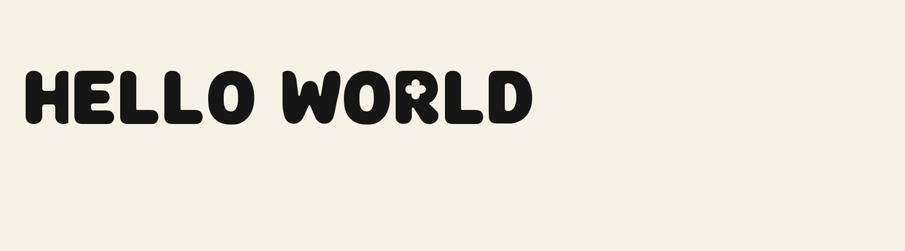
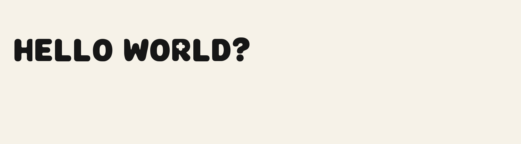
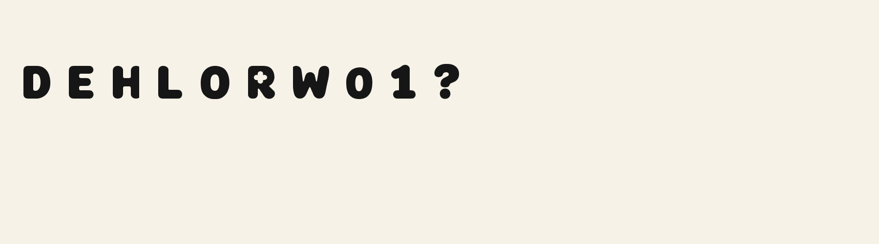
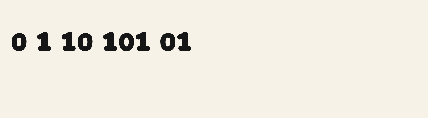
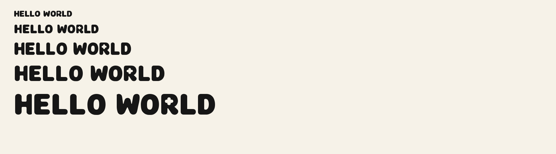
Clover Counter Display gives heavy capitals a soft, steady rhythm. In the specimens, the R holds a small, connected flowerlike white opening inside its solid bowl, while the O keeps a plain oval opening. The W has deep rounded valleys, and the D has a smooth, uninterrupted outer curve. Broad black strokes stay nearly even in weight, with blunt ends and gently rounded corners. The generous curves make the lettering feel cheerful, while the clear shapes keep short words easy to read at headline size.
Clover Counter Display in use
PARTY FAVORS
Product label. The thick rounded letters give a small package a playful look, and their clear shapes stay readable at a glance. YOU'RE INVITED
Card or invitation. The soft corners and flowerlike opening in the R suit a cheerful invitation heading. HELLO SUMMER
Poster. The broad black strokes hold their shape across a poster, while the rounded valleys keep the headline friendly.
The scenes are illustrations drawn on this page with Clover Counter Display itself, not client work.
How this page was made. Clover Counter Display is a FontGenerator library font made with AI; before release its letters were read back one by one by independent automated checks. The design notes were written by AI from the specimen images and checked against them by a second, independent pass; every number on the page is measured from the font file.
Specimens
Specimens
Rendered from the font files, without retouching.
About
About Clover Counter Display
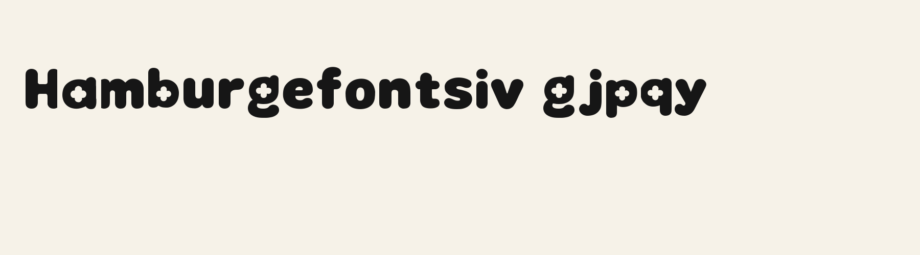
Clover Counter Display's lowercase x reaches 75.2% of the capital height, close to the 74.5% median for display fonts, taller than 62 of the 117 other display fonts. Ascenders on b, d, h, k and l line up with the capitals (98.6% of their height), and descenders on g, j, p, q and y drop 18.1% of the cap height below the baseline, shallower than 100 of the 117 other display fonts. Its letters are of average width for display fonts: an average lowercase letter, spacing included, is 83% as wide as the capitals are tall (an average capital, 93.1%), within 4.7% of the median. The o is close to a circle, 0.98 times as wide as it is tall, and W is the widest capital, at 1.23 times the width of H. The O tops out level with H and dips 1.1% below the baseline.
The letters stand upright, leaning less than 2.5° either way. Vertical stems measure 31.5% of the cap height, heavier than 49 of the 59 other display fonts. Ink covers 53.9% of each lowercase letter's box (its advance width by the cap height), darker than 99 of the 117 other display fonts. The contrast is mild: the sides of o and O are 1.21 times as thick as their tops and bottoms.
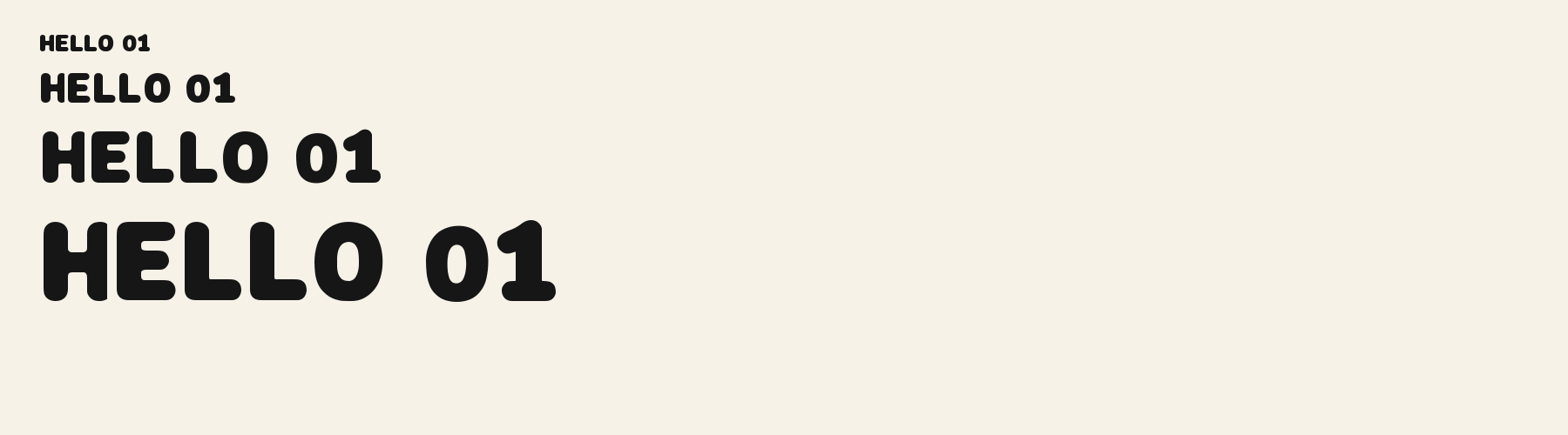
Its 148 characters include 105 Latin letters, plus 43 figures, punctuation marks and symbols; 53 of the Latin letters are accented or special forms beyond A to Z. The word space measures 45.9% of the cap height, and the blank space either side of a lowercase letter takes up 12.3% of its width. The font carries no kerning, so spacing comes from each letter’s own side bearings. The figures have different widths, so columns of numbers set in Clover Counter Display will not line up exactly.
Measured from the version 0.1.1 font file. Comparisons are with the 377 published library fonts measured on October 14, 2026, 118 of them display fonts.
Characters
Characters
Includes all 95 printable Basic Latin characters, 148 characters in total.
Verified language coverage: Afrikaans, Albanian, Basque, Catalan, Dutch, English, Filipino, Galician, Indonesian, Irish, Italian, Malay, Portuguese, Spanish, Swahili, Swedish, Zulu
- Structure
- Solid low-contrast rounded display letters with one repeatable clover-counter system. In every enclosed bowl of B, P, R, b, d, p, q, 8, a and g, the internal white counter is one single connected four-lobe clover-shaped void: four rounded lobes meet continuously around an open central waist, with no central black island, no black divider, no crossing bar and never four separate holes. The external bowl remains an ordinary single continuous black silhouette; O, o and D retain one ordinary uninterrupted oval white counter. This changes the repeatable internal counter topology across capitals, lowercase and figures. It is not Bubble Soft Petal’s outer terminal flowers, Cute Scallop Print’s outside shoulders, an inflated balloon/gel silhouette, a width/weight change, outline, shadow, stripe, confetti, flame, sprinkle or detached ornament. A has a clear apex and crossbar; a is double-storey; e is open; k has a normal fork; N has a full diagonal; g has a true descender; 1 keeps a clear flag
- Stroke
- Solid black, broad but open rounded mono-strokes with shared cap height, x-height, baseline, ascenders and descenders
- Best for
- Friendly kids labels, birthday and party headings, short packaging headlines and playful invitations
Basic Latin · 95
- !
- "
- #
- $
- %
- &
- '
- (
- )
- *
- +
- ,
- -
- .
- /
- 0
- 1
- 2
- 3
- 4
- 5
- 6
- 7
- 8
- 9
- :
- ;
- <
- =
- >
- ?
- @
- A
- B
- C
- D
- E
- F
- G
- H
- I
- J
- K
- L
- M
- N
- O
- P
- Q
- R
- S
- T
- U
- V
- W
- X
- Y
- Z
- [
- \
- ]
- ^
- _
- `
- a
- b
- c
- d
- e
- f
- g
- h
- i
- j
- k
- l
- m
- n
- o
- p
- q
- r
- s
- t
- u
- v
- w
- x
- y
- z
- {
- |
- }
- ~
Latin letters with accents · 105
- ª
- º
- À
- Á
- Â
- Ã
- Ä
- Å
- Æ
- Ç
- È
- É
- Ê
- Ë
- Ì
- Í
- Î
- Ï
- Ñ
- Ò
- Ó
- Ô
- Õ
- Ö
- Ø
- Ù
- Ú
- Û
- Ü
- Ý
- ß
- à
- á
- â
- ã
- ä
- å
- æ
- ç
- è
- é
- ê
- ë
- ì
- í
- î
- ï
- ñ
- ò
- ó
- ô
- õ
- ö
- ø
- ù
- ú
- û
- ü
- ý
- ÿ
- Ā
- ā
- Ă
- ă
- Ċ
- ċ
- Ē
- ē
- Ĕ
- ĕ
- Ġ
- ġ
- Ī
- ī
- Ĭ
- ĭ
- Ŀ
- ŀ
- Ō
- ō
- Ŏ
- ŏ
- Œ
- œ
- Ū
- ū
- Ŭ
- ŭ
- Ÿ
- ɑ
- Ḃ
- ḃ
- Ḋ
- ḋ
- Ḟ
- ḟ
- Ṁ
- ṁ
- Ṗ
- ṗ
- Ṡ
- ṡ
- Ṫ
- ṫ
- Ɑ
Download
Download
Choose the license that matches your project before downloading.
Download
This font is part of the Pro library: it downloads with Pro or Studio, or as one of the five picks of a Font Pass.
Commercial use
Client work, products and redistribution need a commercial license. Library fonts include it with Pro or Studio; fonts you make include it when you make them on Pro or Studio. A Font Pass is for personal projects.
TTF · OTF · WOFF · WOFF2
Read the full font licenseTools
Do more with Clover Counter Display
Free tools that run in your browser. Images you make with them, such as a signature PNG, can be used for any purpose.
- Make a font like thisDescribe the style and get your own font in the direction of Clover Counter Display, private on paid plans.
- Check languagesSee which of 54 languages a font can write and exactly which letters are missing.
- Convert font filesTurn TTF or OTF into WOFF2 for the web, or back again. Files never leave your device.
- Compare with your fontsDrop in your own font files and set them next to library fonts.
Pairings
Fonts to pair with Clover Counter Display
A different structure keeps a pairing readable: set one font for headings and the other for text. Test both with your own words.
Geo Diagonal Aperture
Free downloadSans serif2 styles21 languages
Serif1 style17 languages
Similar
More display fonts
See all display fontsDisplay1 style18 languages
Compared with Clover Counter Display: 22% wider · 3D effect
Display1 style17 languages
Compared with Clover Counter Display: Lighter strokes · 14% narrower
Marquee Round Inline
Free downloadDisplay1 style18 languages
Compared with Clover Counter Display: Lighter strokes · inline effect
Display1 style17 languages
More
You may also like
Fonts from other styles, first those that suit the same kinds of work as Clover Counter Display.
Pixel Console Square
Free downloadPixel1 style21 languages
Also suits: product label
Decorative1 style17 languages
Also suits: poster
Stencil1 style38 languages
Also suits: poster
Handwriting1 style17 languages
Also suits: poster
FAQ
Clover Counter Display questions
- Can I use Clover Counter Display commercially?
- Clover Counter Display is part of the Pro library. Pro and Studio include it with a commercial license that continues after the plan ends; a Font Pass can pick it as one of 5 fonts for personal use.
- Which languages does Clover Counter Display support?
- Clover Counter Display's 148 characters include 105 Latin letters, plus 43 figures, punctuation marks and symbols; 53 of the Latin letters are accented or special forms beyond A to Z. It has all 95 printable Basic Latin characters. Verified language coverage: Afrikaans, Albanian, Basque, Catalan, Dutch, English, Filipino, Galician, Indonesian, Irish, Italian, Malay, Portuguese, Spanish, Swahili, Swedish, Zulu. Missing a language? Customize the font and add it in Studio.
- What is Clover Counter Display good for?
- Product label: The thick rounded letters give a small package a playful look, and their clear shapes stay readable at a glance. Card or invitation: The soft corners and flowerlike opening in the R suit a cheerful invitation heading. Poster: The broad black strokes hold their shape across a poster, while the rounded valleys keep the headline friendly. Less suited: Long paragraphs would feel dense in these heavy letters; choose a lighter text face for sustained reading.
- What fonts pair well with Clover Counter Display?
- Halo Light (sans serif), Geo Diagonal Aperture (sans serif) and Keyhole Counter Roman Outline (serif) are drawn on a different letter structure, so Clover Counter Display can carry the headings while one of them sets the text. Each has its own page with a type tester for trying the pair.
- Which fonts are similar to Clover Counter Display?
- In the same display style: Hyper 3D (22% wider, 3d effect); Deco Fan Serif 3D (lighter strokes, 14% narrower); Marquee Round Inline (lighter strokes, inline effect).