
Sans serif1 style17 languages
Rounded Pill Display Capsule Joint Monoline Font
a g M O & Aa
AI-generated
Display · 1 style · 339 characters · Version 0.3.2 · Published September 23, 2026
Rounded Pill Display combines straight, even strokes with capsule-like projections at terminals and joins.
Personal use: with Pro, Studio, or as one of 5 Font Pass picks ($4.99 once)Commercial license from $15/mo, yours to keep after your plan endsSee plans
Aa
agMO&
Test
Test Rounded Pill Display
Type the words you plan to use and adjust size, line height, and letter spacing. The preview uses the final font file.
The quick brown fox jumps over the lazy dog
Design
Capsule Joint Monoline Letterforms
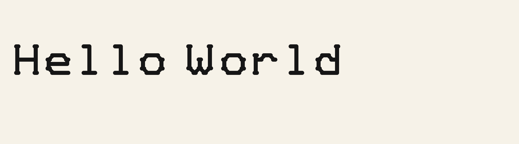
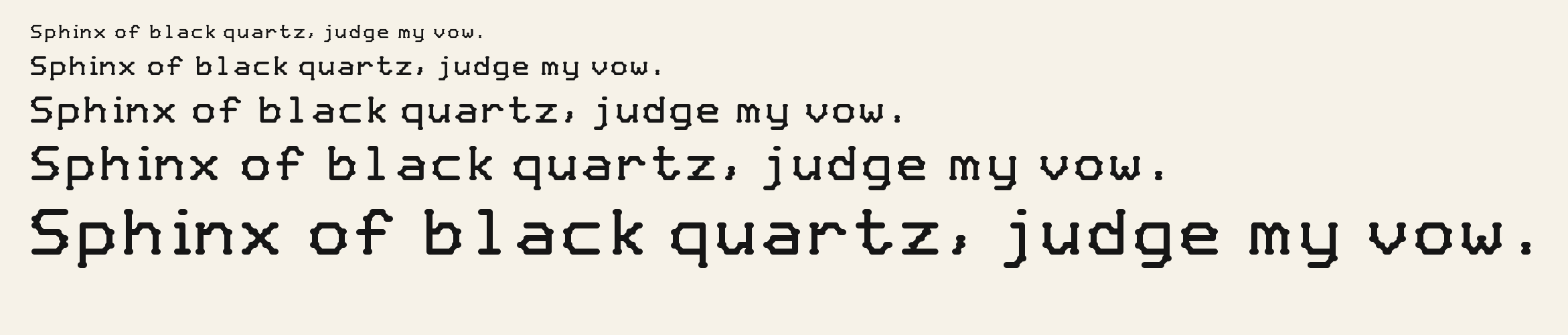
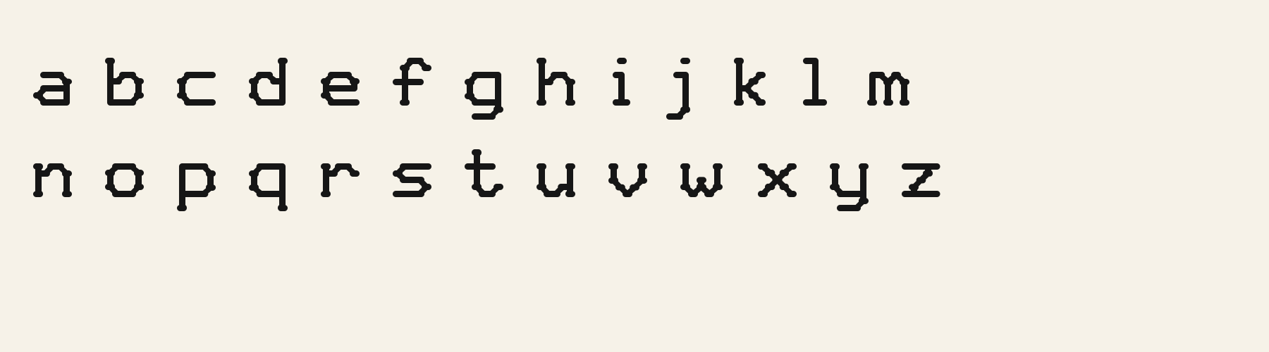
Rounded Pill Display combines straight, even strokes with capsule-like projections at terminals and joins. The H carries small horizontal caps at the ends of its upright stems, while the lowercase o has flat stretches and clipped corners, with little nodes interrupting its outer contour. The lowercase l rises to capital height, with a leftward top hook and a foot spreading across the baseline. Smaller lowercase bodies sit beneath those tall ascenders, giving mixed-case words a noticeable rise and fall. Open counters and generous spacing keep the texture light, while the repeated rounded protrusions add a playful, slightly mechanical character.
Test the font in your wording
Inspect the lowercase e opening, the nodes around o, and adjacent capsule terminals in your actual wording. Check line wrapping and clearance beneath descending letters. The supplied specimens establish Latin shapes; evaluate other scripts separately with appropriate samples.
Font pairing roles
Try this face for short headings, with a compact sans serif for supporting text and labels. Its wide spacing and projecting terminals create a distinctive heading texture; simpler companion letterforms could keep longer explanations visually steady.
Rounded Pill Display: letterforms and layout
Distinctive letterforms
H
o
l
Compare the layout
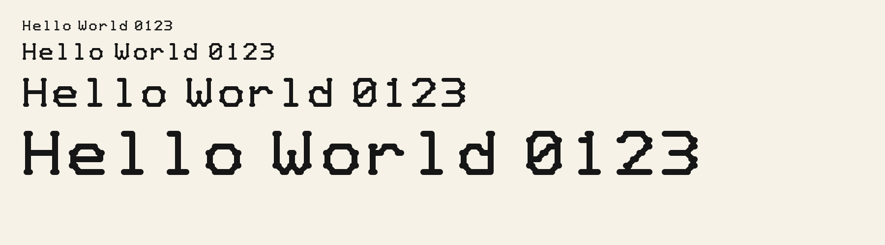
Same font, different settingsHello World
Hello World
Compare smaller and larger previews to inspect the projecting nodes around the o and the compact opening in e. Check whether these details remain distinct in your intended layout.
Preview settings, not minimum size recommendations. Wide samples scroll sideways.
Choose your letterforms
Same wording · 40pxHELLO WORLD
In this uppercase phrase, Rounded Pill Display adds short capsule projections to the H stems and small bumps around O's clipped outer corners. These details give the otherwise straight strokes a more decorative rhythm.
HELLO WORLD
Rounded Soft Block shows simpler rounded endpoints on H and a cleaner octagonal outer contour on O. Its uppercase phrase emphasizes uninterrupted strokes and clipped corners, with fewer projecting details.
Rounded Pill Display font in use
Happy Soap
Product label. The open counters and capsule terminals give a short product name a light, playful presence on simple packaging. Small Wonders
Website headline. Tall ascenders and compact lowercase bodies create an animated silhouette for a brief, friendly website heading. Hello Little One
Card or invitation. Soft terminal projections and evenly weighted strokes bring a gentle, decorative rhythm to a welcoming card.
The scenes are illustrations drawn on this page with Rounded Pill Display itself, not client work.
How this page was made. Rounded Pill Display is a FontGenerator library font made with AI; before release its letters were read back one by one by independent automated checks. The design notes were written by AI from the specimen images and checked against them by a second, independent pass; font measurements come from the font file. Preview sizes and spacing are comparison settings.
Specimens
Specimens
Rendered from the font files, without retouching.
About
About Rounded Pill Display
The x-height is a compact 71.1% of the cap height, below the 74.4% median for display fonts, lower than 84 of the 116 other display fonts. Ascenders on b, d, h, k and l line up with the capitals (100% of their height), and descenders on g, j, p, q and y drop 28.9% of the cap height below the baseline, deeper than 103 of the 116 other display fonts. It sets wide: an average lowercase letter, spacing included, is 100.6% as wide as the capitals are tall (an average capital, 101.2%), 15.5% more than the median for display fonts, so the same words take a longer line. The o is close to a circle, 1.14 times as wide as it is tall, and M and W are the widest capitals, at 1.12 times the width of H. O stands exactly as tall as H and sits on the baseline, with no overshoot.
The letters stand upright, leaning less than 2.5° either way. Vertical stems measure 13.3% of the cap height, lighter than 53 of the 58 other display fonts. Ink covers 28.7% of each lowercase letter's box (its advance width by the cap height), lighter than 96 of the 116 other display fonts. Strokes keep one thickness in every direction: the sides of o and O measure the same as their tops and bottoms.
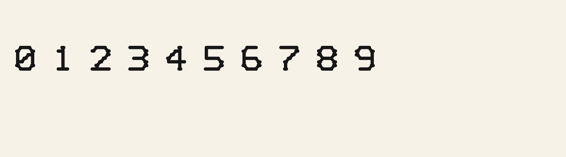
Its 339 characters include 296 Latin letters, plus 43 figures, punctuation marks and symbols; 244 of the Latin letters are accented or special forms beyond A to Z. The word space measures 49% of the cap height, and the blank space either side of a lowercase letter takes up 23.9% of its width. The font carries no kerning, so spacing comes from each letter’s own side bearings. All ten figures share one width, so columns of numbers line up.
Measured from the version 0.3.2 font file. Comparisons are with the 376 published library fonts measured on November 8, 2026, 117 of them display fonts.
Rounded Pill Display in 3 languages
- Italian
Quel vituperabile xenofobo zelante assaggia il whisky ed esclama: alleluja!
- Polish
Pchnąć w tę łódź jeża lub ośm skrzyń fig.
- Swedish
Flygande bäckasiner söka hwila på mjuka tuvor.
Characters
Characters
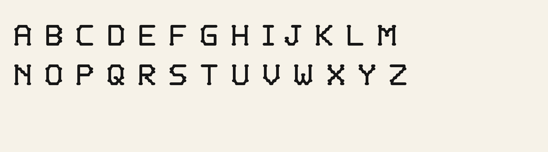
Includes all 95 printable Basic Latin characters, 339 characters in total.
Verified language coverage: Afrikaans, Albanian, Basque, Bosnian, Catalan, Croatian, Danish, Dutch, English, Estonian, Filipino, Finnish, French, Galician, German, Hungarian, Icelandic, Indonesian, Irish, Italian, Latvian, Lithuanian, Malay, Maltese, Norwegian, Polish, Portuguese, Romanian, Slovak, Slovenian, Spanish, Swahili, Swedish, Turkish, Welsh, Zulu
- Structure
- Connected strokes with horizontally extended pill-shaped junctions and terminals
- Stroke
- Soft monoline strokes with elongated rounded nodes
- Best for
- Apps, children's products, packaging and friendly brand headings
Basic Latin · 95
- !
- "
- #
- $
- %
- &
- '
- (
- )
- *
- +
- ,
- -
- .
- /
- 0
- 1
- 2
- 3
- 4
- 5
- 6
- 7
- 8
- 9
- :
- ;
- <
- =
- >
- ?
- @
- A
- B
- C
- D
- E
- F
- G
- H
- I
- J
- K
- L
- M
- N
- O
- P
- Q
- R
- S
- T
- U
- V
- W
- X
- Y
- Z
- [
- \
- ]
- ^
- _
- `
- a
- b
- c
- d
- e
- f
- g
- h
- i
- j
- k
- l
- m
- n
- o
- p
- q
- r
- s
- t
- u
- v
- w
- x
- y
- z
- {
- |
- }
- ~
Latin letters with accents · 230
- ª
- º
- À
- Á
- Â
- Ã
- Ä
- Å
- Æ
- Ç
- È
- É
- Ê
- Ë
- Ì
- Í
- Î
- Ï
- Ð
- Ñ
- Ò
- Ó
- Ô
- Õ
- Ö
- Ø
- Ù
- Ú
- Û
- Ü
- Ý
- Þ
- ß
- à
- á
- â
- ã
- ä
- å
- æ
- ç
- è
- é
- ê
- ë
- ì
- í
- î
- ï
- ð
- ñ
- ò
- ó
- ô
- õ
- ö
- ø
- ù
- ú
- û
- ü
- ý
- þ
- ÿ
- Ā
- ā
- Ă
- ă
- Ą
- ą
- Ć
- ć
- Ċ
- ċ
- Č
- č
- Ď
- ď
- Đ
- đ
- Ē
- ē
- Ĕ
- ĕ
- Ė
- ė
- Ę
- ę
- Ě
- ě
- Ğ
- ğ
- Ġ
- ġ
- Ģ
- ģ
- Ħ
- ħ
- Ĩ
- ĩ
- Ī
- ī
- Ĭ
- ĭ
- Į
- į
- İ
- ı
- IJ
- ij
- Ķ
- ķ
- Ĺ
- ĺ
- Ļ
- ļ
- Ľ
- ľ
- Ŀ
- ŀ
- Ł
- ł
- Ń
- ń
- Ņ
- ņ
- Ň
- ň
- Ŋ
- ŋ
- Ō
- ō
- Ŏ
- ŏ
- Ő
- ő
- Œ
- œ
- Ŕ
- ŕ
- Ŗ
- ŗ
- Ř
- ř
- Ś
- ś
- Ŝ
- ŝ
- Ş
- ş
- Š
- š
- Ţ
- ţ
- Ť
- ť
- Ŧ
- ŧ
- Ũ
- ũ
- Ū
- ū
- Ŭ
- ŭ
- Ů
- ů
- Ű
- ű
- Ų
- ų
- Ŵ
- ŵ
- Ŷ
- ŷ
- Ÿ
- Ź
- ź
- Ż
- ż
- Ž
- ž
- ſ
- Ʒ
- Ǎ
- ǎ
- Ǔ
- ǔ
- Ǥ
- ǥ
- Ǧ
- ǧ
- Ǩ
- ǩ
- Ǯ
- ǯ
- Ǿ
- ǿ
- Ș
- ș
- Ț
- ț
- Ȟ
- ȟ
- ɑ
- ʒ
- Ḃ
- ḃ
- Ḋ
- ḋ
- Ḟ
- ḟ
- Ṁ
- ṁ
- Ṗ
- ṗ
- Ṡ
- ṡ
- Ṫ
- ṫ
- Ẁ
- ẁ
- Ẃ
- ẃ
- Ẅ
- ẅ
- Ẽ
- ẽ
- Ỳ
- ỳ
- Ɑ
Download
Download
Choose the license that matches your project before downloading.
Download
This font is part of the Pro library: it downloads with Pro or Studio, or as one of the five picks of a Font Pass.
Commercial use
Client work, products and redistribution need a commercial license. Library fonts include it with Pro or Studio; fonts you make include it when you make them on Pro or Studio. A Font Pass is for personal projects.
TTF · OTF · WOFF · WOFF2
Read the full font licenseTools
Do more with Rounded Pill Display
Free tools that run in your browser. Images you make with them, such as a signature PNG, can be used for any purpose.
- Make a font like thisDescribe the style and get your own font in the direction of Rounded Pill Display, private on paid plans.
- Check languagesSee which of 54 languages a font can write and exactly which letters are missing.
- Convert font filesTurn TTF or OTF into WOFF2 for the web, or back again. Files never leave your device.
- Compare with your fontsDrop in your own font files and set them next to library fonts.
Pairings
Fonts to pair with Rounded Pill Display
A different structure keeps a pairing readable: set one font for headings and the other for text. Test both with your own words.
Sans serif1 style18 languages
Serif1 style17 languages
Similar
More display fonts
See all display fontsDisplay1 style17 languages
Compared with Rounded Pill Display: Lighter strokes · outline effect
Display1 style18 languages
Compared with Rounded Pill Display: Heavier strokes · taller x-height
Display1 style32 languages
Compared with Rounded Pill Display: Heavier strokes · 13% narrower
Display1 style18 languages
Compared with Rounded Pill Display: Heavier strokes · taller x-height
More
You may also like
Fonts from other styles, first those that suit the same kinds of work as Rounded Pill Display.
Stencil1 style38 languages
Also suits: product label
Sans serif1 style17 languages
Also suits: product label
Monospace1 style17 languages
Also suits: product label
Script1 style17 languages
Also suits: card or invitation
FAQ
Rounded Pill Display questions
- Can I use Rounded Pill Display commercially?
- Rounded Pill Display is part of the Pro library. Pro and Studio include it with a commercial license that continues after the plan ends; a Font Pass can pick it as one of 5 fonts for personal use.
- Which languages does Rounded Pill Display support?
- Rounded Pill Display's 339 characters include 296 Latin letters, plus 43 figures, punctuation marks and symbols; 244 of the Latin letters are accented or special forms beyond A to Z. It has all 95 printable Basic Latin characters. Verified language coverage: Afrikaans, Albanian, Basque, Bosnian, Catalan, Croatian, Danish, Dutch, English, Estonian, Filipino, Finnish, French, Galician, German, Hungarian, Icelandic, Indonesian, Irish, Italian, Latvian, Lithuanian, Malay, Maltese, Norwegian, Polish, Portuguese, Romanian, Slovak, Slovenian, Spanish, Swahili, Swedish, Turkish, Welsh, Zulu. Missing a language? Customize the font and add it in Studio.
- What is Rounded Pill Display good for?
- Product label: The open counters and capsule terminals give a short product name a light, playful presence on simple packaging. Website headline: Tall ascenders and compact lowercase bodies create an animated silhouette for a brief, friendly website heading. Card or invitation: Soft terminal projections and evenly weighted strokes bring a gentle, decorative rhythm to a welcoming card. Less suited: For dense instructions or long paragraphs, choose a quieter text face with simpler terminals and more economical spacing.
- What fonts pair well with Rounded Pill Display?
- Pinched Counter Grotesk (sans serif), Civic Sans (sans serif) and Quarry Slab (serif) are drawn on a different letter structure, so Rounded Pill Display can carry the headings while one of them sets the text. Each has its own page with a type tester for trying the pair.
- Which fonts are similar to Rounded Pill Display?
- In the same display style: Mech Slab Outline (lighter strokes, outline effect); Campus Varsity (heavier strokes, taller x-height); Bubble Pebble Sans (heavier strokes, 13% narrower).