Mellow Italic
Free downloadSerif1 style23 languages
A D G M S Aa
Decorative · 1 style · 95 characters · Version 0.3.0 · Published September 23, 2026
Gothic Lombardic Round combines heavy upright strokes with swollen curves and small curled terminals.
Personal use: with Pro, Studio, or as one of 5 Font Pass picks ($4.99 once)Commercial license from $15/mo, yours to keep after your plan endsSee plans
Aa
ADGMS
Test
Type the words you plan to use and adjust size, line height, and letter spacing. The preview uses the final font file.
The quick brown fox jumps over the lazy dog
Design
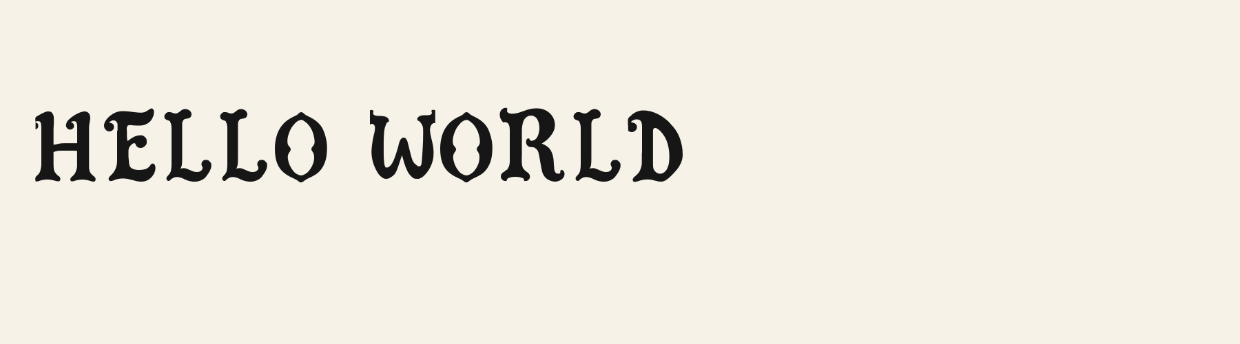
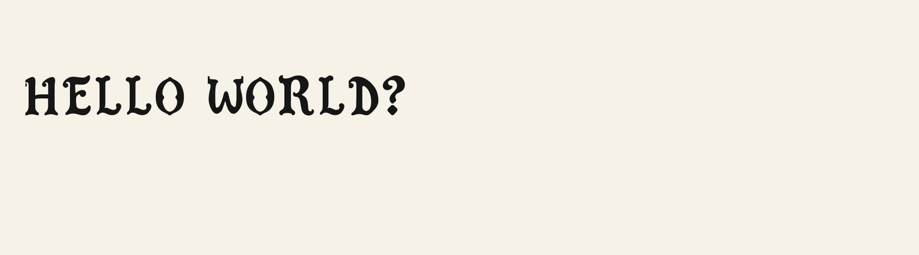
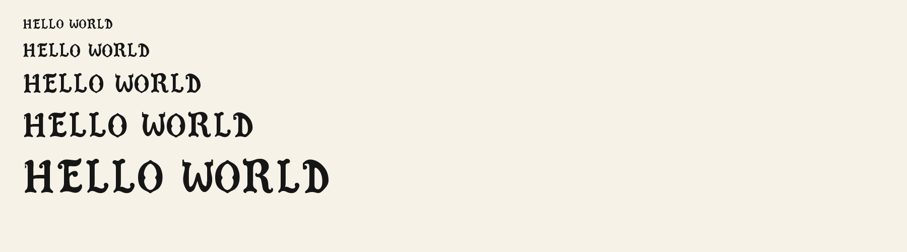
Gothic Lombardic Round combines heavy upright strokes with swollen curves and small curled terminals. The O narrows to points at its crown and base, with inward pinches shaping an almond-like counter. The E carries a sweeping top arm, a curled upper-left entry, and a bulb at the end of its middle arm. The R gathers weight in its rounded bowl before sending its leg down into an outward curl. These details give the capitals a ceremonial, storybook character without filling every opening with ornament. Repeated curved feet make a line feel patterned, while the dark strokes give short titles a firm presence.
Inspect the pinched O counters, curled R legs, and repeated L feet in your actual wording. Check neighboring letters individually because spacing relies on side bearings. For Latin accents or other scripts, verify character availability and test a suitable fallback alongside the display lettering.
Try this face for a brief main heading, with a plain sans serif handling descriptions and small labels. Its dark bowls and curled feet already provide substantial detail, so a companion with simple terminals could keep the supporting information visually calm.
O
E
R
HELLO WORLD
HELLO WORLD
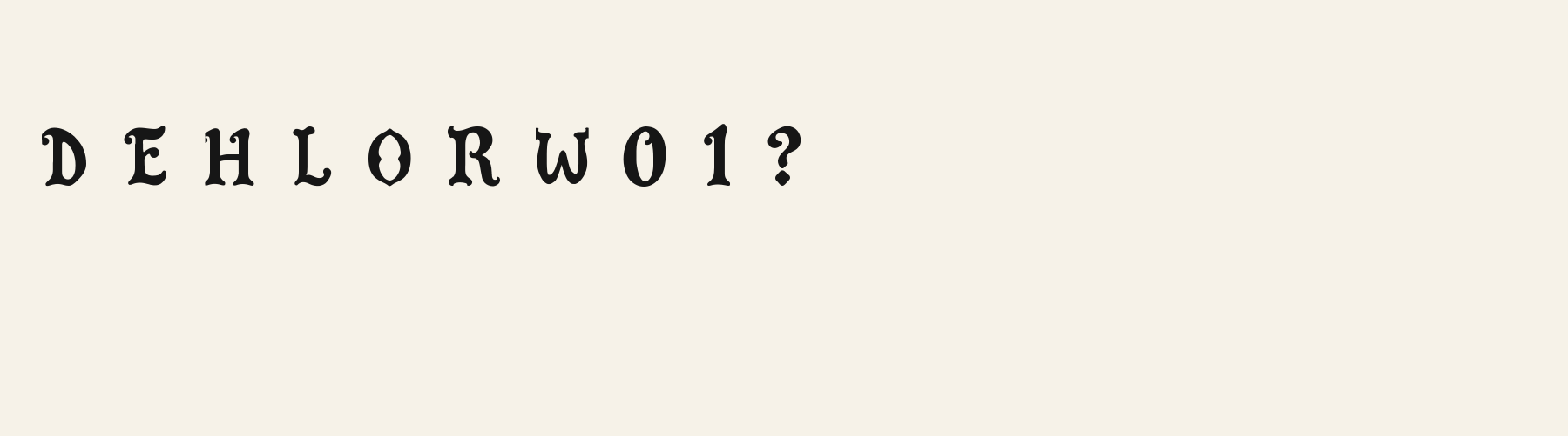
Compare the original spacing with a slightly wider setting. Watch how the repeated L feet establish a rhythm and how the broad W changes the gap before O; extra space may clarify the ornaments while loosening the word shape.
Preview settings, not minimum size recommendations. Wide samples scroll sideways.
HELLO WORLD
Gothic Lombardic Round gives this phrase upright stems, compact curled feet, and pointed oval O forms. Its H has a direct crossbar, keeping the opening letter relatively familiar within the ornamental setting.
HELLO WORLD
Banner Fraktur spreads the phrase into broader, more folded shapes. Its L has a large open upper loop and sweeping base, while its W interweaves several strokes. Try it when those expansive gestures belong in the composition.
THE AMBER KEEP
WINTER FEAST
HERBAL ELIXIR
The scenes are illustrations drawn on this page with Gothic Lombardic Round itself, not client work.
How this page was made. Gothic Lombardic Round is a FontGenerator library font made with AI; before release its letters were read back one by one by independent automated checks. The design notes were written by AI from the specimen images and checked against them by a second, independent pass; font measurements come from the font file. Preview sizes and spacing are comparison settings.
Specimens
Rendered from the font files, without retouching.
About
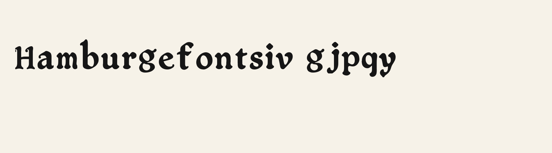
Its lowercase sits low: the x-height is 70.1% of the cap height, where the median for decorative fonts is 74.4%, lower than 30 of the 36 other decorative fonts. Ascenders on b, d, h, k and l rise 16% above the capitals, and descenders on g, j, p, q and y drop 26.9% of the cap height below the baseline, deeper than 24 of the 36 other decorative fonts. Its letters are of average width for decorative fonts: an average lowercase letter, spacing included, is 76.1% as wide as the capitals are tall (an average capital, 84.1%), within 0% of the median. The o is close to a circle, 0.95 times as wide as it is tall, and R is the widest capital, at 1.06 times the width of H. The O stops 5% of the cap height short of H and dips 1.2% below the baseline.
The letters stand upright, leaning less than 2.5° either way. Vertical stems measure 16.8% of the cap height, heavier than 18 of the 23 other decorative fonts. Ink covers 40% of each lowercase letter's box (its advance width by the cap height), darker than 25 of the 36 other decorative fonts.
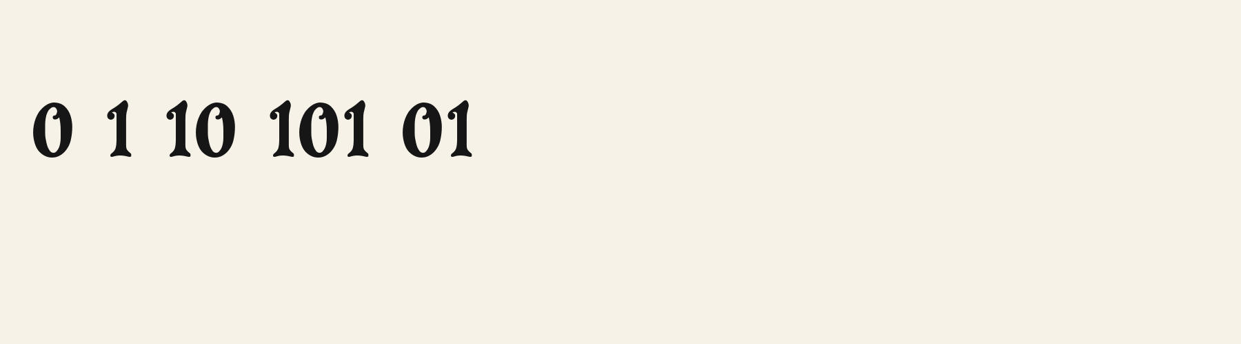
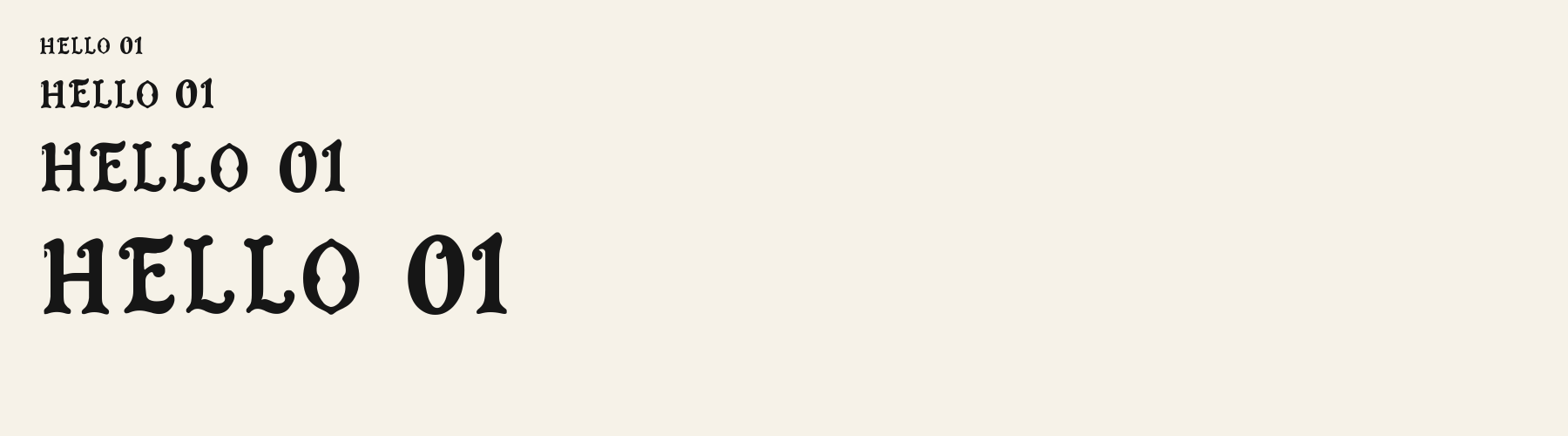
Its 95 characters include 52 Latin letters, plus 43 figures, punctuation marks and symbols; there are no accented Latin letters beyond A to Z. The word space measures 53.1% of the cap height, and the blank space either side of a lowercase letter takes up 13% of its width. The font carries no kerning, so spacing comes from each letter’s own side bearings. The figures have different widths, so columns of numbers set in Gothic Lombardic Round will not line up exactly.
Measured from the version 0.3.0 font file. Comparisons are with the 376 published library fonts measured on November 8, 2026, 37 of them decorative fonts.
Characters
Includes all 95 printable Basic Latin characters, 95 characters in total.
Verified language coverage: English, Indonesian, Malay, Swahili, Zulu
Download
Choose the license that matches your project before downloading.
This font is part of the Pro library: it downloads with Pro or Studio, or as one of the five picks of a Font Pass.
Client work, products and redistribution need a commercial license. Library fonts include it with Pro or Studio; fonts you make include it when you make them on Pro or Studio. A Font Pass is for personal projects.
TTF · OTF · WOFF · WOFF2
Read the full font licenseTools
Free tools that run in your browser. Images you make with them, such as a signature PNG, can be used for any purpose.
Pairings
A different structure keeps a pairing readable: set one font for headings and the other for text. Test both with your own words.
Serif1 style23 languages
Serif1 style17 languages
Sans serif1 style22 languages
Similar
Decorative1 style17 languages
Compared with Gothic Lombardic Round: Lighter strokes · drip effect
Decorative1 style37 languages
Compared with Gothic Lombardic Round: 22% narrower
Decorative1 style37 languages
Compared with Gothic Lombardic Round: Drip effect · lighter strokes
Decorative1 style17 languages
Compared with Gothic Lombardic Round: 29% narrower · taller x-height
More
Fonts from other styles, first those that suit the same kinds of work as Gothic Lombardic Round.
Serif1 style18 languages
Also suits: product label
Script1 style5 languages
Also suits: card or invitation
Stencil1 style33 languages
Also suits: product label
Display1 style17 languages
Also suits: product label
FAQ