Sans serif1 style17 languages
Monolith Slab Broad Nicked Display Font
a g R S & Aa
AI-generated
Serif · 1 style · 175 characters · Version 0.1.1 · Published October 1, 2026
Monolith Slab builds a broad, dark silhouette from thick upright strokes and flat, projecting serifs.
Personal use: with Pro, Studio, or as one of 5 Font Pass picks ($4.99 once)Commercial license from $15/mo, yours to keep after your plan endsSee plans
Aa
agRS&
Test
Test Monolith Slab
Type the words you plan to use and adjust size, line height, and letter spacing. The preview uses the final font file.
The quick brown fox jumps over the lazy dog
Design
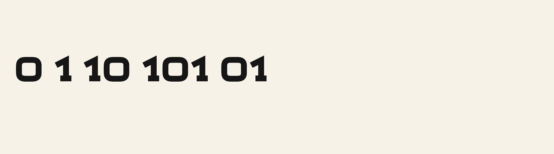
Broad Nicked Display Letterforms
Monolith Slab builds a broad, dark silhouette from thick upright strokes and flat, projecting serifs. The O is a rounded rectangle with a smaller rounded opening, giving the line a padded, solid centre. The R adds a pointed nick inside its bowl and a diagonal leg that ends in a wide foot with a downward point. Small peaks on the W’s top caps interrupt its otherwise blunt outline. Stroke weight stays steady around the bowls and through the straight stems, while the wide letters and close-set feet give short phrases a weighty, retro signboard mood.
Test the font in your wording
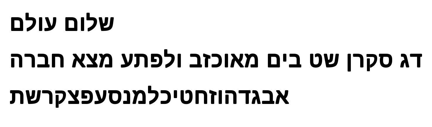
Check rounded Latin counters and the R’s pointed nick in your actual wording, then inspect gaps where broad serifs approach each other. The supplied Hebrew specimen shows rounded strokes without the Latin slab feet; review Hebrew wording and mixed-script alignment separately.
Font pairing roles
Let this face carry a short main heading, then try a lighter, narrower sans serif for descriptions and supporting labels. Its broad bowls and heavy horizontal feet already occupy substantial space, so a quieter companion can keep the information hierarchy clear.
Monolith Slab: letterforms and layout
Distinctive letterforms
O
R
W
Compare the layout
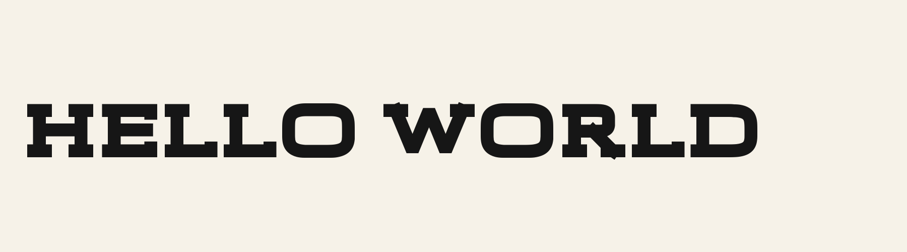
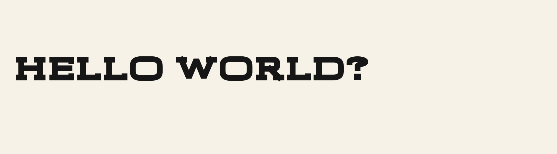
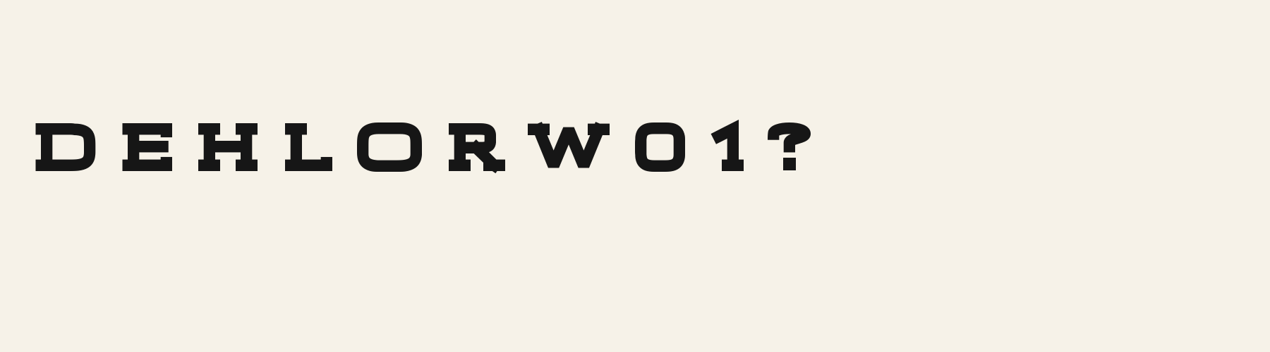
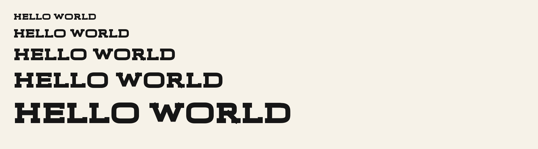
Same font, different settingsHELLO WORLD
HELLO WORLD
Compare the original spacing with a slightly wider setting. Watch how the broad feet of H, E and L form a nearly continuous horizontal rhythm; added space may separate those blocks, while also making an already broad phrase longer.
Preview settings, not minimum size recommendations. Wide samples scroll sideways.
Choose your letterforms
Same wording · 40pxHELLO WORLD
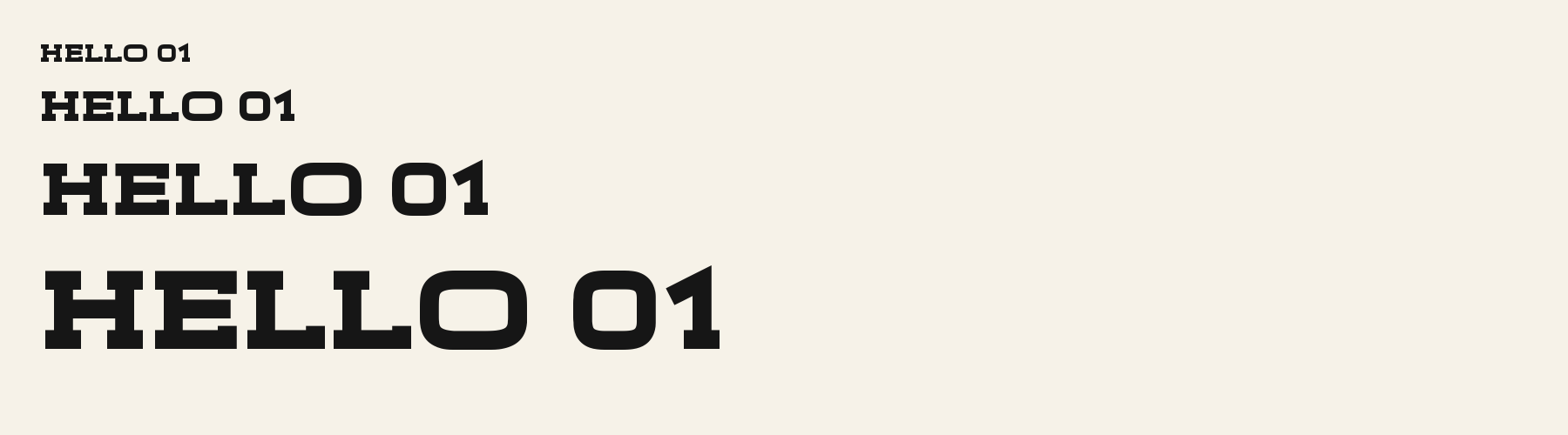
Monolith Slab gives the phrase more horizontal spread. Its O has softer corners around both the outer bowl and counter, and the D has a straight upright left stem. These shapes give the heavy word line a fuller, rounder presence.
HELLO WORLD
Headline Slab fits the same phrase into a shorter line. Its O has more sharply squared inner corners, and the D’s left stem visibly slopes. Choose it when those angular details and a more compact word shape suit the composition.
Monolith Slab font in use
NIGHT MARKET
Poster. Broad capitals and thick projecting feet give a short event title a solid silhouette with a retro signboard character. DARK ROAST
Product label. The rounded O and nicked R give a brief product name distinctive details within a dense, blocklike word shape. HEAVY WEATHER
Book or album cover. Wide letters and sharp valleys in the W give a brief cover title weight and an uneven edge.
The scenes are illustrations drawn on this page with Monolith Slab itself, not client work.
How this page was made. Monolith Slab is a FontGenerator library font made with AI; before release its letters were read back one by one by independent automated checks. The design notes were written by AI from the specimen images and checked against them by a second, independent pass; font measurements come from the font file. Preview sizes and spacing are comparison settings.
Specimens
Specimens
Rendered from the font files, without retouching.
About
About Monolith Slab
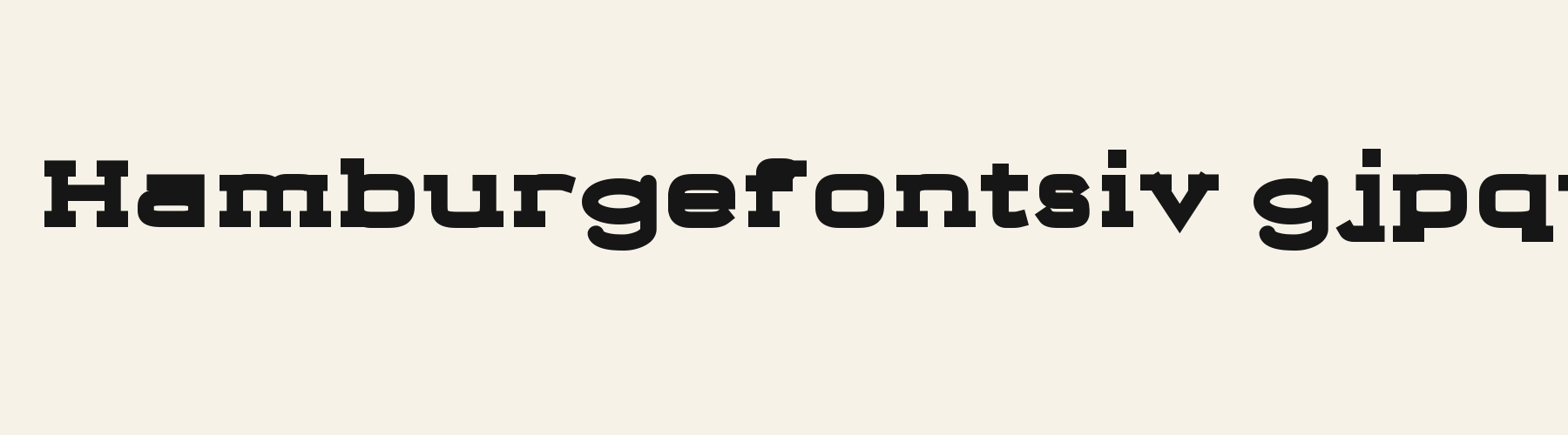
Its lowercase is tall: the x-height is 82.7% of the cap height, against a median of 69.6% for serif fonts, the tallest of all 52 serif fonts. Ascenders on b, d, h, k and l rise 3.3% above the capitals, and descenders on g, j, p, q and y drop 22.7% of the cap height below the baseline, shallower than 49 of the 51 other serif fonts. Monolith Slab runs 37.8% wider than the median for serif fonts: an average lowercase letter, spacing included, is 115.1% as wide as the capitals are tall (an average capital, 128.1%). The o is wider than it is tall, 1.28 to 1, and W is the widest capital, at 1.27 times the width of H. Round letters overshoot: O rises 1.1% of the cap height above H and dips 1.1% below the baseline.
The letters stand upright, leaning less than 2.5° either way. Ink covers 51.9% of each lowercase letter's box (its advance width by the cap height), darker than 50 of the 51 other serif fonts. Strokes keep one thickness in every direction: the sides of o and O measure the same as their tops and bottoms.
Its 175 characters include 105 Latin and 27 Hebrew letters, plus 43 figures, punctuation marks and symbols; 53 of the Latin letters are accented or special forms beyond A to Z. The word space measures 42.3% of the cap height, and the blank space either side of a lowercase letter takes up 11.4% of its width. Spacing is adjusted with 146 kerning pairs, more than 27 of the 51 other serif fonts. The tightest of them is VA, which closes up by 30.3% of the cap height. Its OpenType tables also hold ligatures (liga, dlig). The figures have different widths, so columns of numbers set in Monolith Slab will not line up exactly.
8 other library fonts share Monolith Slab's underlying letter structure. Compared with Monolith Slab, Rodeo Slab adds Afrikaans, Azerbaijani, Bosnian and 3 more languages. Frost Slab adds caps of snow, sets 22% narrower and puts down 23% less ink. Depot Slab Outline draws the letters as hollow outlines and puts down 65% less ink.
Measured from the version 0.1.1 font file. Comparisons are with the 376 published library fonts measured on November 12, 2026, 52 of them serif fonts.
Monolith Slab in 5 languages
- Hebrew
דג סקרן שט בים מאוכזב ולפתע מצא חברה
- Albanian
Zhvillimi i gjuhës shqipe është një çështje e rëndësishme.
- Filipino
Magandang umaga sa inyong lahat.
- Malay
Selamat pagi, apa khabar hari ini?
- Swahili
Habari za asubuhi, karibu nyumbani.
Characters
Characters
Includes all 95 printable Basic Latin characters, 175 characters in total.
Verified language coverage: Afrikaans, Albanian, Basque, Catalan, Dutch, English, Filipino, Galician, Hebrew, Indonesian, Irish, Italian, Malay, Portuguese, Spanish, Swahili, Swedish, Zulu
- Best for
- Block designs
Basic Latin · 95
- !
- "
- #
- $
- %
- &
- '
- (
- )
- *
- +
- ,
- -
- .
- /
- 0
- 1
- 2
- 3
- 4
- 5
- 6
- 7
- 8
- 9
- :
- ;
- <
- =
- >
- ?
- @
- A
- B
- C
- D
- E
- F
- G
- H
- I
- J
- K
- L
- M
- N
- O
- P
- Q
- R
- S
- T
- U
- V
- W
- X
- Y
- Z
- [
- \
- ]
- ^
- _
- `
- a
- b
- c
- d
- e
- f
- g
- h
- i
- j
- k
- l
- m
- n
- o
- p
- q
- r
- s
- t
- u
- v
- w
- x
- y
- z
- {
- |
- }
- ~
Latin letters with accents · 105
- ª
- º
- À
- Á
- Â
- Ã
- Ä
- Å
- Æ
- Ç
- È
- É
- Ê
- Ë
- Ì
- Í
- Î
- Ï
- Ñ
- Ò
- Ó
- Ô
- Õ
- Ö
- Ø
- Ù
- Ú
- Û
- Ü
- Ý
- ß
- à
- á
- â
- ã
- ä
- å
- æ
- ç
- è
- é
- ê
- ë
- ì
- í
- î
- ï
- ñ
- ò
- ó
- ô
- õ
- ö
- ø
- ù
- ú
- û
- ü
- ý
- ÿ
- Ā
- ā
- Ă
- ă
- Ċ
- ċ
- Ē
- ē
- Ĕ
- ĕ
- Ġ
- ġ
- Ī
- ī
- Ĭ
- ĭ
- Ŀ
- ŀ
- Ō
- ō
- Ŏ
- ŏ
- Œ
- œ
- Ū
- ū
- Ŭ
- ŭ
- Ÿ
- ɑ
- Ḃ
- ḃ
- Ḋ
- ḋ
- Ḟ
- ḟ
- Ṁ
- ṁ
- Ṗ
- ṗ
- Ṡ
- ṡ
- Ṫ
- ṫ
- Ɑ
Hebrew · 27
- א
- ב
- ג
- ד
- ה
- ו
- ז
- ח
- ט
- י
- ך
- כ
- ל
- ם
- מ
- ן
- נ
- ס
- ע
- ף
- פ
- ץ
- צ
- ק
- ר
- ש
- ת
Download
Download
Choose the license that matches your project before downloading.
Download
This font is part of the Pro library: it downloads with Pro or Studio, or as one of the five picks of a Font Pass.
Commercial use
Client work, products and redistribution need a commercial license. Library fonts include it with Pro or Studio; fonts you make include it when you make them on Pro or Studio. A Font Pass is for personal projects.
TTF · OTF · WOFF · WOFF2
Read the full font licenseTools
Do more with Monolith Slab
Free tools that run in your browser. Images you make with them, such as a signature PNG, can be used for any purpose.
- Make a font like thisDescribe the style and get your own font in the direction of Monolith Slab, private on paid plans.
- Make a monogramSet your initials in Monolith Slab inside a circle, diamond or plain frame.
- Check languagesSee which of 54 languages a font can write and exactly which letters are missing.
- Convert font filesTurn TTF or OTF into WOFF2 for the web, or back again. Files never leave your device.
- Compare with your fontsDrop in your own font files and set them next to library fonts.
Pairings
Fonts to pair with Monolith Slab
A different structure keeps a pairing readable: set one font for headings and the other for text. Test both with your own words.
Sans serif1 style17 languages
Script1 style35 languages
Similar
More serif fonts
See all serif fontsDecorative1 style18 languages
Compared with Monolith Slab: 22% narrower · snow-cap effect
Serif1 style18 languages
Compared with Monolith Slab: 28% narrower · lighter strokes
Serif1 style18 languages
Compared with Monolith Slab: 28% narrower · lighter strokes
Serif1 style31 languages
Compared with Monolith Slab: 35% narrower · lower x-height
More
You may also like
Fonts from other styles, first those that suit the same kinds of work as Monolith Slab.
Decorative1 style17 languages
Also suits: poster
Stencil1 style17 languages
Also suits: poster
Pixel1 style31 languages
Also suits: poster
Script1 style17 languages
Also suits: product label
FAQ
Monolith Slab questions
- Can I use Monolith Slab commercially?
- Monolith Slab is part of the Pro library. Pro and Studio include it with a commercial license that continues after the plan ends; a Font Pass can pick it as one of 5 fonts for personal use.
- Which languages does Monolith Slab support?
- Monolith Slab's 175 characters include 105 Latin and 27 Hebrew letters, plus 43 figures, punctuation marks and symbols; 53 of the Latin letters are accented or special forms beyond A to Z. It has all 95 printable Basic Latin characters. Verified language coverage: Afrikaans, Albanian, Basque, Catalan, Dutch, English, Filipino, Galician, Hebrew, Indonesian, Irish, Italian, Malay, Portuguese, Spanish, Swahili, Swedish, Zulu. Missing a language? Customize the font and add it in Studio.
- What is Monolith Slab good for?
- Poster: Broad capitals and thick projecting feet give a short event title a solid silhouette with a retro signboard character. Product label: The rounded O and nicked R give a brief product name distinctive details within a dense, blocklike word shape. Book or album cover: Wide letters and sharp valleys in the W give a brief cover title weight and an uneven edge. Less suited: For long passages or tightly packed information, try a lighter text face with narrower letters and more open counters.
- What fonts pair well with Monolith Slab?
- Signage Shopfront Round Outline (sans serif), Frame Sans (sans serif) and Monogram Hand (script) are drawn on a different letter structure, so Monolith Slab can carry the headings while one of them sets the text. Each has its own page with a type tester for trying the pair.
- Which fonts are similar to Monolith Slab?
- In the same serif style: Frost Slab (22% narrower, snow-cap effect); Bandit Slab (28% narrower, lighter strokes); Lore Serif (28% narrower, lighter strokes).