Geo Diagonal Aperture
Free downloadSans serif2 styles21 languages
a g R S & Aa
Handwriting · 1 style · 355 characters · Version 0.1.1 · Published October 17, 2026
Notebook Hand has round, open letters with the soft ends of a felt tip.
Personal use: with Pro, Studio, or as one of 5 Font Pass picks ($4.99 once)Commercial license from $15/mo, yours to keep after your plan endsSee plans
Aa
agRS&
Test
Type the words you plan to use and adjust size, line height, and letter spacing. The preview uses the final font file.
The quick brown fox jumps over the lazy dog
Design
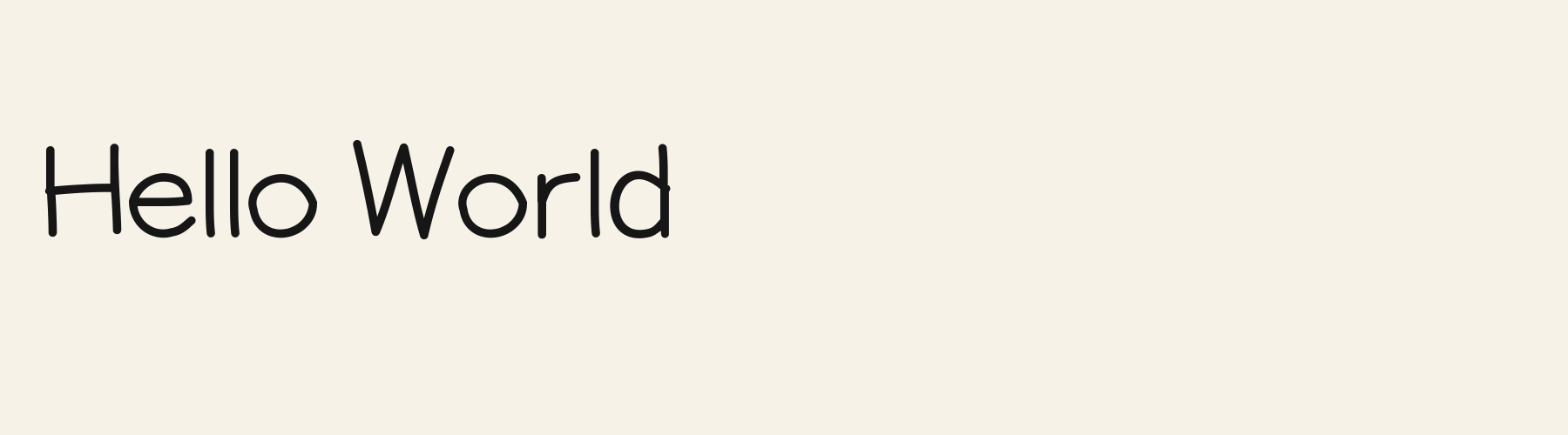
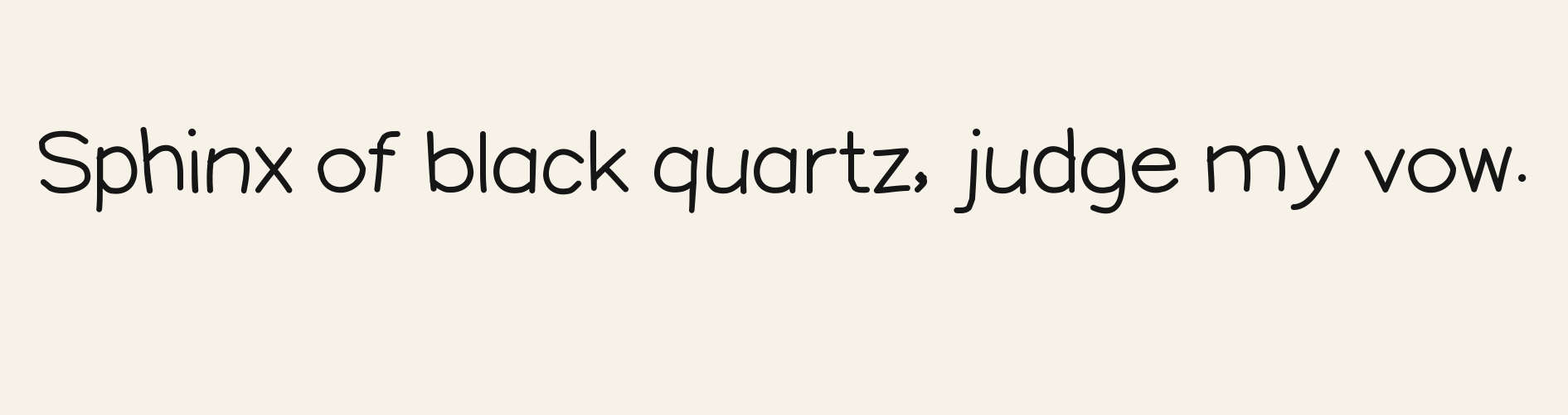
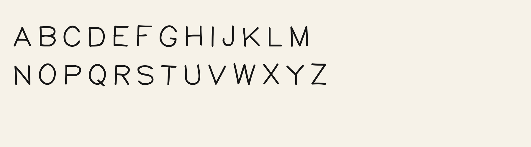
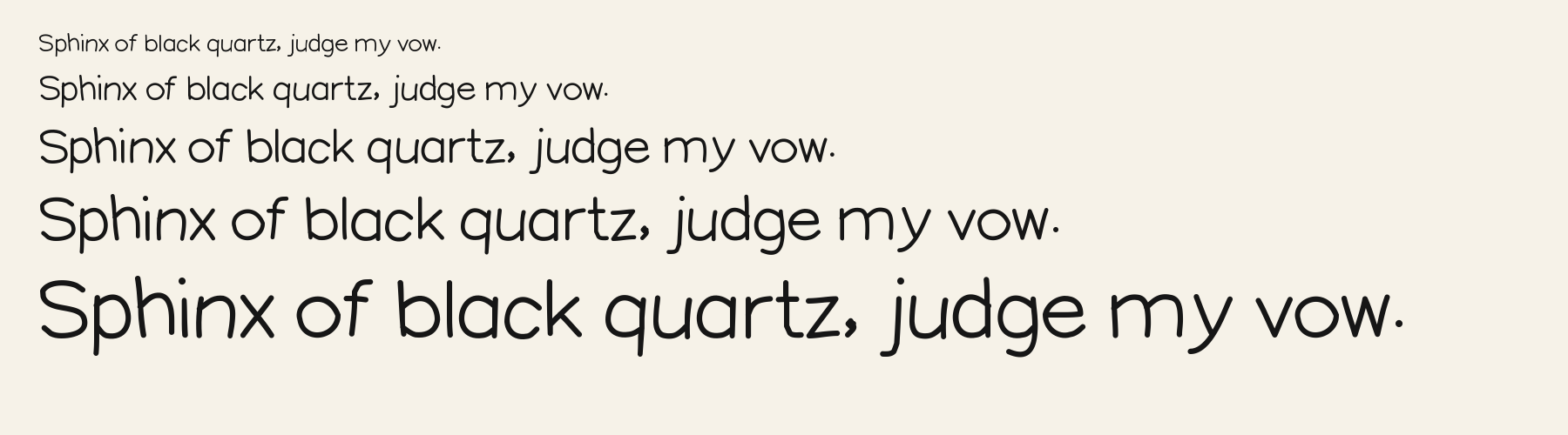
Notebook Hand has round, open letters with the soft ends of a felt tip. The strokes stay nearly the same weight around the o and O, while small shifts in the curves keep the print from feeling rigid. The capital R ends in a direct diagonal leg, and the Q lets a short tail slip below its bowl. In the lowercase, j drops into a long leftward hook, while l rises well above the smaller letters. The letters stand nearly upright, giving the loose shapes a calm, personal feel.
Compare a mixed-case note and an all-capital label. Look at the rounded ends and the space under descending letters before tightening the lines. Inspect your punctuation too, keeping every mark clear enough to preserve its meaning.
Use Notebook Hand for a greeting or brief note, then try a regular text face for longer directions. Keep both at their intended sizes so the gently irregular curves complement the supporting words instead of competing with them.
Q
R
j
Hello again
HELLO AGAIN
Look at the change from rounded lowercase bowls to a line of capitals. The mixed-case sample keeps the contrast between tall letters and shorter neighbors; uppercase changes that rhythm.
Preview settings, not minimum size recommendations. Wide samples scroll sideways.
Hello again
Choose Notebook Hand for a rounded handwritten heading with relatively open letter shapes and a steady stroke.
Hello again
Choose Marker Memo when the same heading should look taller and narrower, with more emphatic ascending strokes.
Back Soon
See You There
Little Things
The scenes are illustrations drawn on this page with Notebook Hand itself, not client work.
How this page was made. Notebook Hand is a FontGenerator library font made with AI; before release its letters were read back one by one by independent automated checks. The design notes were written by AI from the specimen images and checked against them by a second, independent pass; font measurements come from the font file. Preview sizes and spacing are comparison settings.
Specimens
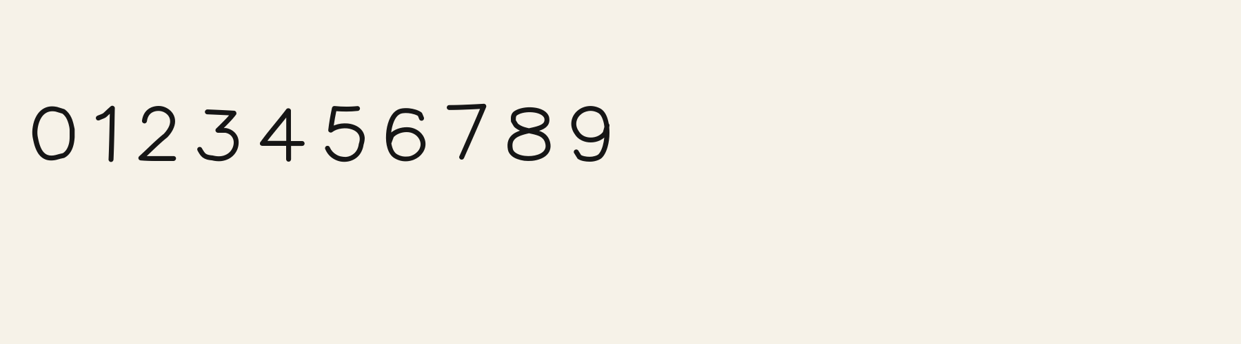
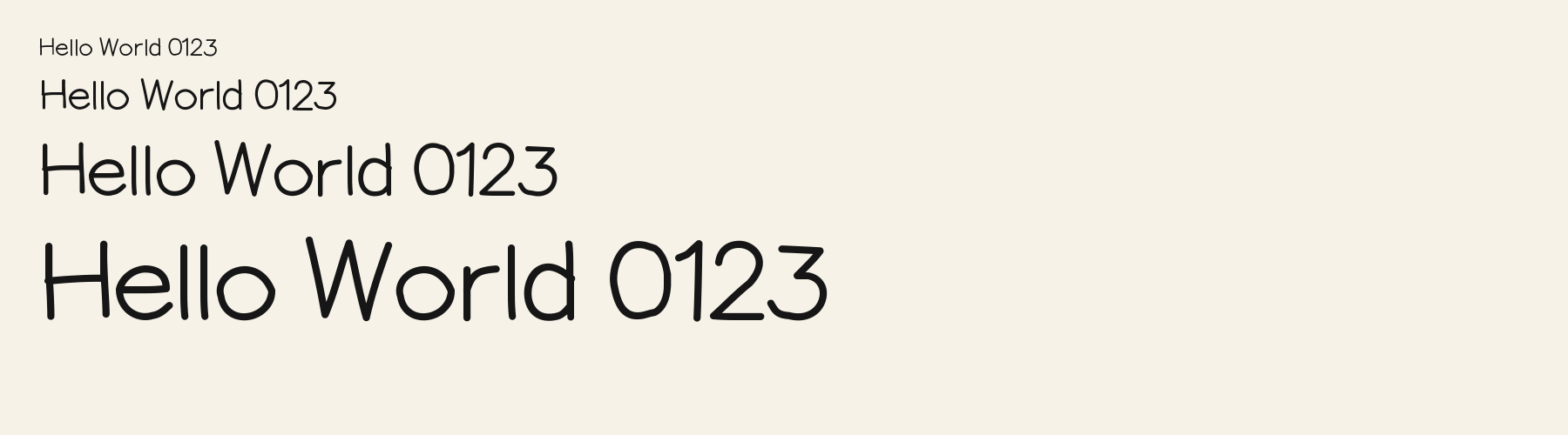
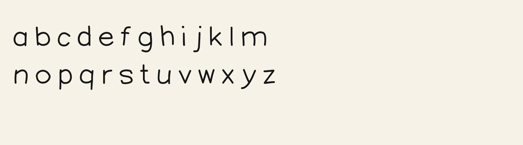
Rendered from the font files, without retouching.
About
Its lowercase sits low: the x-height is 69% of the cap height, where the median for handwriting fonts is 73.1%, lower than 23 of the 30 other handwriting fonts. Ascenders on b, d, h, k and l stop at 95.9% of the capital height, and descenders on g, j, p, q and y drop 30.5% of the cap height below the baseline, deeper than 25 of the 30 other handwriting fonts. Notebook Hand runs 5.8% narrower than the median for handwriting fonts: an average lowercase letter, spacing included, is 67.6% as wide as the capitals are tall (an average capital, 83.4%). The o is close to a circle, 1.08 times as wide as it is tall, and W is the widest capital, at 1.20 times the width of H. The O rises 3.4% of the cap height above H and sits on the baseline.
The letters stand upright, leaning less than 2.5° either way. Vertical stems measure 8.8% of the cap height, lighter than 17 of the 19 other handwriting fonts. Ink covers 24.5% of each lowercase letter's box (its advance width by the cap height), lighter than 25 of the 30 other handwriting fonts. Strokes keep one thickness in every direction: the sides of o and O measure the same as their tops and bottoms.
Its 355 characters include 312 Latin letters, plus 43 figures, punctuation marks and symbols; 260 of the Latin letters are accented or special forms beyond A to Z. The word space measures 33.4% of the cap height, and the blank space either side of a lowercase letter takes up 12.7% of its width. Spacing is adjusted with 121 kerning pairs, more than 20 of the 30 other handwriting fonts. The tightest of them is AY, which closes up by 24.7% of the cap height. The figures have different widths, so columns of numbers set in Notebook Hand will not line up exactly.
2 other library fonts share Notebook Hand's underlying letter structure. Compared with Notebook Hand, Doodle Bounce adds Greek. Doodle Outline draws the letters as hollow outlines, sets 21% wider and puts down 34% less ink.
Measured from the version 0.1.1 font file. Comparisons are with the 377 published library fonts measured on November 12, 2026, 31 of them handwriting fonts.
Ons sê dankie vir die mooi weer en die rooi wyn.
Zhvillimi i gjuhës shqipe është një çështje e rëndësishme.
Magandang umaga sa inyong lahat.
Selamat pagi, apa khabar hari ini?
Pchnąć w tę łódź jeża lub ośm skrzyń fig.
Habari za asubuhi, karibu nyumbani.
Flygande bäckasiner söka hwila på mjuka tuvor.
Characters
Includes all 95 printable Basic Latin characters, 355 characters in total.
Verified language coverage: Afrikaans, Albanian, Azerbaijani, Basque, Bosnian, Catalan, Croatian, Czech, Danish, Dutch, English, Estonian, Filipino, Finnish, French, Galician, German, Hungarian, Indonesian, Irish, Italian, Latvian, Lithuanian, Malay, Maltese, Norwegian, Polish, Portuguese, Romanian, Slovak, Slovenian, Spanish, Swahili, Swedish, Turkish, Vietnamese, Welsh, Zulu
Download
Choose the license that matches your project before downloading.
This font is part of the Pro library: it downloads with Pro or Studio, or as one of the five picks of a Font Pass.
Client work, products and redistribution need a commercial license. Library fonts include it with Pro or Studio; fonts you make include it when you make them on Pro or Studio. A Font Pass is for personal projects.
TTF · OTF · WOFF · WOFF2
Read the full font licenseTools
Free tools that run in your browser. Images you make with them, such as a signature PNG, can be used for any purpose.
Pairings
A different structure keeps a pairing readable: set one font for headings and the other for text. Test both with your own words.
Sans serif2 styles21 languages
Sans serif1 style17 languages
Serif1 style17 languages
Similar
Handwriting1 style18 languages
Handwriting1 style18 languages
Compared with Notebook Hand: 21% wider · lighter strokes
Handwriting1 style37 languages
Compared with Notebook Hand: Heavier strokes · 16% narrower
Handwriting1 style18 languages
Compared with Notebook Hand: Lighter strokes · 19% wider
More
Fonts from other styles, first those that suit the same kinds of work as Notebook Hand.
Script1 style17 languages
Also suits: card or invitation
Decorative1 style18 languages
Also suits: card or invitation
Pixel1 style17 languages
Also suits: product label
Sans serif1 style17 languages
Also suits: product label
FAQ