Sans serif1 style17 languages
Quartz Nocturne Beaded Curl Oval Serif Font
A a g R & Aa
AI-generated
Serif · 1 style · 345 characters · Version 0.1.0 · Published September 24, 2026
Quartz Nocturne draws its character from tall, narrow capitals and a sharp contrast between dark uprights and fine connecting strokes.
Personal use: with Pro, Studio, or as one of 5 Font Pass picks ($4.99 once)Commercial license from $15/mo, yours to keep after your plan endsSee plans
Aa
AagR&
Test
Test Quartz Nocturne
Type the words you plan to use and adjust size, line height, and letter spacing. The preview uses the final font file.
The quick brown fox jumps over the lazy dog
Design
Beaded Curl Oval Serif Letterforms
Quartz Nocturne draws its character from tall, narrow capitals and a sharp contrast between dark uprights and fine connecting strokes. The O has an elongated oval contour and a similarly slender counter, with almost threadlike curves at the top and bottom. The R adds a distinctive flourish: its leg descends into an outward curl ending in a rounded bead. On E, fine horizontal arms extend from a firm vertical stem, with pointed flares at their ends. Thin, flat serifs keep the baseline crisp. Together, these details give short headings a poised, formal mood with a touch of ornament.
Test the font in your wording
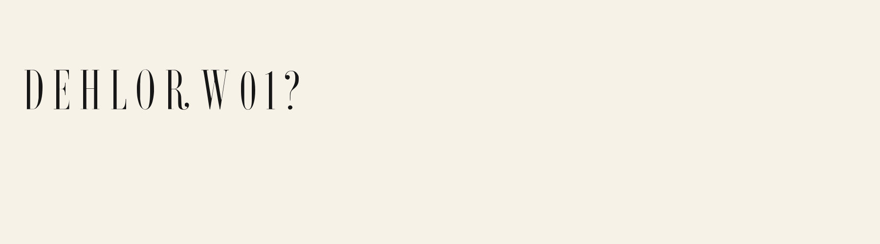
Check the curled R, narrow O counters, and fine crossbars in your actual wording, including reversed previews. These specimens show Latin capitals; inspect lowercase, accents, and any other script separately before committing to a layout.
Font pairing roles
Try this face for short lead headings, with a moderately weighted sans serif for supporting text and labels. Its narrow ovals and delicate crossbars suggest a companion with wider counters and more even strokes.
Quartz Nocturne: letterforms and layout
Distinctive letterforms
R
O
E
Compare the layout
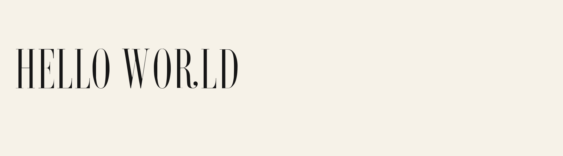
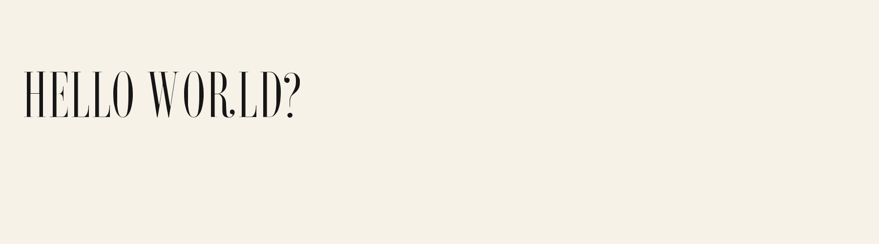
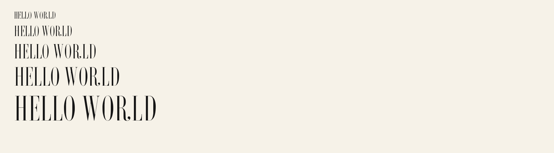
Same font, different settingsHELLO WORLD
HELLO WORLD
Compare smaller and larger previews while watching the fine crossbar of H and the thin curves of O. The larger setting reveals the beaded curl on R more clearly; inspect whether that detail stays distinct in the smaller setting.
Preview settings, not minimum size recommendations. Wide samples scroll sideways.
Choose your letterforms
Same wording · 40pxHELLO WORLD
In this uppercase phrase, Quartz Nocturne has taller, narrower proportions, elongated oval O forms, and an R whose leg curls into a bead. Choose it when a slender silhouette and a small ornamental finish support the composition.
HELLO WORLD
In the same uppercase phrase, Serif Didone Fashion shows broader letters, heavier vertical strokes, and an R with a straight diagonal leg. Try it when the composition calls for more substantial letter shapes and a more angular finish.
Quartz Nocturne font in use
AFTER HOURS
Book or album cover. Tall oval capitals and the curled R give a spare book or album cover a distinctive focal point. AN EVENING
Card or invitation. Fine serifs and slender proportions suit an invitation heading framed by generous blank space. THE NEW EDIT
Website headline. Narrow capitals create a compact editorial heading, while the fine horizontal strokes bring delicacy to the page.
The scenes are illustrations drawn on this page with Quartz Nocturne itself, not client work.
How this page was made. Quartz Nocturne is a FontGenerator library font made with AI; before release its letters were read back one by one by independent automated checks. The design notes were written by AI from the specimen images and checked against them by a second, independent pass; font measurements come from the font file. Preview sizes and spacing are comparison settings.
Specimens
Specimens
Rendered from the font files, without retouching.
About
About Quartz Nocturne
The x-height is a compact 63.6% of the cap height, below the 69.6% median for serif fonts, lower than 49 of the 51 other serif fonts. Ascenders on b, d, h, k and l line up with the capitals (97.9% of their height), and descenders on g, j, p, q and y drop 26.6% of the cap height below the baseline, shallower than 38 of the 51 other serif fonts. It sets narrow: an average lowercase letter, spacing included, is 41.8% as wide as the capitals are tall (an average capital, 54%), 49.9% less than the median for serif fonts, so more words fit on a line. The o is an upright oval, 0.51 times as wide as it is tall, and W is the widest capital, at 1.45 times the width of H. Round letters overshoot: O rises 0.9% of the cap height above H and dips 0.7% below the baseline.
The letters stand upright, leaning less than 2.5° either way. Vertical stems measure 8% of the cap height, lighter than 42 of the 44 other serif fonts. Ink covers 20.9% of each lowercase letter's box (its advance width by the cap height), lighter than 46 of the 51 other serif fonts. Strokes change thickness with direction: the sides of o and O are 16.0 times as thick as their tops and bottoms.
Its 345 characters include 245 Latin letters, plus 100 figures, punctuation marks and symbols; 193 of the Latin letters are accented or special forms beyond A to Z. The word space measures 20.4% of the cap height, and the blank space either side of a lowercase letter takes up 14.9% of its width. Spacing is adjusted with 10,920 kerning pairs, the most of all 52 serif fonts. The tightest of them is Yj, which closes up by 26.8% of the cap height. The figures have different widths, so columns of numbers set in Quartz Nocturne will not line up exactly.
Measured from the version 0.1.0 font file. Comparisons are with the 376 published library fonts measured on November 8, 2026, 52 of them serif fonts.
Quartz Nocturne in 12 languages
- Czech
Příliš žluťoučký kůň úpěl ďábelské ódy.
- Danish
Høj bly gom vandt fræk sexquiz på wc.
- Dutch
Pa’s wijze lynx bezag vroom het fikse aquaduct.
- German
Victor jagt zwölf Boxkämpfer quer über den großen Sylter Deich.
- Hungarian
Árvíztűrő tükörfúrógép.
- Italian
Quel vituperabile xenofobo zelante assaggia il whisky ed esclama: alleluja!
- Polish
Pchnąć w tę łódź jeża lub ośm skrzyń fig.
- Portuguese
À noite, vovô Kowalsky vê o ímã cair no pé do pinguim queixoso.
- Romanian
Înjurând pițigăiat, zoofobul comandă vexat whisky și tequila.
- Spanish
El veloz murciélago hindú comía feliz cardillo y kiwi.
- Swedish
Flygande bäckasiner söka hwila på mjuka tuvor.
- Turkish
Pijamalı hasta yağız şoföre çabucak güvendi.
Characters
Characters
Includes all 95 printable Basic Latin characters, 345 characters in total.
Verified language coverage: Afrikaans, Albanian, Basque, Bosnian, Catalan, Croatian, Czech, Danish, Dutch, English, Estonian, Filipino, Finnish, French, Galician, German, Hungarian, Icelandic, Indonesian, Irish, Italian, Latvian, Lithuanian, Malay, Maltese, Norwegian, Polish, Portuguese, Romanian, Slovak, Slovenian, Spanish, Swahili, Swedish, Turkish, Welsh, Zulu
Basic Latin · 95
- !
- "
- #
- $
- %
- &
- '
- (
- )
- *
- +
- ,
- -
- .
- /
- 0
- 1
- 2
- 3
- 4
- 5
- 6
- 7
- 8
- 9
- :
- ;
- <
- =
- >
- ?
- @
- A
- B
- C
- D
- E
- F
- G
- H
- I
- J
- K
- L
- M
- N
- O
- P
- Q
- R
- S
- T
- U
- V
- W
- X
- Y
- Z
- [
- \
- ]
- ^
- _
- `
- a
- b
- c
- d
- e
- f
- g
- h
- i
- j
- k
- l
- m
- n
- o
- p
- q
- r
- s
- t
- u
- v
- w
- x
- y
- z
- {
- |
- }
- ~
Latin letters with accents · 230
- ª
- º
- À
- Á
- Â
- Ã
- Ä
- Å
- Æ
- Ç
- È
- É
- Ê
- Ë
- Ì
- Í
- Î
- Ï
- Ð
- Ñ
- Ò
- Ó
- Ô
- Õ
- Ö
- Ø
- Ù
- Ú
- Û
- Ü
- Ý
- Þ
- ß
- à
- á
- â
- ã
- ä
- å
- æ
- ç
- è
- é
- ê
- ë
- ì
- í
- î
- ï
- ð
- ñ
- ò
- ó
- ô
- õ
- ö
- ø
- ù
- ú
- û
- ü
- ý
- þ
- ÿ
- Ā
- ā
- Ă
- ă
- Ą
- ą
- Ć
- ć
- Ċ
- ċ
- Č
- č
- Ď
- ď
- Đ
- đ
- Ē
- ē
- Ĕ
- ĕ
- Ė
- ė
- Ę
- ę
- Ě
- ě
- Ğ
- ğ
- Ġ
- ġ
- Ģ
- ģ
- Ħ
- ħ
- Ĩ
- ĩ
- Ī
- ī
- Ĭ
- ĭ
- Į
- į
- İ
- ı
- IJ
- ij
- Ķ
- ķ
- Ĺ
- ĺ
- Ļ
- ļ
- Ľ
- ľ
- Ŀ
- ŀ
- Ł
- ł
- Ń
- ń
- Ņ
- ņ
- Ň
- ň
- Ŋ
- ŋ
- Ō
- ō
- Ŏ
- ŏ
- Ő
- ő
- Œ
- œ
- Ŕ
- ŕ
- Ŗ
- ŗ
- Ř
- ř
- Ś
- ś
- Ŝ
- ŝ
- Ş
- ş
- Š
- š
- Ţ
- ţ
- Ť
- ť
- Ŧ
- ŧ
- Ũ
- ũ
- Ū
- ū
- Ŭ
- ŭ
- Ů
- ů
- Ű
- ű
- Ų
- ų
- Ŵ
- ŵ
- Ŷ
- ŷ
- Ÿ
- Ź
- ź
- Ż
- ż
- Ž
- ž
- ſ
- Ʒ
- Ǎ
- ǎ
- Ǔ
- ǔ
- Ǥ
- ǥ
- Ǧ
- ǧ
- Ǩ
- ǩ
- Ǯ
- ǯ
- Ǿ
- ǿ
- Ș
- ș
- Ț
- ț
- Ȟ
- ȟ
- ɑ
- ʒ
- Ḃ
- ḃ
- Ḋ
- ḋ
- Ḟ
- ḟ
- Ṁ
- ṁ
- Ṗ
- ṗ
- Ṡ
- ṡ
- Ṫ
- ṫ
- Ẁ
- ẁ
- Ẃ
- ẃ
- Ẅ
- ẅ
- Ẽ
- ẽ
- Ỳ
- ỳ
- Ɑ
Download
Download
Choose the license that matches your project before downloading.
Download
This font is part of the Pro library: it downloads with Pro or Studio, or as one of the five picks of a Font Pass.
Commercial use
Client work, products and redistribution need a commercial license. Library fonts include it with Pro or Studio; fonts you make include it when you make them on Pro or Studio. A Font Pass is for personal projects.
TTF · OTF · WOFF · WOFF2
Read the full font licenseTools
Do more with Quartz Nocturne
Free tools that run in your browser. Images you make with them, such as a signature PNG, can be used for any purpose.
- Make a font like thisDescribe the style and get your own font in the direction of Quartz Nocturne, private on paid plans.
- Make a monogramSet your initials in Quartz Nocturne inside a circle, diamond or plain frame.
- Check languagesSee which of 54 languages a font can write and exactly which letters are missing.
- Convert font filesTurn TTF or OTF into WOFF2 for the web, or back again. Files never leave your device.
- Compare with your fontsDrop in your own font files and set them next to library fonts.
Pairings
Fonts to pair with Quartz Nocturne
A different structure keeps a pairing readable: set one font for headings and the other for text. Test both with your own words.
Sans serif1 style17 languages
Script1 style35 languages
Similar
More serif fonts
See all serif fontsSalon Didone
Free downloadSerif1 style19 languages
Compared with Quartz Nocturne: 74% wider
Serif1 style17 languages
Compared with Quartz Nocturne: 106% wider · taller x-height
Serif1 style17 languages
Compared with Quartz Nocturne: 93% wider · heavier strokes
Serif1 style17 languages
Compared with Quartz Nocturne: 144% wider · heavier strokes
More
You may also like
Fonts from other styles, first those that suit the same kinds of work as Quartz Nocturne.
Sans serif1 style17 languages
Also suits: website headline
Display1 style24 languages
Also suits: card or invitation
Monospace1 style18 languages
Also suits: book or album cover
Decorative1 style5 languages
Also suits: card or invitation
FAQ
Quartz Nocturne questions
- Can I use Quartz Nocturne commercially?
- Quartz Nocturne is part of the Pro library. Pro and Studio include it with a commercial license that continues after the plan ends; a Font Pass can pick it as one of 5 fonts for personal use.
- Which languages does Quartz Nocturne support?
- Quartz Nocturne's 345 characters include 245 Latin letters, plus 100 figures, punctuation marks and symbols; 193 of the Latin letters are accented or special forms beyond A to Z. It has all 95 printable Basic Latin characters. Verified language coverage: Afrikaans, Albanian, Basque, Bosnian, Catalan, Croatian, Czech, Danish, Dutch, English, Estonian, Filipino, Finnish, French, Galician, German, Hungarian, Icelandic, Indonesian, Irish, Italian, Latvian, Lithuanian, Malay, Maltese, Norwegian, Polish, Portuguese, Romanian, Slovak, Slovenian, Spanish, Swahili, Swedish, Turkish, Welsh, Zulu. Missing a language? Customize the font and add it in Studio.
- What is Quartz Nocturne good for?
- Book or album cover: Tall oval capitals and the curled R give a spare book or album cover a distinctive focal point. Card or invitation: Fine serifs and slender proportions suit an invitation heading framed by generous blank space. Website headline: Narrow capitals create a compact editorial heading, while the fine horizontal strokes bring delicacy to the page. Less suited: For dense paragraphs or aligned numerical tables, try a sturdier text face with open proportions and tabular figures.
- What fonts pair well with Quartz Nocturne?
- Catenary Stem Sans Outline (sans serif), Keystone Shoulder Sans Outline (sans serif) and Inkwell Script (script) are drawn on a different letter structure, so Quartz Nocturne can carry the headings while one of them sets the text. Each has its own page with a type tester for trying the pair.
- Which fonts are similar to Quartz Nocturne?
- In the same serif style: Salon Didone (74% wider); Keyhole Counter Roman Outline (106% wider, taller x-height); Couture Display (93% wider, heavier strokes).