Sans serif1 style37 languages
Brush Crescent Wash Tapered Bowl Display Font
AI-generated
Handwriting · 1 style · 317 characters · Version 0.1.1 · Added October 4, 2026
Brush Crescent Wash is a handwriting font: An original upright, unconnected side-brush display face for short poster headlines, packaging labels and sign text. Real side-brush pressure makes a crescent-like thick-to-thin sweep around bowls and joins: broad curved entry pressure resolves into a controlled narrow exit, solid continuous black silhouettes, and restrained rounded-brush terminals. No dry holes, detached bristles, splatter, drips, shadows, stripes, outlines, random texture, or decorative swashes. Best for Brush designs.
Personal use: with Pro, Studio, or as one of 5 Font Pass picks ($4.99 once)Commercial license from $15/mo, yours to keep after your plan endsSee plans
Aa
HS$Ins
Test
Test Brush Crescent Wash
Type the words you plan to use and adjust size, line height, and letter spacing. The preview uses the final font file.
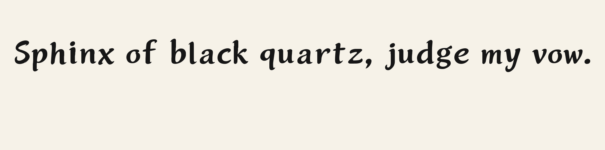
The quick brown fox jumps over the lazy dog
Design
Tapered Bowl Display Letterforms
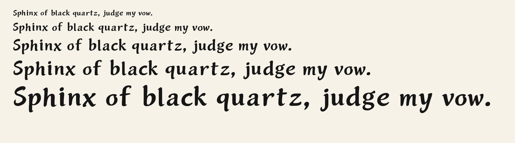
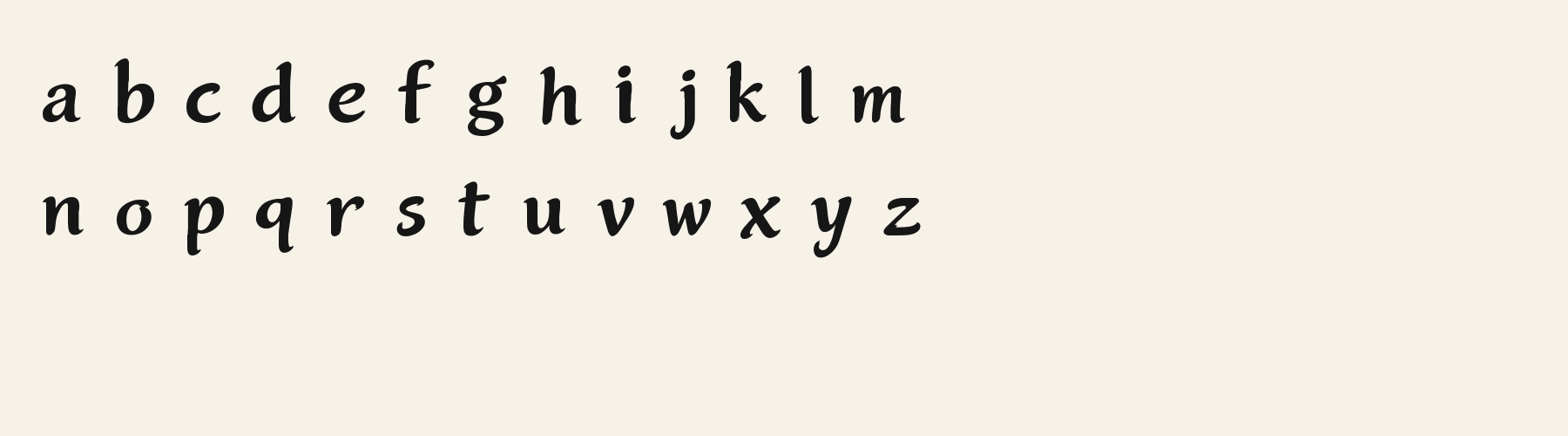
Brush Crescent Wash combines upright, separate letters with substantial curved strokes and narrow connecting turns. The o is nearly round, with heavy sides and a much lighter top that gives its bowl an uneven distribution of ink. The lowercase e has a rising cross-stroke and an open finish, while the capital Q sends a broad, curved tail beneath its bowl. Tall ascenders stand above the compact lowercase bodies, adding a clear rise and fall to mixed-case words. Smooth black silhouettes, hooked entries, and softly flared feet give the lettering a warm, composed character without rough texture or sprawling flourishes.
Test the font in your wording
Inspect repeated l stems, the small counter in e, and descending letters in your actual wording. Check individual letter gaps and line spacing at the intended output size. These observations concern Latin specimens; test other scripts separately with the required characters.
Font pairing roles
Use this face for a short heading, then try a restrained sans serif for descriptions and practical labels. Its even strokes would contrast with the heading’s tapered bowls and hooked terminals. Test the companion’s clarity at your intended size and line spacing.
Brush Crescent Wash: letterforms and layout
Distinctive letterforms
Q
e
l
Compare the layout
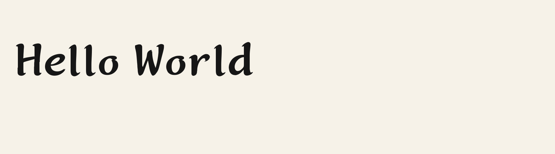
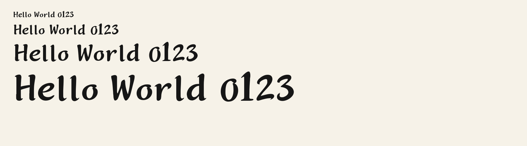
Same font, different settingsHello World
HELLO WORLD
Compare the wording as written with uppercase. Mixed case brings the compact lowercase bowls and tall ascenders into focus; uppercase emphasizes the broad W and the capitals’ curved, flared endings. Inspect how each treatment changes the line’s rhythm.
Preview settings, not minimum size recommendations. Wide samples scroll sideways.
Choose your letterforms
Same wording · 40pxHELLO WORLD
Brush Crescent Wash has upright capitals, solid edges, and rounded transitions between thick and thin strokes. The H crossbar rises gently, while the L finishes with a restrained curved foot, supporting a composed sign-lettering treatment.
HELLO WORLD
Brush Note Casual shows a stronger forward lean, frayed edges, and pointed stroke endings. Its angular W and sharply extended L feet give the shared wording a brisker, more scratchy appearance suited to an energetic headline treatment.
Brush Crescent Wash font in use
Evening Market
Poster. Substantial curved strokes give a short event title presence, while the separate letters keep the composition visually orderly. Wild Honey
Product label. Rounded bowls and softly flared endings bring a warm lettering character to a concise product name. Hello Again
Card or invitation. Tall ascenders and compact lowercase bowls give a brief greeting a gentle rhythm without elaborate flourishes.
The scenes are illustrations drawn on this page with Brush Crescent Wash itself, not client work.
How this page was made. Brush Crescent Wash is a FontGenerator library font made with AI; before release its letters were read back one by one by independent automated checks. The design notes were written by AI from the specimen images and checked against them by a second, independent pass; font measurements come from the font file. Preview sizes and spacing are comparison settings.
Specimens
Specimens
Rendered from the font files, without retouching.
About
About Brush Crescent Wash
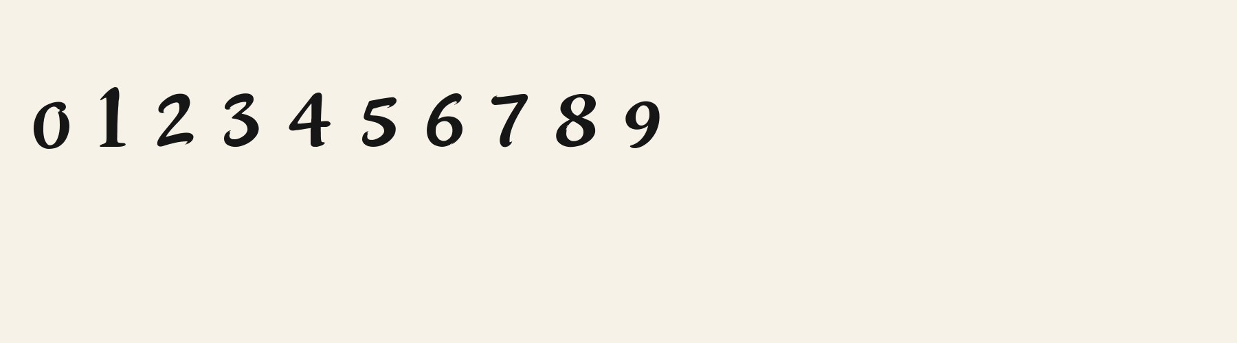
The x-height is a compact 65.5% of the cap height, below the 73.1% median for handwriting fonts, lower than 24 of the 30 other handwriting fonts. Ascenders on b, d, h, k and l rise 3.8% above the capitals, and descenders on g, j, p, q and y drop 27.3% of the cap height below the baseline, deeper than 16 of the 30 other handwriting fonts. Its letters are of average width for handwriting fonts: an average lowercase letter, spacing included, is 72.4% as wide as the capitals are tall (an average capital, 85.1%), within 0% of the median. The o is close to a circle, 0.99 times as wide as it is tall, and M is the widest capital, at 1.11 times the width of H. The O stops 2% of the cap height short of H and sits on the baseline.
The letters stand upright, leaning less than 2.5° either way. Vertical stems measure 17% of the cap height, heavier than 15 of the 19 other handwriting fonts. Ink covers 33.4% of each lowercase letter's box (its advance width by the cap height), lighter than 17 of the 30 other handwriting fonts. Strokes change thickness with direction: the sides of o and O are 2.1 times as thick as their tops and bottoms.
Its 317 characters include 274 Latin letters, plus 43 figures, punctuation marks and symbols; 222 of the Latin letters are accented or special forms beyond A to Z. The word space measures 45.8% of the cap height, and the blank space either side of a lowercase letter takes up 13.6% of its width. The font carries no kerning, so spacing comes from each letter’s own side bearings. The figures have different widths, so columns of numbers set in Brush Crescent Wash will not line up exactly.
Measured from the version 0.1.1 font file. Comparisons are with the 377 published library fonts measured on October 21, 2026, 31 of them handwriting fonts.
Characters
Characters
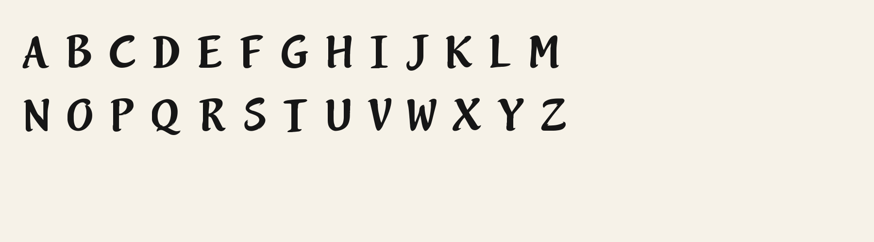
Includes all 95 printable Basic Latin characters, 317 characters in total.
Verified language coverage: Afrikaans, Albanian, Basque, Bosnian, Catalan, Croatian, Czech, Danish, Dutch, English, Estonian, Filipino, Finnish, French, Galician, Hungarian, Indonesian, Irish, Italian, Malay, Norwegian, Portuguese, Romanian, Slovak, Slovenian, Spanish, Swahili, Swedish, Turkish, Zulu
- Stroke
- Real side-brush pressure makes a crescent-like thick-to-thin sweep around bowls and joins: broad curved entry pressure resolves into a controlled narrow exit, solid continuous black silhouettes, and restrained rounded-brush terminals. No dry holes, detached bristles, splatter, drips, shadows, stripes, outlines, random texture, or decorative swashes
- Best for
- Brush designs
Basic Latin · 95
- !
- "
- #
- $
- %
- &
- '
- (
- )
- *
- +
- ,
- -
- .
- /
- 0
- 1
- 2
- 3
- 4
- 5
- 6
- 7
- 8
- 9
- :
- ;
- <
- =
- >
- ?
- @
- A
- B
- C
- D
- E
- F
- G
- H
- I
- J
- K
- L
- M
- N
- O
- P
- Q
- R
- S
- T
- U
- V
- W
- X
- Y
- Z
- [
- \
- ]
- ^
- _
- `
- a
- b
- c
- d
- e
- f
- g
- h
- i
- j
- k
- l
- m
- n
- o
- p
- q
- r
- s
- t
- u
- v
- w
- x
- y
- z
- {
- |
- }
- ~
Latin letters with accents · 210
- ª
- º
- À
- Á
- Â
- Ã
- Ä
- Å
- Æ
- Ç
- È
- É
- Ê
- Ë
- Ì
- Í
- Î
- Ï
- Ð
- Ñ
- Ò
- Ó
- Ô
- Õ
- Ö
- Ø
- Ù
- Ú
- Û
- Ü
- Ý
- Þ
- ß
- à
- á
- â
- ã
- ä
- å
- æ
- ç
- è
- é
- ê
- ë
- ì
- í
- î
- ï
- ð
- ñ
- ò
- ó
- ô
- õ
- ö
- ø
- ù
- ú
- û
- ü
- ý
- þ
- ÿ
- Ā
- ā
- Ă
- ă
- Ą
- ą
- Ć
- ć
- Ċ
- ċ
- Č
- č
- Ď
- ď
- Đ
- đ
- Ē
- ē
- Ĕ
- ĕ
- Ė
- ė
- Ę
- ę
- Ě
- ě
- Ğ
- ğ
- Ġ
- ġ
- Ģ
- ģ
- Ħ
- ħ
- Ī
- ī
- Ĭ
- ĭ
- Į
- į
- İ
- ı
- IJ
- ij
- Ķ
- ķ
- Ĺ
- ĺ
- Ļ
- ļ
- Ľ
- ľ
- Ŀ
- ŀ
- Ł
- ł
- Ń
- ń
- Ņ
- ņ
- Ň
- ň
- Ŋ
- ŋ
- Ō
- ō
- Ŏ
- ŏ
- Ő
- ő
- Œ
- œ
- Ŕ
- ŕ
- Ř
- ř
- Ś
- ś
- Ŝ
- ŝ
- Ş
- ş
- Š
- š
- Ţ
- ţ
- Ť
- ť
- Ŧ
- ŧ
- Ū
- ū
- Ŭ
- ŭ
- Ů
- ů
- Ű
- ű
- Ų
- ų
- Ÿ
- Ź
- ź
- Ż
- ż
- Ž
- ž
- ſ
- Ʒ
- Ǎ
- ǎ
- Ǔ
- ǔ
- Ǥ
- ǥ
- Ǧ
- ǧ
- Ǩ
- ǩ
- Ǯ
- ǯ
- Ǿ
- ǿ
- Ș
- ș
- Ț
- ț
- Ȟ
- ȟ
- ɑ
- ʒ
- Ḃ
- ḃ
- Ḋ
- ḋ
- Ḟ
- ḟ
- Ṁ
- ṁ
- Ṗ
- ṗ
- Ṡ
- ṡ
- Ṫ
- ṫ
- Ɑ
Download
Download
Choose the license that matches your project before downloading.
Download
This font is part of the Pro library: it downloads with Pro or Studio, or as one of the five picks of a Font Pass.
Commercial use
Client work, products and redistribution need a commercial license. Library fonts include it with Pro or Studio; fonts you make include it when you make them on Pro or Studio. A Font Pass is for personal projects.
TTF · OTF · WOFF · WOFF2
Read the full font licenseTools
Do more with Brush Crescent Wash
Free tools that run in your browser. Images you make with them, such as a signature PNG, can be used for any purpose.
- Make a font like thisDescribe the style and get your own font in the direction of Brush Crescent Wash, private on paid plans.
- Write your signatureType your name in Brush Crescent Wash and download a transparent PNG for documents and email.
- Check languagesSee which of 54 languages a font can write and exactly which letters are missing.
- Convert font filesTurn TTF or OTF into WOFF2 for the web, or back again. Files never leave your device.
- Compare with your fontsDrop in your own font files and set them next to library fonts.
Pairings
Fonts to pair with Brush Crescent Wash
A different structure keeps a pairing readable: set one font for headings and the other for text. Test both with your own words.
Sans serif1 style18 languages
Serif1 style35 languages
Similar
More handwriting fonts
See all handwriting fontsHandwriting1 style37 languages
Compared with Brush Crescent Wash: Taller x-height · 7% wider
Handwriting1 style5 languages
Compared with Brush Crescent Wash: Heavier strokes · 14% wider
Handwriting1 style18 languages
Compared with Brush Crescent Wash: Lighter strokes · 13% wider
Marker Felt Round
Free downloadHandwriting2 styles5 languages
Compared with Brush Crescent Wash: Heavier strokes · taller x-height
More
You may also like
Fonts from other styles, first those that suit the same kinds of work as Brush Crescent Wash.
Stencil1 style38 languages
Also suits: poster
Monospace2 styles21 languages
Also suits: poster
Pixel1 style17 languages
Also suits: poster
Display1 style17 languages
Also suits: card or invitation
FAQ
Brush Crescent Wash questions
- Can I use Brush Crescent Wash commercially?
- Brush Crescent Wash is part of the Pro library. Pro and Studio include it with a commercial license that continues after the plan ends; a Font Pass can pick it as one of 5 fonts for personal use.
- Which languages does Brush Crescent Wash support?
- Brush Crescent Wash's 317 characters include 274 Latin letters, plus 43 figures, punctuation marks and symbols; 222 of the Latin letters are accented or special forms beyond A to Z. It has all 95 printable Basic Latin characters. Verified language coverage: Afrikaans, Albanian, Basque, Bosnian, Catalan, Croatian, Czech, Danish, Dutch, English, Estonian, Filipino, Finnish, French, Galician, Hungarian, Indonesian, Irish, Italian, Malay, Norwegian, Portuguese, Romanian, Slovak, Slovenian, Spanish, Swahili, Swedish, Turkish, Zulu. Missing a language? Customize the font and add it in Studio.
- What is Brush Crescent Wash good for?
- Poster: Substantial curved strokes give a short event title presence, while the separate letters keep the composition visually orderly. Product label: Rounded bowls and softly flared endings bring a warm lettering character to a concise product name. Card or invitation: Tall ascenders and compact lowercase bowls give a brief greeting a gentle rhythm without elaborate flourishes. Less suited: For dense instructions or aligned price columns, try a neutral text face with tabular figures instead of these strongly modulated letters.
- What fonts pair well with Brush Crescent Wash?
- Ion Velvet Grotesk (sans serif), Grid Sans (sans serif) and Chronicle Italic Nib (serif) are drawn on a different letter structure, so Brush Crescent Wash can carry the headings while one of them sets the text. Each has its own page with a type tester for trying the pair.
- Which fonts are similar to Brush Crescent Wash?
- In the same handwriting style: Wobble Print (taller x-height, 7% wider); Marker Broad Flat (heavier strokes, 14% wider); Doodle Outline (lighter strokes, 13% wider).