Sans serif1 style29 languages
Cursive Letterpress Slant Wedge Tip Signwriting Font
H n a g R 8
AI-generated
Script · 1 style · 148 characters · Version 0.1.0 · Published September 27, 2026
Cursive Letterpress Slant combines broad, right-leaning capitals with firm strokes and clean, angular tips.
Personal use: free with an account (3 fonts a month)Commercial license from $15/mo, yours to keep after your plan endsSee plans
Aa
HnagR8
Test
Test Cursive Letterpress Slant
Type the words you plan to use and adjust size, line height, and letter spacing. The preview uses the final font file.
The quick brown fox jumps over the lazy dog
Design
Wedge Tip Signwriting Letterforms
Cursive Letterpress Slant combines broad, right-leaning capitals with firm strokes and clean, angular tips. The H carries a rising crossbar and a hooked lower stroke, while the L curls through a narrow upper loop before sweeping into a wide foot. The R adds a rounded bowl and an outward-turning leg that keeps the baseline lively. The O is a simple tilted oval with an open counter, giving the flourished letters some breathing room. Mild stroke contrast and smooth edges give the lettering a sturdy, composed shopfront mood.
Test the font in your wording
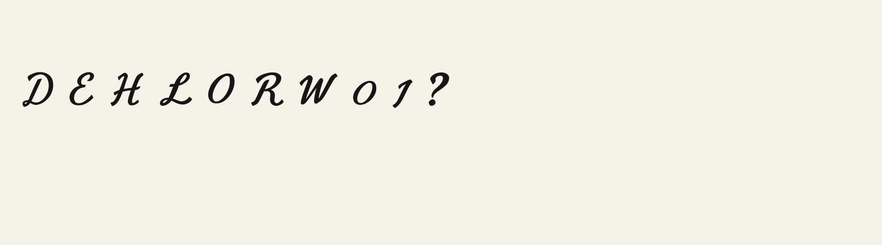
Check repeated L feet, the R leg, and gaps around rounded capitals in your actual wording. Compare tighter and wider spacing before choosing a setting. These specimens establish Latin letter shapes; preview accented Latin and any other scripts separately to confirm their appearance and availability.
Font pairing roles
Try this face for a short heading, with a plain upright sans serif for descriptions and prices. Its curled feet and leaning capitals already supply movement, so a companion with simple terminals can keep supporting information visually steady.
Cursive Letterpress Slant: letterforms and layout
Distinctive letterforms
H
L
R
Compare the layout
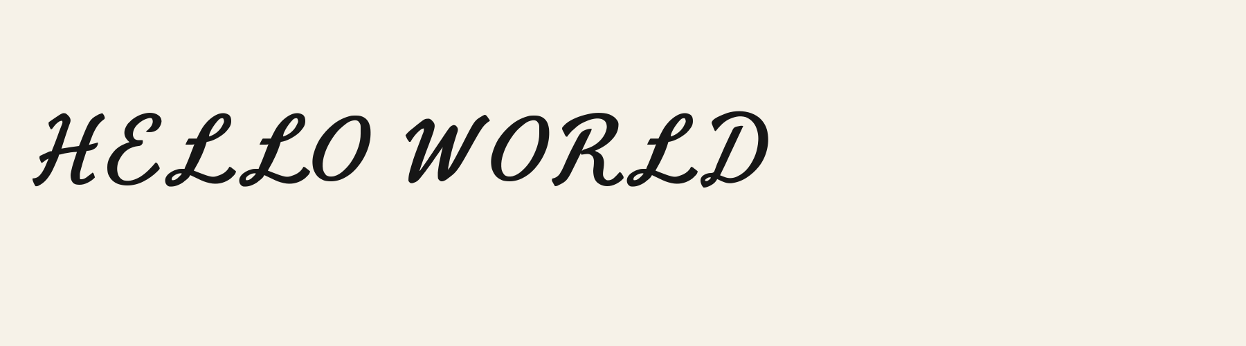
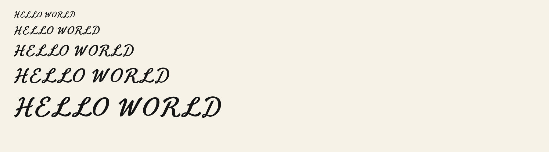
Same font, different settingsHELLO WORLD
HELLO WORLD
Compare the original spacing with a slightly wider setting. The repeated L feet create a strong horizontal rhythm; extra space may separate those curves more clearly, while also lengthening an already broad line.
Preview settings, not minimum size recommendations. Wide samples scroll sideways.
Choose your letterforms
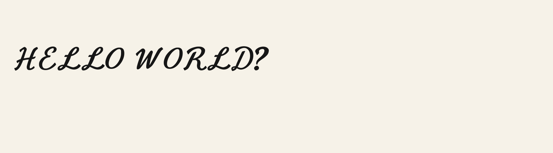
Same wording · 40pxHELLO WORLD
Cursive Letterpress Slant has firm strokes, compact upper loops, and broad feet on L. Its capitals hold together as a substantial signwriting line, with relatively little difference between thick and thin strokes.
HELLO WORLD
Copperline Script shows finer connecting strokes and more expansive loops in its capitals. Its H has a delicate entry flourish, while its O includes an interior sweep, offering a more ornamental direction for the same wording.
Cursive Letterpress Slant font in use
CORNER SHOP
Shop sign. Firm strokes and hooked capitals give a shop name a substantial presence, while the rightward lean adds movement. GOLDEN HONEY
Product label. Broad oval counters and clean wedge tips give a short product name a warm, orderly vintage character. DAILY SPECIAL
Menu board. Sweeping L feet and rounded capitals bring a signwritten rhythm to a short menu heading above simpler descriptions.
The scenes are illustrations drawn on this page with Cursive Letterpress Slant itself, not client work.
How this page was made. Cursive Letterpress Slant is a FontGenerator library font made with AI; before release its letters were read back one by one by independent automated checks. The design notes were written by AI from the specimen images and checked against them by a second, independent pass; font measurements come from the font file. Preview sizes and spacing are comparison settings.
Specimens
Specimens
Rendered from the font files, without retouching.
About
About Cursive Letterpress Slant
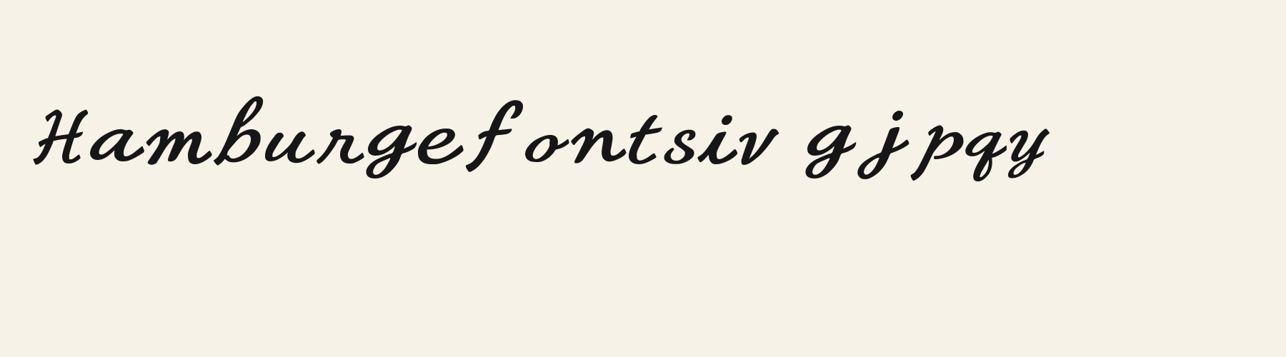
With an x-height of 62.5% of the cap height, its lowercase stands above the 48.5% median for script fonts, taller than 50 of the 53 other script fonts. Ascenders on b, d, h, k and l rise 10.6% above the capitals, and descenders on g, j, p, q and y drop 26.4% of the cap height below the baseline, shallower than 52 of the 53 other script fonts. It sets wide: an average lowercase letter, spacing included, is 88.5% as wide as the capitals are tall (an average capital, 94.7%), 38.1% more than the median for script fonts, so the same words take a longer line. The o is wider than it is tall, 1.61 to 1, and Z is the widest capital, at 1.24 times the width of H. The O stops 3.8% of the cap height short of H and stands 7.2% above the baseline.
The letters lean roughly 20° to the right. Ink covers 27.5% of each lowercase letter's box (its advance width by the cap height), darker than 34 of the 53 other script fonts. The contrast is mild: the sides of o and O are 1.47 times as thick as their tops and bottoms.
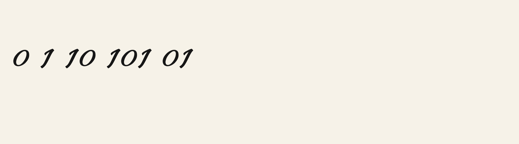
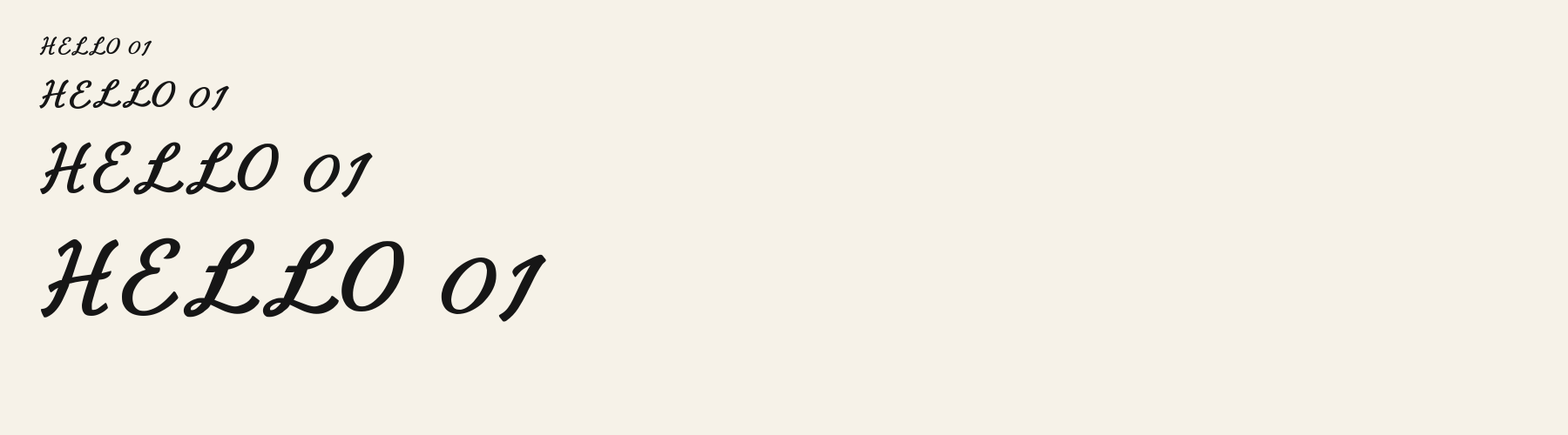
Its 148 characters include 105 Latin letters, plus 43 figures, punctuation marks and symbols; 53 of the Latin letters are accented or special forms beyond A to Z. The word space measures 45.3% of the cap height, and the blank space either side of a lowercase letter takes up 3.5% of its width. The font carries no kerning, so spacing comes from each letter’s own side bearings. The figures have different widths, so columns of numbers set in Cursive Letterpress Slant will not line up exactly.
Measured from the version 0.1.0 font file. Comparisons are with the 376 published library fonts measured on November 12, 2026, 54 of them script fonts.
Characters
Characters
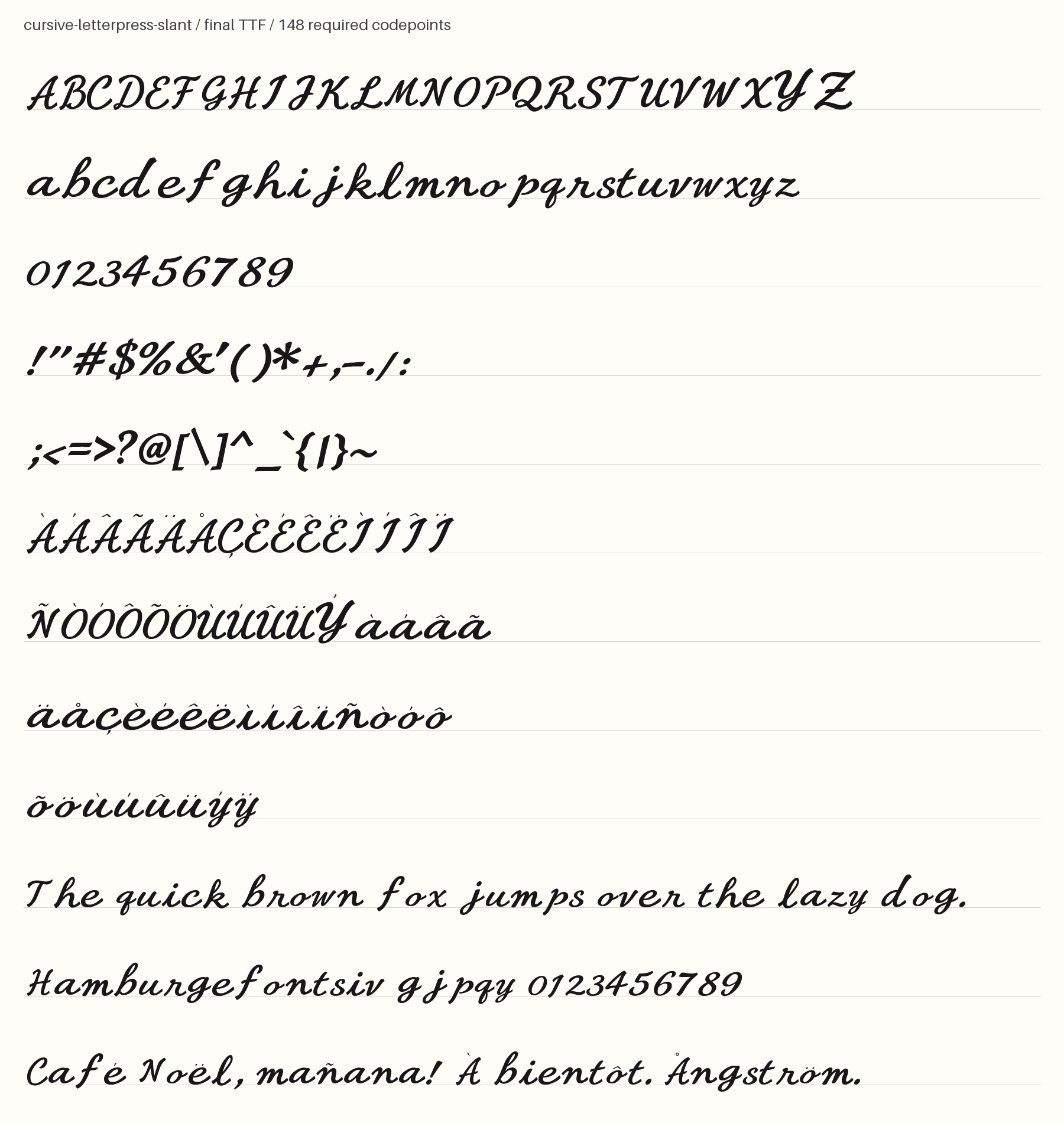
Includes all 95 printable Basic Latin characters, 148 characters in total.
Verified language coverage: Afrikaans, Albanian, Basque, Catalan, Dutch, English, Filipino, Galician, Indonesian, Irish, Italian, Malay, Portuguese, Spanish, Swahili, Swedish, Zulu
- Structure
- Compact signwriting cursive with restrained slant and short ascenders and descenders
- Stroke
- Firm medium-weight strokes with crisp wedge terminals, no distressed texture
- Best for
- Vintage shop signs and labels
Basic Latin · 95
- !
- "
- #
- $
- %
- &
- '
- (
- )
- *
- +
- ,
- -
- .
- /
- 0
- 1
- 2
- 3
- 4
- 5
- 6
- 7
- 8
- 9
- :
- ;
- <
- =
- >
- ?
- @
- A
- B
- C
- D
- E
- F
- G
- H
- I
- J
- K
- L
- M
- N
- O
- P
- Q
- R
- S
- T
- U
- V
- W
- X
- Y
- Z
- [
- \
- ]
- ^
- _
- `
- a
- b
- c
- d
- e
- f
- g
- h
- i
- j
- k
- l
- m
- n
- o
- p
- q
- r
- s
- t
- u
- v
- w
- x
- y
- z
- {
- |
- }
- ~
Latin letters with accents · 105
- ª
- º
- À
- Á
- Â
- Ã
- Ä
- Å
- Æ
- Ç
- È
- É
- Ê
- Ë
- Ì
- Í
- Î
- Ï
- Ñ
- Ò
- Ó
- Ô
- Õ
- Ö
- Ø
- Ù
- Ú
- Û
- Ü
- Ý
- ß
- à
- á
- â
- ã
- ä
- å
- æ
- ç
- è
- é
- ê
- ë
- ì
- í
- î
- ï
- ñ
- ò
- ó
- ô
- õ
- ö
- ø
- ù
- ú
- û
- ü
- ý
- ÿ
- Ā
- ā
- Ă
- ă
- Ċ
- ċ
- Ē
- ē
- Ĕ
- ĕ
- Ġ
- ġ
- Ī
- ī
- Ĭ
- ĭ
- Ŀ
- ŀ
- Ō
- ō
- Ŏ
- ŏ
- Œ
- œ
- Ū
- ū
- Ŭ
- ŭ
- Ÿ
- ɑ
- Ḃ
- ḃ
- Ḋ
- ḋ
- Ḟ
- ḟ
- Ṁ
- ṁ
- Ṗ
- ṗ
- Ṡ
- ṡ
- Ṫ
- ṫ
- Ɑ
Download
Download
Choose the license that matches your project before downloading.
Download
Free with a FontGenerator account: a TTF for personal, non-commercial projects, up to 3 free fonts a month. Pro and Studio add every format and commercial use.
Commercial use
Client work, products and redistribution need a commercial license. Library fonts include it with Pro or Studio; fonts you make include it when you make them on Pro or Studio. A Font Pass is for personal projects.
TTF · OTF · WOFF · WOFF2
Read the full font licenseTools
Do more with Cursive Letterpress Slant
Free tools that run in your browser. Images you make with them, such as a signature PNG, can be used for any purpose.
- Make a font like thisDescribe the style and get your own font in the direction of Cursive Letterpress Slant, private on paid plans.
- Write your signatureType your name in Cursive Letterpress Slant and download a transparent PNG for documents and email.
- Make a monogramSet your initials in Cursive Letterpress Slant inside a circle, diamond or plain frame.
- Check languagesSee which of 54 languages a font can write and exactly which letters are missing.
- Convert font filesTurn TTF or OTF into WOFF2 for the web, or back again. Files never leave your device.
- Compare with your fontsDrop in your own font files and set them next to library fonts.
Pairings
Fonts to pair with Cursive Letterpress Slant
A different structure keeps a pairing readable: set one font for headings and the other for text. Test both with your own words.
Sans serif1 style17 languages
Serif1 style35 languages
Similar
More script fonts
See all script fontsScript1 style5 languages
Compared with Cursive Letterpress Slant: 16% narrower · lower x-height
Script1 style35 languages
Compared with Cursive Letterpress Slant: Lower x-height · 12% narrower
Script1 style17 languages
Compared with Cursive Letterpress Slant: Heavier strokes · taller x-height
Script1 style35 languages
Compared with Cursive Letterpress Slant: Lighter strokes · lower x-height
More
You may also like
Fonts from other styles, first those that suit the same kinds of work as Cursive Letterpress Slant.
Pixel1 style21 languages
Also suits: product label
Bellbottom Serif
Free downloadSerif1 style21 languages
Also suits: product label
Decorative1 style17 languages
Also suits: product label
Display1 style17 languages
Also suits: product label
FAQ
Cursive Letterpress Slant questions
- Can I use Cursive Letterpress Slant commercially?
- A free account downloads Cursive Letterpress Slant as a TTF for personal, non-commercial projects. For client work, products, logos and redistribution, download it with a Pro or Studio plan; fonts downloaded during an active plan keep their commercial rights after the plan ends.
- Which languages does Cursive Letterpress Slant support?
- Cursive Letterpress Slant's 148 characters include 105 Latin letters, plus 43 figures, punctuation marks and symbols; 53 of the Latin letters are accented or special forms beyond A to Z. It has all 95 printable Basic Latin characters. Verified language coverage: Afrikaans, Albanian, Basque, Catalan, Dutch, English, Filipino, Galician, Indonesian, Irish, Italian, Malay, Portuguese, Spanish, Swahili, Swedish, Zulu. Missing a language? Customize the font and add it in Studio.
- What is Cursive Letterpress Slant good for?
- Shop sign: Firm strokes and hooked capitals give a shop name a substantial presence, while the rightward lean adds movement. Product label: Broad oval counters and clean wedge tips give a short product name a warm, orderly vintage character. Menu board: Sweeping L feet and rounded capitals bring a signwritten rhythm to a short menu heading above simpler descriptions. Less suited: For dense instructions or aligned price columns, choose a restrained text face with tabular figures and reserve these sweeping letters for headings.
- What fonts pair well with Cursive Letterpress Slant?
- Buttress Bowl Sans (sans serif), Signage Shopfront Extrude 3D (sans serif) and Chronicle Italic Nib (serif) are drawn on a different letter structure, so Cursive Letterpress Slant can carry the headings while one of them sets the text. Each has its own page with a type tester for trying the pair.
- Which fonts are similar to Cursive Letterpress Slant?
- In the same script style: Script Signpainter Swash (16% narrower, lower x-height); Noel Copper (lower x-height, 12% narrower); Cursive Soft Bounce (heavier strokes, taller x-height).