Sans serif1 style17 languages
Cursive School Upright Open Loop Penmanship Font
H n a g R 8
AI-generated
Script · 1 style · 148 characters · Version 0.1.0 · Published September 27, 2026
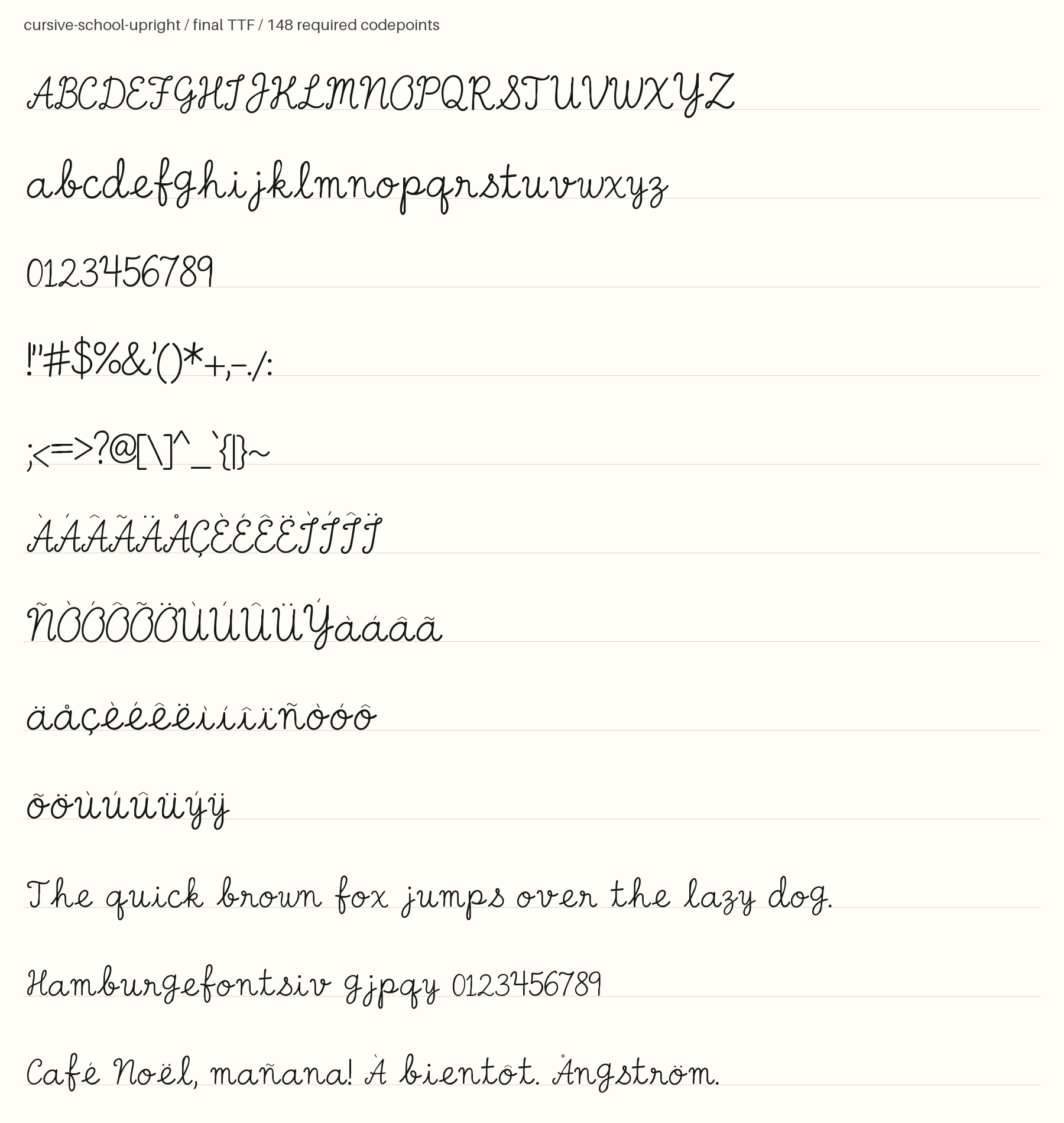
Cursive School Upright pairs nearly vertical stems with rounded, open loops and an even pen stroke.
Personal use: free with an account (3 fonts a month)Commercial license from $15/mo, yours to keep after your plan endsSee plans
Aa
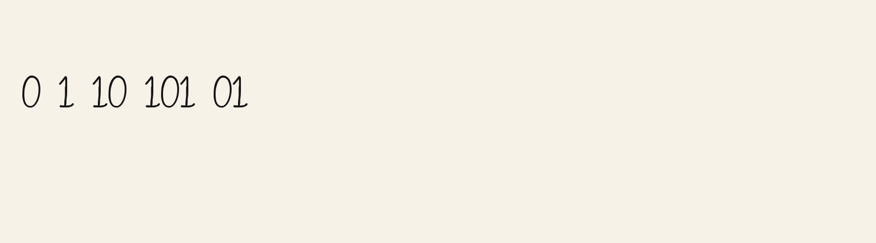
HnagR8
Test
Test Cursive School Upright
Type the words you plan to use and adjust size, line height, and letter spacing. The preview uses the final font file.
The quick brown fox jumps over the lazy dog
Design
Open Loop Penmanship Letterforms
Cursive School Upright pairs nearly vertical stems with rounded, open loops and an even pen stroke. The H has a rising cross stroke that meets a narrow loop near the top of its right stem. The L curls through a slim upper loop before sweeping into a long, rounded foot, giving repeated letters a gentle baseline rhythm. The R carries a broad bowl and a curved leg with an upturned finish. Capitals sit separately rather than forming a continuous joined line. These restrained flourishes and generous rounded shapes give short wording a calm, personal feel, with enough movement to keep labels from looking rigid.
Test the font in your wording
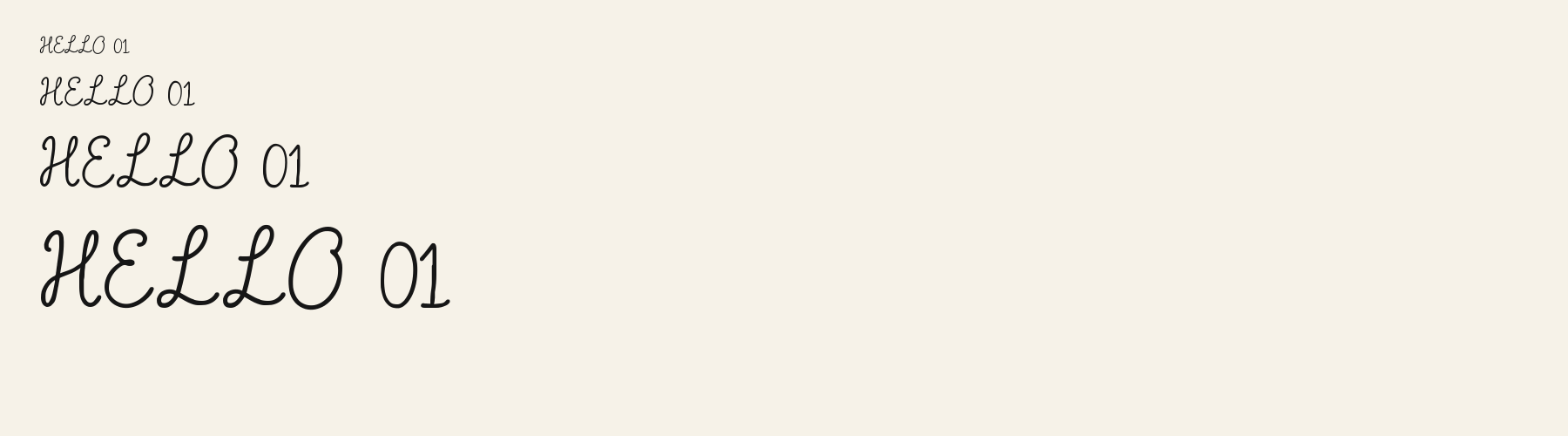
Check repeated L feet, the H cross stroke, and gaps around rounded capitals in your actual wording. Compare smaller and larger previews for loop clarity. These specimens show Latin capitals; inspect lowercase, accents, and any other script separately with your intended text.
Font pairing roles
Try this face for a short heading or personal label, with a plain sans serif handling instructions and supporting details. Its curled capital feet and rounded bowls provide the expressive role; a companion with simple terminals can keep longer passages visually steady.
Cursive School Upright: letterforms and layout
Distinctive letterforms
H
L
R
Compare the layout
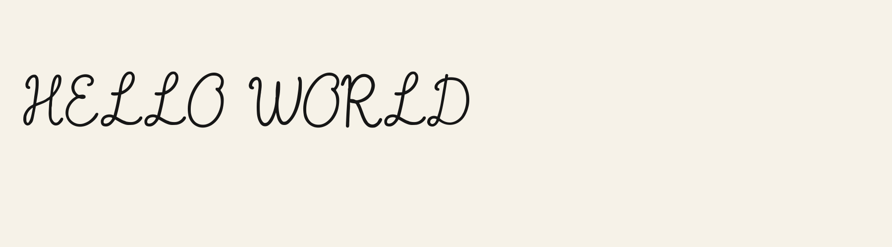
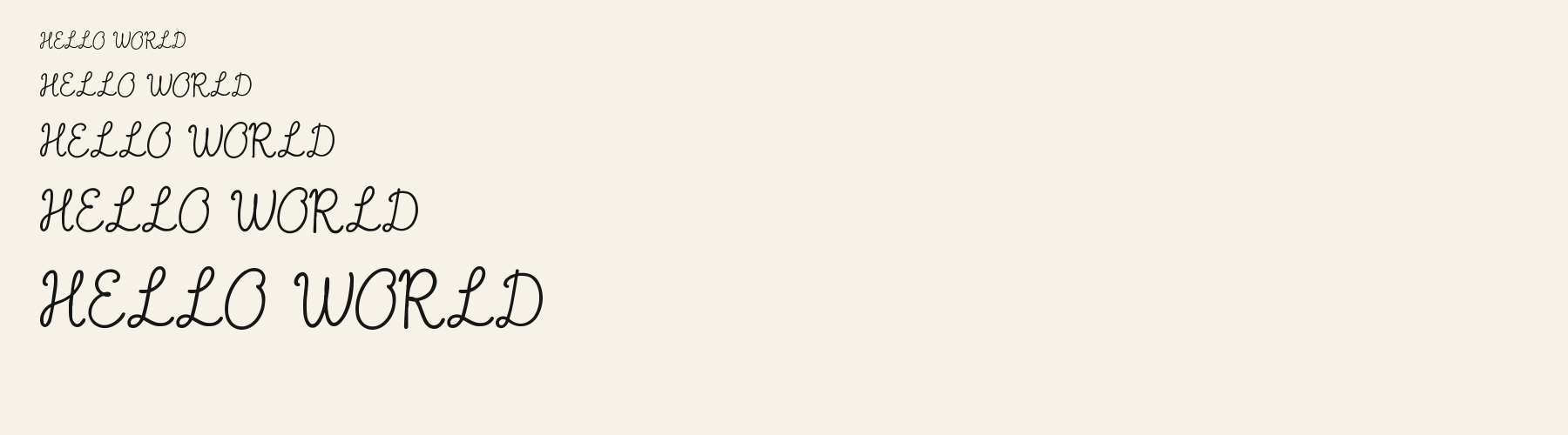
Same font, different settingsHELLO WORLD
HELLO WORLD
Compare the original spacing with a slightly wider setting. The repeated L feet and rounded O shapes give this phrase a flowing rhythm, while the separate capitals leave visible gaps. Check whether added space makes your wording feel pleasantly open or breaks that rhythm.
Preview settings, not minimum size recommendations. Wide samples scroll sideways.
Choose your letterforms
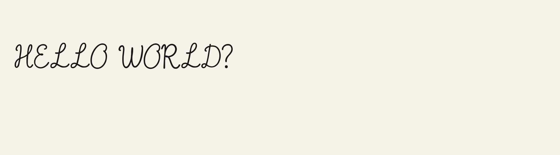
Same wording · 40pxHELLO WORLD?
Cursive School Upright has nearly even stroke weight, rounded turns, and relatively vertical stems. Its narrow looped L and softly curved W give the shared phrase a relaxed penmanship character suited to personal notes.
HELLO WORLD?
Gala Script shows pronounced thick and thin strokes, stronger slant, and sharper tapered endings. Its sweeping L and pointed W create a more formal calligraphic rhythm, making it a suggestion to try for ceremonial wording.
Cursive School Upright font in use
Hello Again
Handwritten note. The even pen strokes and gently curled capitals bring a personal, unhurried tone to a short handwritten message. Reading Journal
Product label. Rounded bowls and restrained flourishes give a notebook label a friendly identity without filling it with elaborate swashes. With Love
Card or invitation. The looped L and softly turning terminals lend a warm handwritten accent to a simple personal card.
The scenes are illustrations drawn on this page with Cursive School Upright itself, not client work.
How this page was made. Cursive School Upright is a FontGenerator library font made with AI; before release its letters were read back one by one by independent automated checks. The design notes were written by AI from the specimen images and checked against them by a second, independent pass; font measurements come from the font file. Preview sizes and spacing are comparison settings.
Specimens
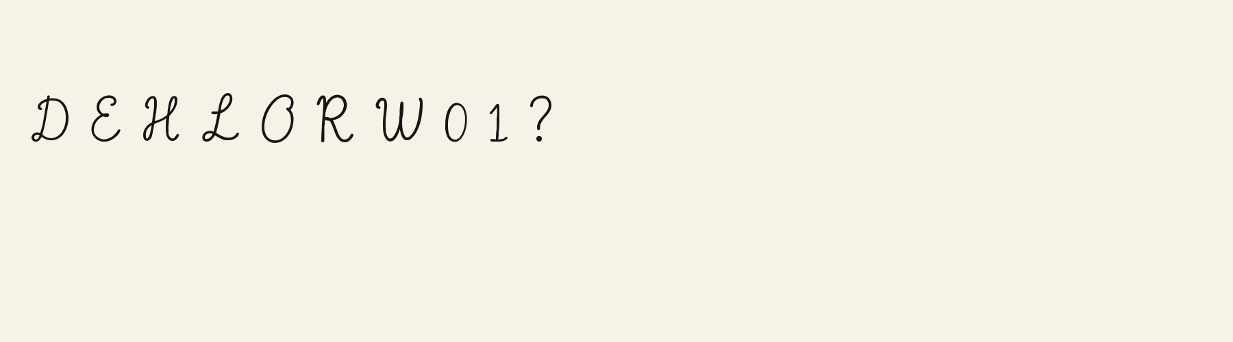
Specimens
Rendered from the font files, without retouching.
About
About Cursive School Upright
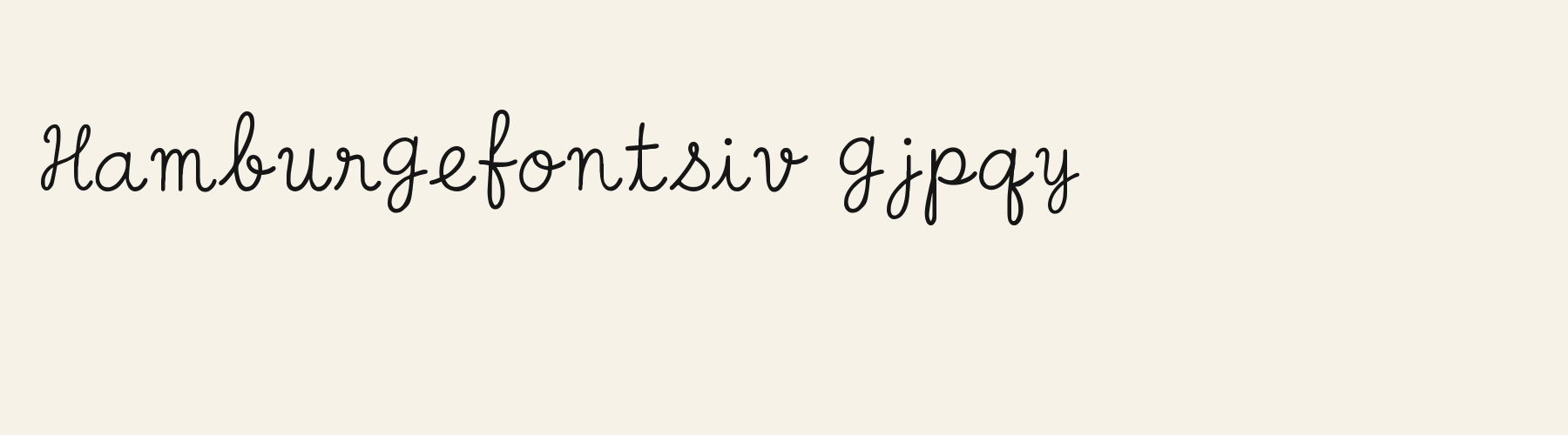
With an x-height of 63.9% of the cap height, its lowercase stands above the 48.5% median for script fonts, taller than 51 of the 53 other script fonts. Ascenders on b, d, h, k and l rise 13.7% above the capitals, and descenders on g, j, p, q and y drop 39.8% of the cap height below the baseline, shallower than 45 of the 53 other script fonts. It sets wide: an average lowercase letter, spacing included, is 73.6% as wide as the capitals are tall (an average capital, 81.2%), 14.8% more than the median for script fonts, so the same words take a longer line. The o is close to a circle, 1.12 times as wide as it is tall, and M is the widest capital, at 1.28 times the width of H. Round letters overshoot: O rises 2.2% of the cap height above H and dips 1.9% below the baseline.
Ink covers 20.1% of each lowercase letter's box (its advance width by the cap height), lighter than 39 of the 53 other script fonts.
Its 148 characters include 105 Latin letters, plus 43 figures, punctuation marks and symbols; 53 of the Latin letters are accented or special forms beyond A to Z. The word space measures 45.3% of the cap height, and the blank space either side of a lowercase letter takes up 4.3% of its width. The font carries no kerning, so spacing comes from each letter’s own side bearings. The figures have different widths, so columns of numbers set in Cursive School Upright will not line up exactly.
Measured from the version 0.1.0 font file. Comparisons are with the 376 published library fonts measured on November 12, 2026, 54 of them script fonts.
Characters
Characters
Includes all 95 printable Basic Latin characters, 148 characters in total.
Verified language coverage: Afrikaans, Albanian, Basque, Catalan, Dutch, English, Filipino, Galician, Indonesian, Irish, Italian, Malay, Portuguese, Spanish, Swahili, Swedish, Zulu
- Structure
- Upright classroom cursive with open simple loops and short flourishes
- Stroke
- Medium monoline pen, nearly vertical stems, clearly distinct true lowercase
- Best for
- Notes and school labels
Basic Latin · 95
- !
- "
- #
- $
- %
- &
- '
- (
- )
- *
- +
- ,
- -
- .
- /
- 0
- 1
- 2
- 3
- 4
- 5
- 6
- 7
- 8
- 9
- :
- ;
- <
- =
- >
- ?
- @
- A
- B
- C
- D
- E
- F
- G
- H
- I
- J
- K
- L
- M
- N
- O
- P
- Q
- R
- S
- T
- U
- V
- W
- X
- Y
- Z
- [
- \
- ]
- ^
- _
- `
- a
- b
- c
- d
- e
- f
- g
- h
- i
- j
- k
- l
- m
- n
- o
- p
- q
- r
- s
- t
- u
- v
- w
- x
- y
- z
- {
- |
- }
- ~
Latin letters with accents · 105
- ª
- º
- À
- Á
- Â
- Ã
- Ä
- Å
- Æ
- Ç
- È
- É
- Ê
- Ë
- Ì
- Í
- Î
- Ï
- Ñ
- Ò
- Ó
- Ô
- Õ
- Ö
- Ø
- Ù
- Ú
- Û
- Ü
- Ý
- ß
- à
- á
- â
- ã
- ä
- å
- æ
- ç
- è
- é
- ê
- ë
- ì
- í
- î
- ï
- ñ
- ò
- ó
- ô
- õ
- ö
- ø
- ù
- ú
- û
- ü
- ý
- ÿ
- Ā
- ā
- Ă
- ă
- Ċ
- ċ
- Ē
- ē
- Ĕ
- ĕ
- Ġ
- ġ
- Ī
- ī
- Ĭ
- ĭ
- Ŀ
- ŀ
- Ō
- ō
- Ŏ
- ŏ
- Œ
- œ
- Ū
- ū
- Ŭ
- ŭ
- Ÿ
- ɑ
- Ḃ
- ḃ
- Ḋ
- ḋ
- Ḟ
- ḟ
- Ṁ
- ṁ
- Ṗ
- ṗ
- Ṡ
- ṡ
- Ṫ
- ṫ
- Ɑ
Download
Download
Choose the license that matches your project before downloading.
Download
Free with a FontGenerator account: a TTF for personal, non-commercial projects, up to 3 free fonts a month. Pro and Studio add every format and commercial use.
Commercial use
Client work, products and redistribution need a commercial license. Library fonts include it with Pro or Studio; fonts you make include it when you make them on Pro or Studio. A Font Pass is for personal projects.
TTF · OTF · WOFF · WOFF2
Read the full font licenseTools
Do more with Cursive School Upright
Free tools that run in your browser. Images you make with them, such as a signature PNG, can be used for any purpose.
- Make a font like thisDescribe the style and get your own font in the direction of Cursive School Upright, private on paid plans.
- Write your signatureType your name in Cursive School Upright and download a transparent PNG for documents and email.
- Make a monogramSet your initials in Cursive School Upright inside a circle, diamond or plain frame.
- Check languagesSee which of 54 languages a font can write and exactly which letters are missing.
- Convert font filesTurn TTF or OTF into WOFF2 for the web, or back again. Files never leave your device.
- Compare with your fontsDrop in your own font files and set them next to library fonts.
Pairings
Fonts to pair with Cursive School Upright
A different structure keeps a pairing readable: set one font for headings and the other for text. Test both with your own words.
Sans serif1 style17 languages
Serif1 style35 languages
Similar
More script fonts
See all script fontsScript1 style17 languages
Compared with Cursive School Upright: Lower x-height · heavier strokes
Script1 style17 languages
Compared with Cursive School Upright: Lower x-height · lighter strokes
Script1 style17 languages
Compared with Cursive School Upright: Lower x-height · lighter strokes
Script1 style35 languages
Compared with Cursive School Upright: Lower x-height · heavier strokes
More
You may also like
Fonts from other styles, first those that suit the same kinds of work as Cursive School Upright.
Geo Circle Open
Free downloadSans serif1 style22 languages
Also suits: product label
Pixel1 style17 languages
Also suits: product label
Scholar Roman
Free downloadSerif1 style23 languages
Also suits: card or invitation
Stencil1 style17 languages
Also suits: product label
FAQ
Cursive School Upright questions
- Can I use Cursive School Upright commercially?
- A free account downloads Cursive School Upright as a TTF for personal, non-commercial projects. For client work, products, logos and redistribution, download it with a Pro or Studio plan; fonts downloaded during an active plan keep their commercial rights after the plan ends.
- Which languages does Cursive School Upright support?
- Cursive School Upright's 148 characters include 105 Latin letters, plus 43 figures, punctuation marks and symbols; 53 of the Latin letters are accented or special forms beyond A to Z. It has all 95 printable Basic Latin characters. Verified language coverage: Afrikaans, Albanian, Basque, Catalan, Dutch, English, Filipino, Galician, Indonesian, Irish, Italian, Malay, Portuguese, Spanish, Swahili, Swedish, Zulu. Missing a language? Customize the font and add it in Studio.
- What is Cursive School Upright good for?
- Handwritten note: The even pen strokes and gently curled capitals bring a personal, unhurried tone to a short handwritten message. Product label: Rounded bowls and restrained flourishes give a notebook label a friendly identity without filling it with elaborate swashes. Card or invitation: The looped L and softly turning terminals lend a warm handwritten accent to a simple personal card. Less suited: For dense instructions or aligned numerical tables, try a compact text face with tabular figures to support scanning and alignment.
- What fonts pair well with Cursive School Upright?
- Orbital Sans (sans serif), Buttress Bowl Sans Outline (sans serif) and Chronicle Italic Nib (serif) are drawn on a different letter structure, so Cursive School Upright can carry the headings while one of them sets the text. Each has its own page with a type tester for trying the pair.
- Which fonts are similar to Cursive School Upright?
- In the same script style: Lovenote Script (lower x-height, heavier strokes); Courier Sign (lower x-height, lighter strokes); Flourish Sign (lower x-height, lighter strokes).