Geo Octagon Counter
Free downloadSans serif2 styles21 languages
a g R S & Aa
Script · 1 style · 148 characters · Version 0.1.0 · Published October 1, 2026
Flourish Sign spreads its capitals across the line with fine, nearly even strokes and generous rounded curves.
Personal use: with Pro, Studio, or as one of 5 Font Pass picks ($4.99 once)Commercial license from $15/mo, yours to keep after your plan endsSee plans
Aa
agRS&
Test
Type the words you plan to use and adjust size, line height, and letter spacing. The preview uses the final font file.
The quick brown fox jumps over the lazy dog
Design
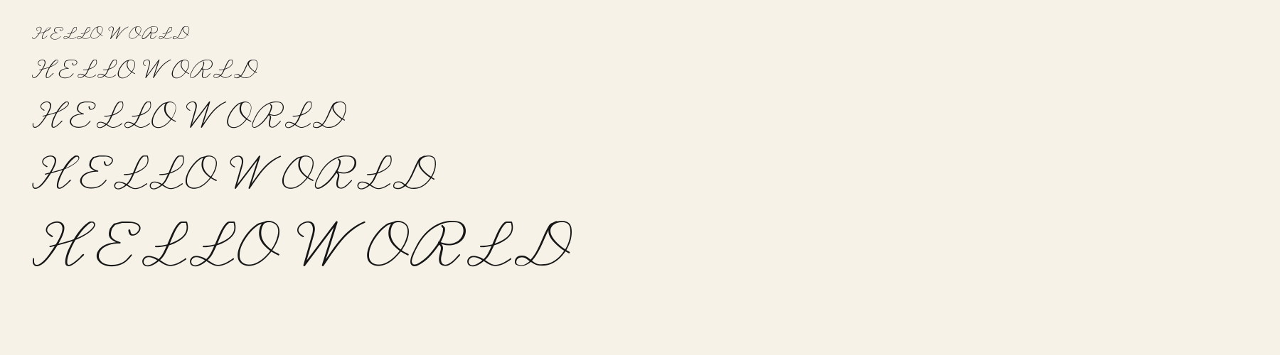
Flourish Sign spreads its capitals across the line with fine, nearly even strokes and generous rounded curves. The L rises into a narrow loop, drops into a small loop at the baseline, and finishes with a long rightward sweep. The O has a broad rounded outline crossed by a diagonal return that trails beyond its right side. The E balances a small inward curl at the top against a much larger open lower bowl. These repeated loops and crossings give short words a poised, leisurely rhythm, with enough empty space inside the letters to keep the ornament feeling light.
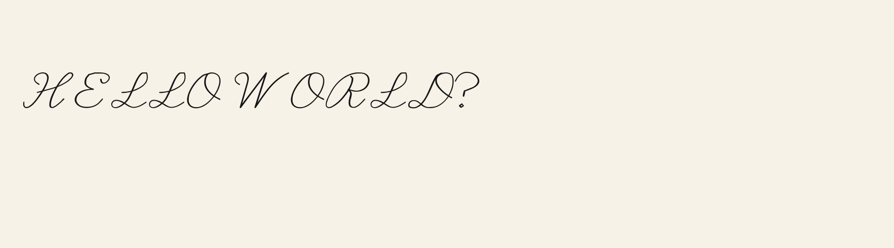
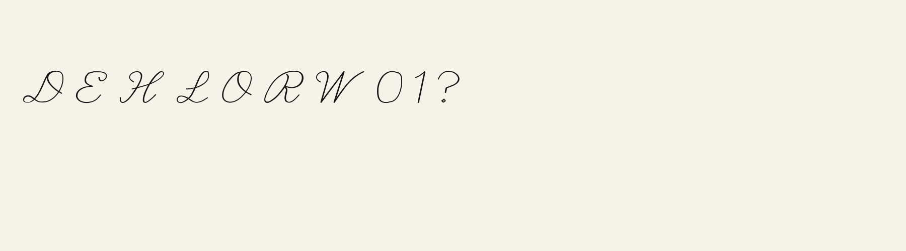
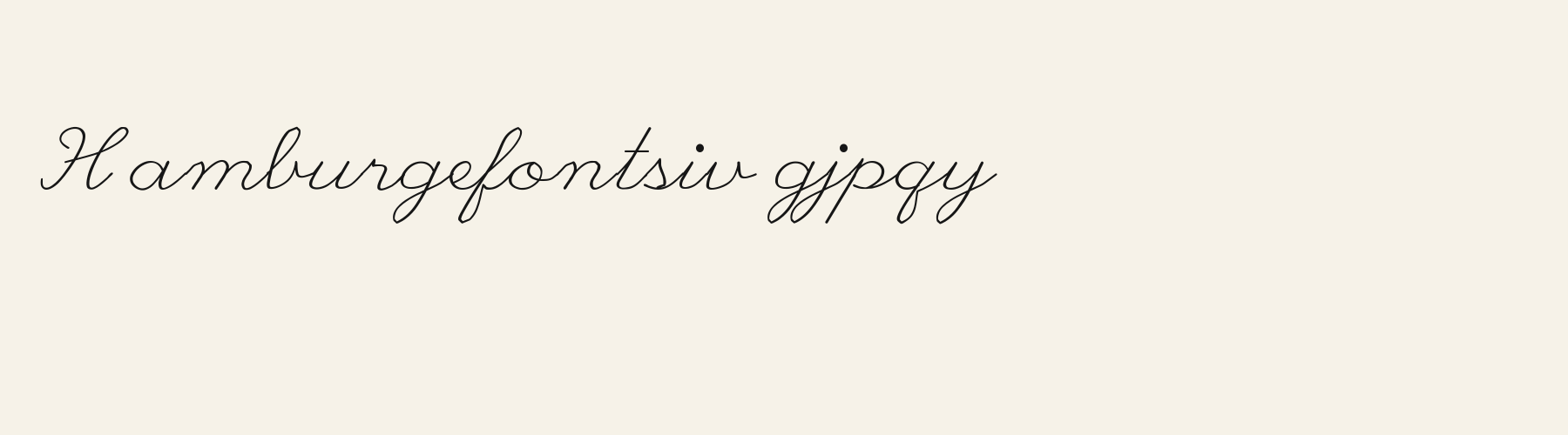
Inspect repeated L sweeps, O crossings, and word spaces in your actual wording. These specimens show uppercase Latin; check lowercase joins and accented Latin forms separately in the preview. Test any other script with its own sample before planning matching typography.
Try this face for a short heading or signature, supported by a plain sans serif for descriptions and labels. Its fine loops and broad capitals benefit from a companion with compact proportions and a firmer stroke, keeping supporting information visually distinct.
L
O
E
HELLO WORLD
HELLO WORLD
Compare smaller and larger previews, watching the fine strokes and the crossings inside O. Larger settings give the small baseline loops more room to remain distinct; check whether those details survive at your intended output size.
Preview settings, not minimum size recommendations. Wide samples scroll sideways.
HELLO WORLD
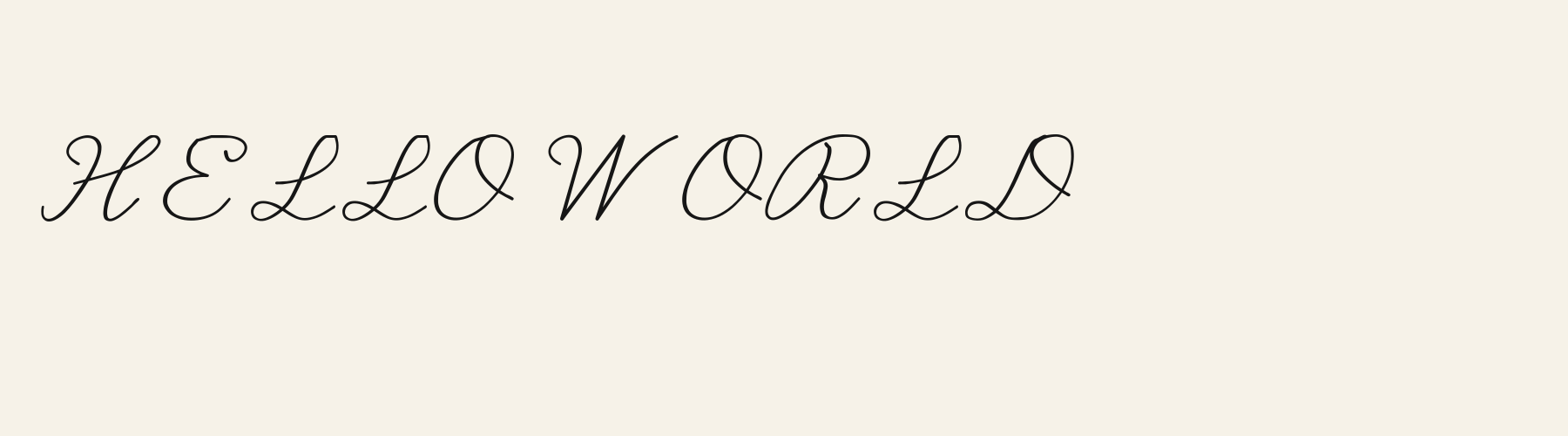
In this uppercase phrase, Flourish Sign uses fine single strokes, broad baseline sweeps on L, and diagonal returns across O. Its open interiors give the lettering a light, spacious presence.
HELLO WORLD
Executive Sign introduces closely spaced parallel contours along portions of H, O, and R, adding visible internal detail. Its O contains an inset curved stroke where Flourish Sign carries a diagonal return across the interior.
WITH LOVE
SLOW HOURS
OLIVE
The scenes are illustrations drawn on this page with Flourish Sign itself, not client work.
How this page was made. Flourish Sign is a FontGenerator library font made with AI; before release its letters were read back one by one by independent automated checks. The design notes were written by AI from the specimen images and checked against them by a second, independent pass; font measurements come from the font file. Preview sizes and spacing are comparison settings.
Specimens
Rendered from the font files, without retouching.
About
The x-height is a compact 45.9% of the cap height, below the 48.5% median for script fonts, lower than 41 of the 53 other script fonts. Ascenders on b, d, h, k and l line up with the capitals (99.4% of their height), and descenders on g, j, p, q and y drop 52.8% of the cap height below the baseline, deeper than 38 of the 53 other script fonts. It sets wide: an average lowercase letter, spacing included, is 71.5% as wide as the capitals are tall (an average capital, 117.4%), 11.5% more than the median for script fonts, so the same words take a longer line. The o is wider than it is tall, 1.79 to 1, and M is the widest capital, at 1.10 times the width of H. The O tops out level with H and stands 0.7% above the baseline.
Ink covers 13.6% of each lowercase letter's box (its advance width by the cap height), lighter than 47 of the 53 other script fonts.
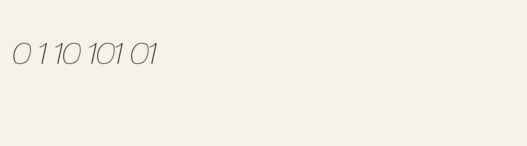
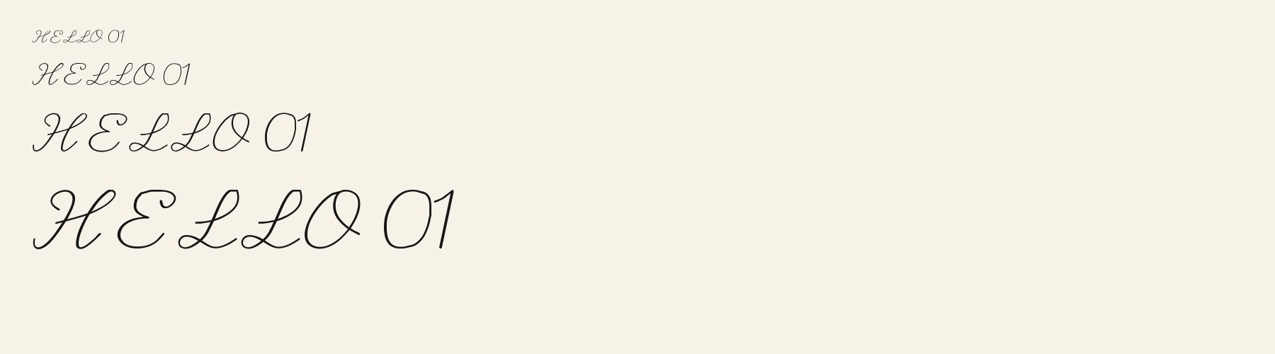
Its 148 characters include 105 Latin letters, plus 43 figures, punctuation marks and symbols; 53 of the Latin letters are accented or special forms beyond A to Z. The word space measures 36.2% of the cap height, and lowercase letters reach 24.4% past their own widths into the space of their neighbours. Spacing is adjusted with 48 kerning pairs, more than 36 of the 53 other script fonts. The tightest of them is FA, which closes up by 29.6% of the cap height. The figures have different widths, so columns of numbers set in Flourish Sign will not line up exactly.
Flourish Sign is drawn on the same letter structure as 14 other fonts in the library. Compared with Flourish Sign, Sailor Script puts down 184% more ink, has a 50% x-height and adds Azerbaijani, Bosnian, Filipino and 6 more languages. Velvet Cursive sets 10% narrower, puts down 135% more ink and adds Azerbaijani, Bosnian, Filipino and 6 more languages. Lovenote Script puts down 86% more ink.
Measured from the version 0.1.0 font file. Comparisons are with the 376 published library fonts measured on November 12, 2026, 54 of them script fonts.
Characters
Includes all 95 printable Basic Latin characters, 148 characters in total.
Verified language coverage: Afrikaans, Albanian, Basque, Catalan, Dutch, English, Filipino, Galician, Indonesian, Irish, Italian, Malay, Portuguese, Spanish, Swahili, Swedish, Zulu
Download
Choose the license that matches your project before downloading.
This font is part of the Pro library: it downloads with Pro or Studio, or as one of the five picks of a Font Pass.
Client work, products and redistribution need a commercial license. Library fonts include it with Pro or Studio; fonts you make include it when you make them on Pro or Studio. A Font Pass is for personal projects.
TTF · OTF · WOFF · WOFF2
Read the full font licenseTools
Free tools that run in your browser. Images you make with them, such as a signature PNG, can be used for any purpose.
Pairings
A different structure keeps a pairing readable: set one font for headings and the other for text. Test both with your own words.
Sans serif2 styles21 languages
Sans serif1 style17 languages
Serif1 style18 languages
Similar
Script1 style35 languages
Compared with Flourish Sign: Heavier strokes
Script1 style35 languages
Compared with Flourish Sign: Heavier strokes · 6% narrower
Script1 style35 languages
Compared with Flourish Sign: Heavier strokes · 10% narrower
Script1 style17 languages
Compared with Flourish Sign: Heavier strokes · 14% narrower
More
Fonts from other styles, first those that suit the same kinds of work as Flourish Sign.
Pixel1 style37 languages
Also suits: logo or badge
Display1 style17 languages
Also suits: card or invitation
Handwriting1 style39 languages
Also suits: book or album cover
Serif1 style17 languages
Also suits: book or album cover
FAQ