Serif1 style18 languages
Melt Sans
AI-generated
Decorative · 1 style · 148 characters · Version 0.1.1 · Added October 3, 2026
Melt Sans is a decorative font: dripping duplex sans. Best for Horror & Spooky designs.
Personal use: with Pro, Studio, or as one of 5 Font Pass picks ($4.99 once)Commercial license from $15/mo, yours to keep after your plan endsSee plans
Aa
agRS&
Test
Test Melt Sans
Type the words you plan to use and adjust size, line height, and letter spacing. The preview uses the final font file.
The quick brown fox jumps over the lazy dog
Design
Melt Sans up close
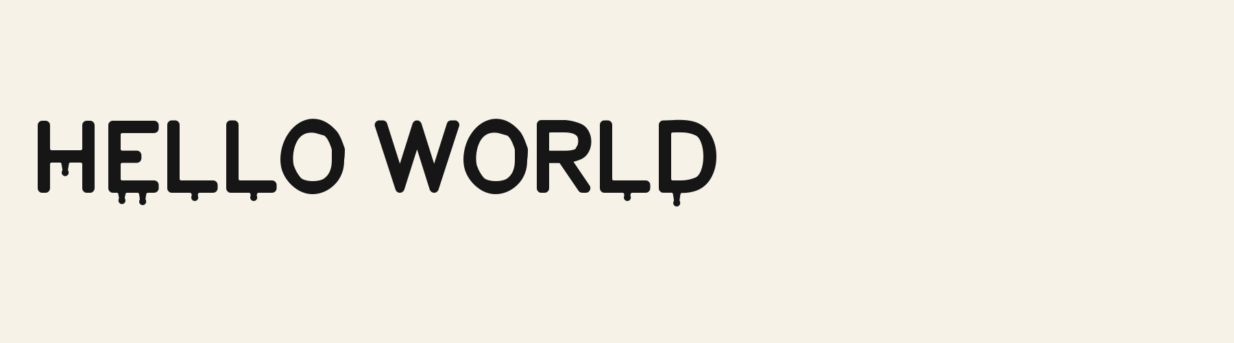
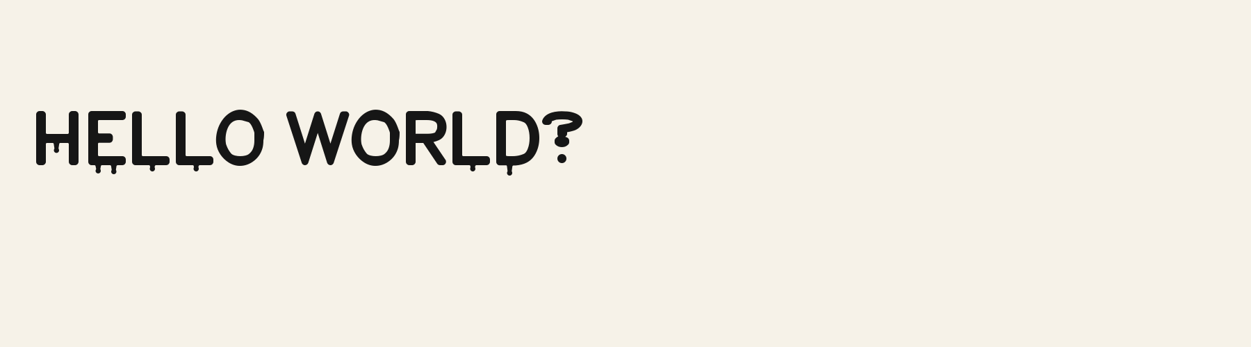
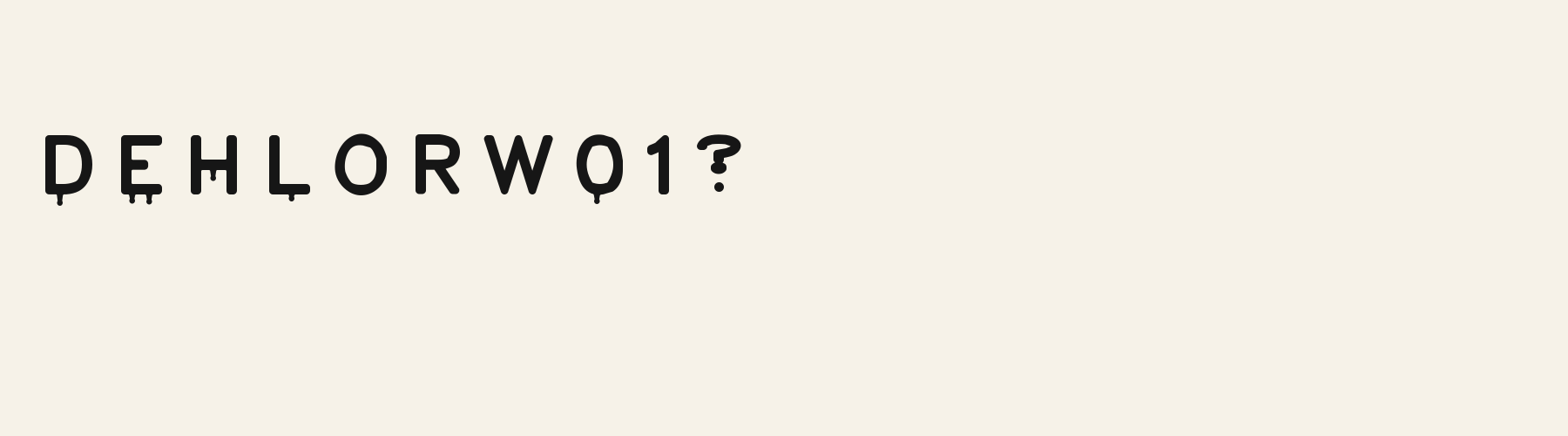
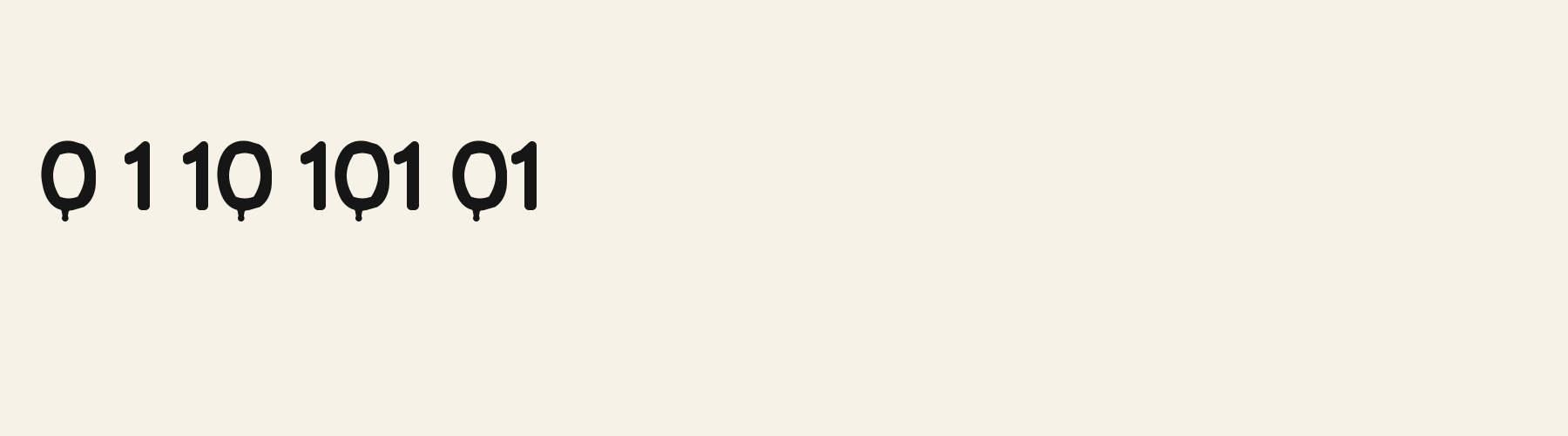
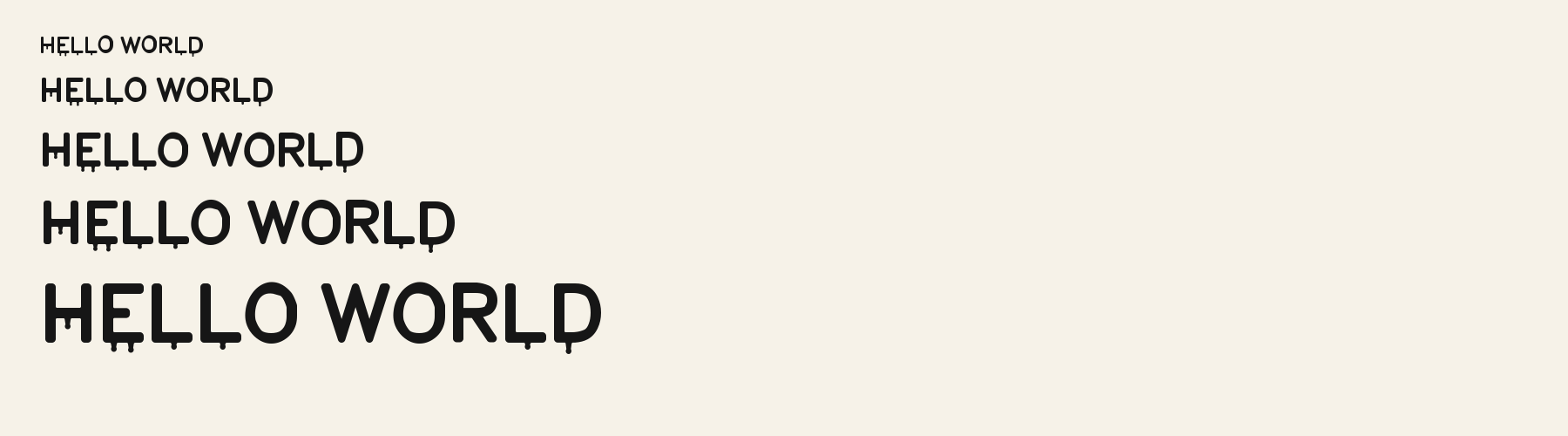
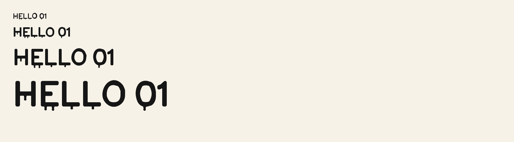
Melt Sans uses broad, upright capitals with thick strokes and softly rounded corners. A small drip hangs from the H’s crossbar, while the E and L let drops fall from the ends of their lower strokes. The O remains a clean upright oval, giving the words a steady shape even where the edges appear to run. The drops are scattered rather than continuous, so each letter stays easy to recognise. That mix of sturdy forms and dangling details gives large text a playful, uneasy mood.
Melt Sans in use
MIDNIGHT SHOW
Poster. Heavy upright letters read from a distance, while the hanging drips give an event title a spooky edge. THE DARK ROOM
Book or album cover. The clean oval shapes keep a title legible, and the scattered drops add a quiet sense of unease. BOO CREW
T-shirt print. Blunt rounded capitals make a bold print, with small drips adding character beneath the words.
The scenes are illustrations drawn on this page with Melt Sans itself, not client work.
How this page was made. Melt Sans is a FontGenerator library font made with AI; before release its letters were read back one by one by independent automated checks. The design notes were written by AI from the specimen images and checked against them by a second, independent pass; every number on the page is measured from the font file.
Specimens
Specimens
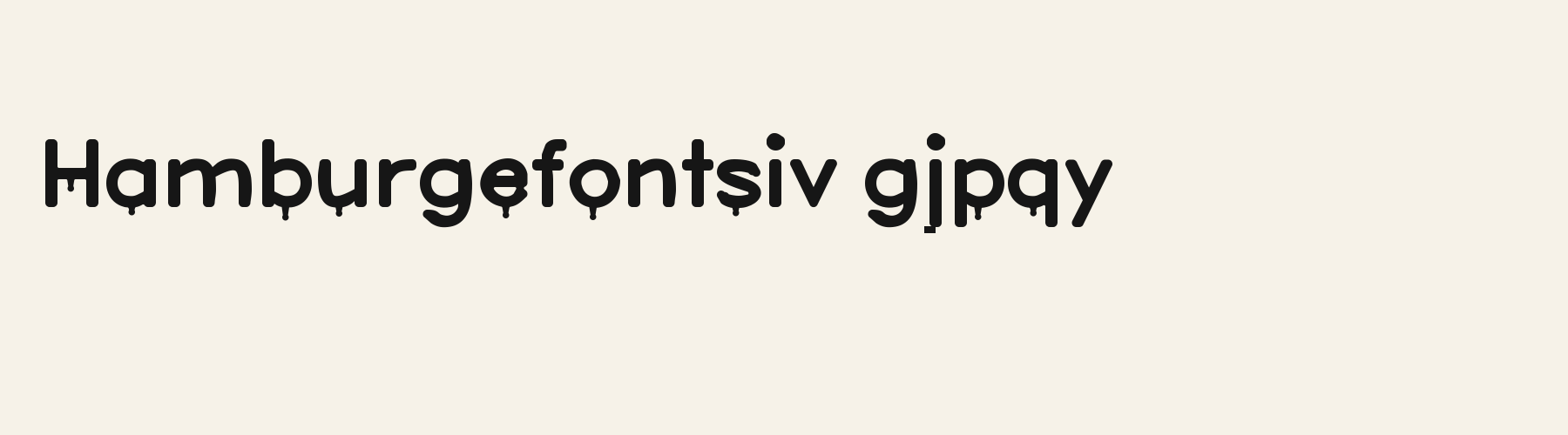
Rendered from the font files, without retouching.
About
About Melt Sans
The x-height is a compact 71% of the cap height, below the 74% median for decorative fonts, lower than 29 of the 37 other decorative fonts. Ascenders on b, d, h, k and l line up with the capitals (100% of their height), and descenders on g, j, p, q and y drop 29% of the cap height below the baseline, deeper than 30 of the 37 other decorative fonts. Its letters are of average width for decorative fonts: an average lowercase letter, spacing included, is 77.3% as wide as the capitals are tall (an average capital, 88.9%), within 1.4% of the median. The o is an upright oval, 0.84 times as wide as it is tall, and W is the widest capital, at 1.24 times the width of H. Round letters overshoot: O rises 2.8% of the cap height above H and dips 1.6% below the baseline.
The letters stand upright, leaning less than 2.5° either way. Vertical stems measure 17.6% of the cap height, heavier than 20 of the 24 other decorative fonts. Ink covers 42.3% of each lowercase letter's box (its advance width by the cap height), darker than 32 of the 37 other decorative fonts. The tops and bottoms of o and O are slightly heavier than their sides, 1.19 to 1. Paint drips hang from the undersides of the strokes.
Its 148 characters include 105 Latin letters, plus 43 figures, punctuation marks and symbols; 53 of the Latin letters are accented or special forms beyond A to Z. The word space measures 35.9% of the cap height, and the blank space either side of a lowercase letter takes up 13.9% of its width. Spacing is adjusted with 96 kerning pairs, fewer than 26 of the 37 other decorative fonts. The tightest of them is AY, which closes up by 20.2% of the cap height. The figures have different widths, so columns of numbers set in Melt Sans will not line up exactly.
Melt Sans is drawn on the same letter structure as 8 other fonts in the library. Compared with Melt Sans, League Sans rings each letter with an outline, sets 9% wider and has a 75% x-height. Marquee Round Inline cuts a thin line along each stroke, sets 13% wider and adds Filipino, Malay, Albanian and 2 more languages. Ration Stencil adds military stencil bridges, leans about 8° and puts down 35% less ink.
Measured from the version 0.1.1 font file. Comparisons are with the 377 published library fonts measured on October 14, 2026, 38 of them decorative fonts.
Characters
Characters
Includes all 95 printable Basic Latin characters, 148 characters in total.
Verified language coverage: Afrikaans, Albanian, Basque, Catalan, Dutch, English, Filipino, Galician, Indonesian, Irish, Italian, Malay, Portuguese, Spanish, Swahili, Swedish, Zulu
- Best for
- Horror & Spooky designs
Basic Latin · 95
- !
- "
- #
- $
- %
- &
- '
- (
- )
- *
- +
- ,
- -
- .
- /
- 0
- 1
- 2
- 3
- 4
- 5
- 6
- 7
- 8
- 9
- :
- ;
- <
- =
- >
- ?
- @
- A
- B
- C
- D
- E
- F
- G
- H
- I
- J
- K
- L
- M
- N
- O
- P
- Q
- R
- S
- T
- U
- V
- W
- X
- Y
- Z
- [
- \
- ]
- ^
- _
- `
- a
- b
- c
- d
- e
- f
- g
- h
- i
- j
- k
- l
- m
- n
- o
- p
- q
- r
- s
- t
- u
- v
- w
- x
- y
- z
- {
- |
- }
- ~
Latin letters with accents · 105
- ª
- º
- À
- Á
- Â
- Ã
- Ä
- Å
- Æ
- Ç
- È
- É
- Ê
- Ë
- Ì
- Í
- Î
- Ï
- Ñ
- Ò
- Ó
- Ô
- Õ
- Ö
- Ø
- Ù
- Ú
- Û
- Ü
- Ý
- ß
- à
- á
- â
- ã
- ä
- å
- æ
- ç
- è
- é
- ê
- ë
- ì
- í
- î
- ï
- ñ
- ò
- ó
- ô
- õ
- ö
- ø
- ù
- ú
- û
- ü
- ý
- ÿ
- Ā
- ā
- Ă
- ă
- Ċ
- ċ
- Ē
- ē
- Ĕ
- ĕ
- Ġ
- ġ
- Ī
- ī
- Ĭ
- ĭ
- Ŀ
- ŀ
- Ō
- ō
- Ŏ
- ŏ
- Œ
- œ
- Ū
- ū
- Ŭ
- ŭ
- Ÿ
- ɑ
- Ḃ
- ḃ
- Ḋ
- ḋ
- Ḟ
- ḟ
- Ṁ
- ṁ
- Ṗ
- ṗ
- Ṡ
- ṡ
- Ṫ
- ṫ
- Ɑ
Download
Download
Choose the license that matches your project before downloading.
Download
This font is part of the Pro library: it downloads with Pro or Studio, or as one of the five picks of a Font Pass.
Commercial use
Client work, products and redistribution need a commercial license. Library fonts include it with Pro or Studio; fonts you make include it when you make them on Pro or Studio. A Font Pass is for personal projects.
TTF · OTF · WOFF · WOFF2
Read the full font licenseTools
Do more with Melt Sans
Free tools that run in your browser. Images you make with them, such as a signature PNG, can be used for any purpose.
- Make a font like thisDescribe the style and get your own font in the direction of Melt Sans, private on paid plans.
- Make a monogramSet your initials in Melt Sans inside a circle, diamond or plain frame.
- Check languagesSee which of 54 languages a font can write and exactly which letters are missing.
- Convert font filesTurn TTF or OTF into WOFF2 for the web, or back again. Files never leave your device.
- Compare with your fontsDrop in your own font files and set them next to library fonts.
Pairings
Fonts to pair with Melt Sans
A different structure keeps a pairing readable: set one font for headings and the other for text. Test both with your own words.
Serif1 style18 languages
Sans serif1 style17 languages
Similar
More decorative fonts
See all decorative fontsDisplay1 style18 languages
Compared with Melt Sans: 3D effect · heavier strokes
Sans serif1 style18 languages
Compared with Melt Sans: 14% narrower · plain letters
Decorative1 style5 languages
Compared with Melt Sans: Lighter strokes · plain letters
Decorative1 style24 languages
Compared with Melt Sans: Lighter strokes · plain letters
More
You may also like
Fonts from other styles, first those that suit the same kinds of work as Melt Sans.
Monospace1 style17 languages
Also suits: book or album cover
Sans serif1 style29 languages
Also suits: poster
Handwriting1 style17 languages
Also suits: poster
Pixel1 style21 languages
Also suits: poster
FAQ
Melt Sans questions
- Can I use Melt Sans commercially?
- Melt Sans is part of the Pro library. Pro and Studio include it with a commercial license that continues after the plan ends; a Font Pass can pick it as one of 5 fonts for personal use.
- Which languages does Melt Sans support?
- Melt Sans's 148 characters include 105 Latin letters, plus 43 figures, punctuation marks and symbols; 53 of the Latin letters are accented or special forms beyond A to Z. It has all 95 printable Basic Latin characters. Verified language coverage: Afrikaans, Albanian, Basque, Catalan, Dutch, English, Filipino, Galician, Indonesian, Irish, Italian, Malay, Portuguese, Spanish, Swahili, Swedish, Zulu. Missing a language? Customize the font and add it in Studio.
- What is Melt Sans good for?
- Poster: Heavy upright letters read from a distance, while the hanging drips give an event title a spooky edge. Book or album cover: The clean oval shapes keep a title legible, and the scattered drops add a quiet sense of unease. T-shirt print: Blunt rounded capitals make a bold print, with small drips adding character beneath the words. Less suited: For body copy or tiny labels, choose a simpler text face whose details stay clear at small sizes.
- What fonts pair well with Melt Sans?
- Monolith Slab (serif), Lore Serif (serif) and Signage Shopfront Round Outline (sans serif) are drawn on a different letter structure, so Melt Sans can carry the headings while one of them sets the text. Each has its own page with a type tester for trying the pair.
- Which fonts are similar to Melt Sans?
- In the same decorative style: Pop 3D (3d effect, heavier strokes); Pivot Sans (14% narrower, plain letters); Decorative Art Nouveau (lighter strokes, plain letters).