Geo Octagon Counter
Free downloadSans serif2 styles21 languages
A D M n h Aa
Display · 1 style · 330 characters · Version 0.3.2 · Published September 23, 2026
Rounded Arch Display combines thin, even strokes with clipped corners and softly capped ends.
Personal use: with Pro, Studio, or as one of 5 Font Pass picks ($4.99 once)Commercial license from $15/mo, yours to keep after your plan endsSee plans
Aa
ADMnh
Test
Type the words you plan to use and adjust size, line height, and letter spacing. The preview uses the final font file.
The quick brown fox jumps over the lazy dog
Design
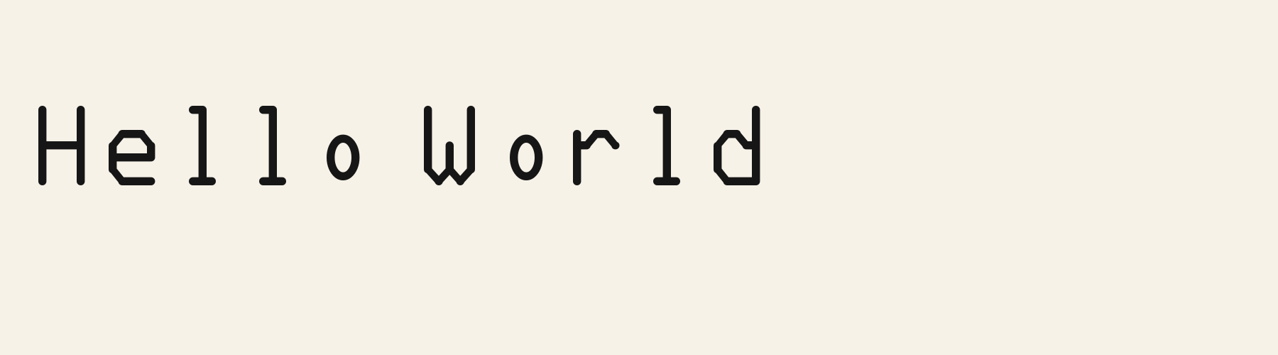
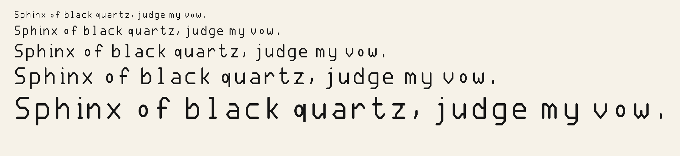
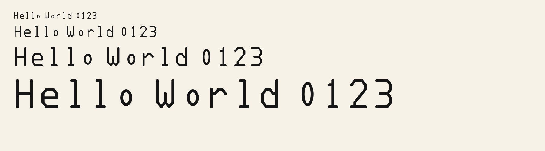
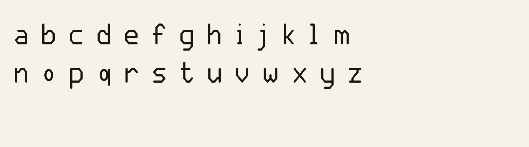
Rounded Arch Display combines thin, even strokes with clipped corners and softly capped ends. The W drops into twin pointed valleys around a short central stem, giving an otherwise upright alphabet a distinctive zigzag. Lowercase e has a faceted bowl, a straight crossbar and an open right side, while o is a small upright oval that sits noticeably below the taller letters. Tall ascenders and low lowercase bodies create a loose, alternating rhythm across words. The result feels spare and architectural, with enough softened detail to keep short headings approachable.
Inspect oval o beside taller stems, the open e, and descending letters in your actual Latin wording. Check repeated l shapes and gaps around capitals before adjusting spacing. For other scripts, inspect separate specimens and confirm the required characters in the font.
Try this face for short headings with a sturdier text sans for descriptions and supporting labels. Its small lowercase o and angular bowls create an uneven visual rhythm; a companion with larger lowercase forms could give longer passages a steadier texture.
W
e
o
Hello World
HELLO WORLD
Compare the phrase as written with its uppercase setting. Mixed case brings low oval forms, tall ascenders and footed l shapes into view; uppercase emphasizes the crossbars and twin valleys of W. Check which rhythm fits the surrounding layout.
Preview settings, not minimum size recommendations. Wide samples scroll sideways.
HELLO WORLD
In this uppercase phrase, Rounded Arch Display has finer strokes and a small oval O that floats inside the capital height. The narrow forms and generous gaps give the heading a light, interrupted rhythm.
HELLO WORLD
Rounded Soft Block gives the same uppercase phrase heavier strokes and a larger octagonal O, with clipped outer corners and a similarly faceted counter. Its letters occupy the line more evenly, creating a fuller block of text.
Quiet Spaces
Objects for Living
Willow Soap
The scenes are illustrations drawn on this page with Rounded Arch Display itself, not client work.
How this page was made. Rounded Arch Display is a FontGenerator library font made with AI; before release its letters were read back one by one by independent automated checks. The design notes were written by AI from the specimen images and checked against them by a second, independent pass; font measurements come from the font file. Preview sizes and spacing are comparison settings.
Specimens
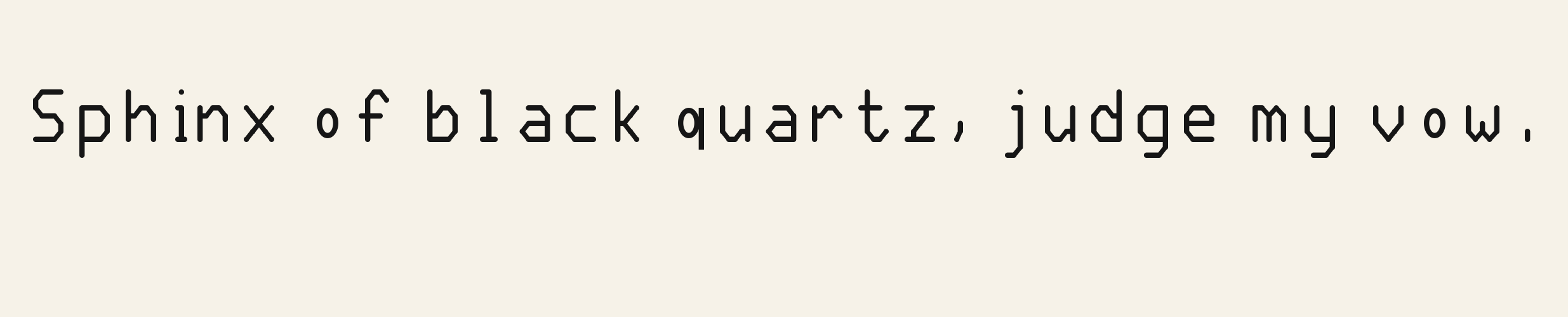
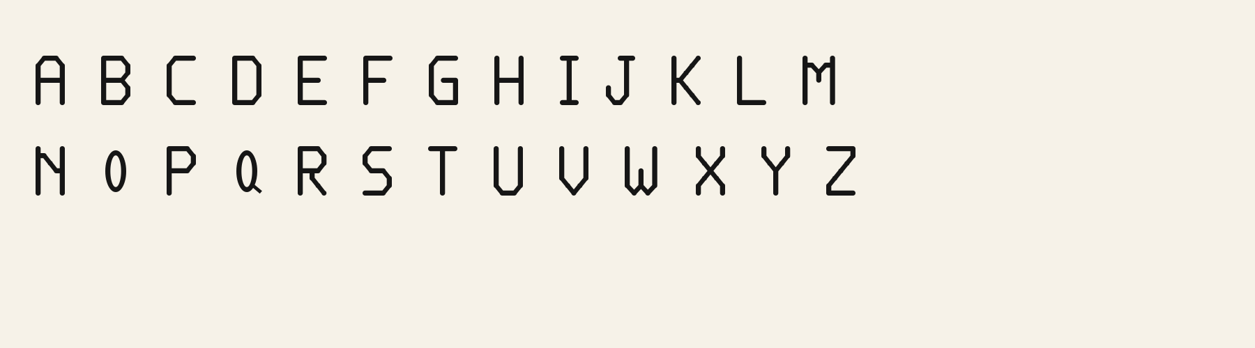
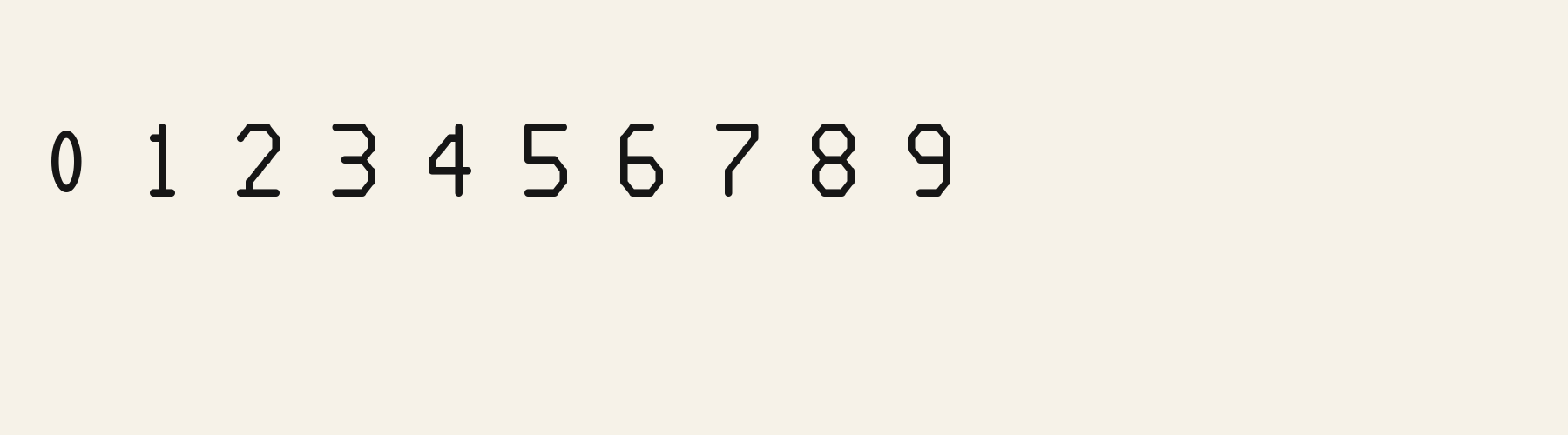
Rendered from the font files, without retouching.
About
Its lowercase sits low: the x-height is 70.1% of the cap height, where the median for display fonts is 74.4%, lower than 93 of the 116 other display fonts. Ascenders on b, d, h, k and l line up with the capitals (100% of their height), and descenders on g, j, p, q and y drop 29.9% of the cap height below the baseline, deeper than 109 of the 116 other display fonts. Its letters are of average width for display fonts: an average lowercase letter, spacing included, is 87.1% as wide as the capitals are tall (an average capital, 87.6%), within 0% of the median. The o is an upright oval, 0.72 times as wide as it is tall, and M and W are the widest capitals, at 1.12 times the width of H. The O stops 9.5% of the cap height short of H and stands 6.3% above the baseline.
The letters stand upright, leaning less than 2.5° either way. Vertical stems measure 10.2% of the cap height, lighter than 57 of the 58 other display fonts. Ink covers 20.6% of each lowercase letter's box (its advance width by the cap height), lighter than 104 of the 116 other display fonts. Strokes keep one thickness in every direction: the sides of o and O measure the same as their tops and bottoms.
Its 330 characters include 287 Latin letters, plus 43 figures, punctuation marks and symbols; 235 of the Latin letters are accented or special forms beyond A to Z. The word space measures 42.4% of the cap height, and the blank space either side of a lowercase letter takes up 38.1% of its width. The font carries no kerning, so spacing comes from each letter’s own side bearings. All ten figures share one width, so columns of numbers line up.
Measured from the version 0.3.2 font file. Comparisons are with the 376 published library fonts measured on November 8, 2026, 117 of them display fonts.
Quel vituperabile xenofobo zelante assaggia il whisky ed esclama: alleluja!
Pchnąć w tę łódź jeża lub ośm skrzyń fig.
Characters
Includes all 95 printable Basic Latin characters, 330 characters in total.
Verified language coverage: Afrikaans, Albanian, Basque, Bosnian, Catalan, Croatian, Danish, Dutch, English, Estonian, Filipino, Finnish, French, Galician, German, Hungarian, Icelandic, Indonesian, Irish, Italian, Malay, Maltese, Norwegian, Polish, Portuguese, Slovak, Slovenian, Spanish, Swahili, Swedish, Welsh, Zulu
Download
Choose the license that matches your project before downloading.
This font is part of the Pro library: it downloads with Pro or Studio, or as one of the five picks of a Font Pass.
Client work, products and redistribution need a commercial license. Library fonts include it with Pro or Studio; fonts you make include it when you make them on Pro or Studio. A Font Pass is for personal projects.
TTF · OTF · WOFF · WOFF2
Read the full font licenseTools
Free tools that run in your browser. Images you make with them, such as a signature PNG, can be used for any purpose.
Pairings
A different structure keeps a pairing readable: set one font for headings and the other for text. Test both with your own words.
Sans serif2 styles21 languages
Sans serif1 style17 languages
Serif1 style19 languages
Similar
Display1 style18 languages
Compared with Rounded Arch Display: Heavier strokes · 27% wider
Display1 style17 languages
Compared with Rounded Arch Display: Heavier strokes
Display1 style37 languages
Compared with Rounded Arch Display: Candy-stripe effect · taller x-height
Display1 style17 languages
Compared with Rounded Arch Display: Heavier strokes · taller x-height
More
Fonts from other styles, first those that suit the same kinds of work as Rounded Arch Display.
Decorative1 style5 languages
Also suits: product label
Handwriting1 style17 languages
Also suits: book or album cover
Stencil1 style38 languages
Also suits: product label
Monospace1 style18 languages
Also suits: book or album cover
FAQ